Test Data
Test Data in FireFlink is a core component that supports efficient and reusable automation by separating data from test logic. The platform allows users to manage structured test data through files such as Excel or CSV, enabling data-driven testing without hardcoding values into test cases. This approach ensures that the same test case can be executed with multiple data sets, improving coverage and reducing maintenance. FireFlink also supports variable mapping and parameterization, making it easy to plug in test data dynamically during execution. This ensures consistency, simplifies updates, and helps maintain clean and scalable test designs.
Navigation
- Click on 'All Projects' in the top navigation bar, as demonstrated below.
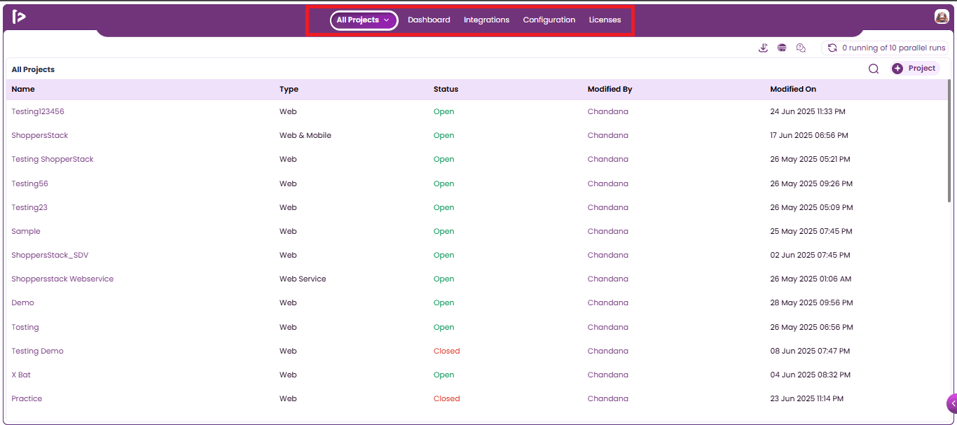
- Select the desired Project user wants to navigate from All Projects, as shown below.
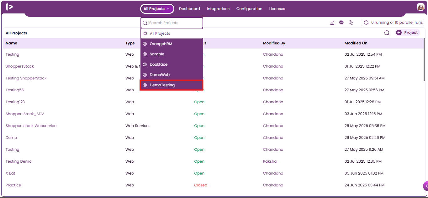
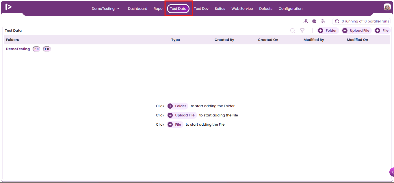
- Users will be navigated to Individual Project wherein on the Top Navigation Bar , click on 'Test Data', as demonstrated below.
Introduction to Folder
- In FireFlink's Test Data section, folders are used to logically organize test data sets for better accessibility and management.
- They allow users to categorize data based on test modules, features, teams, or environments, promoting clarity and reducing clutter.
- By structuring test data into folders, teams can easily locate and reuse datasets, maintain version control and apply consistent naming conventions.
Steps to Create a Folder within FireFlink
There are primarily two methods to add a Folder within FireFlink.
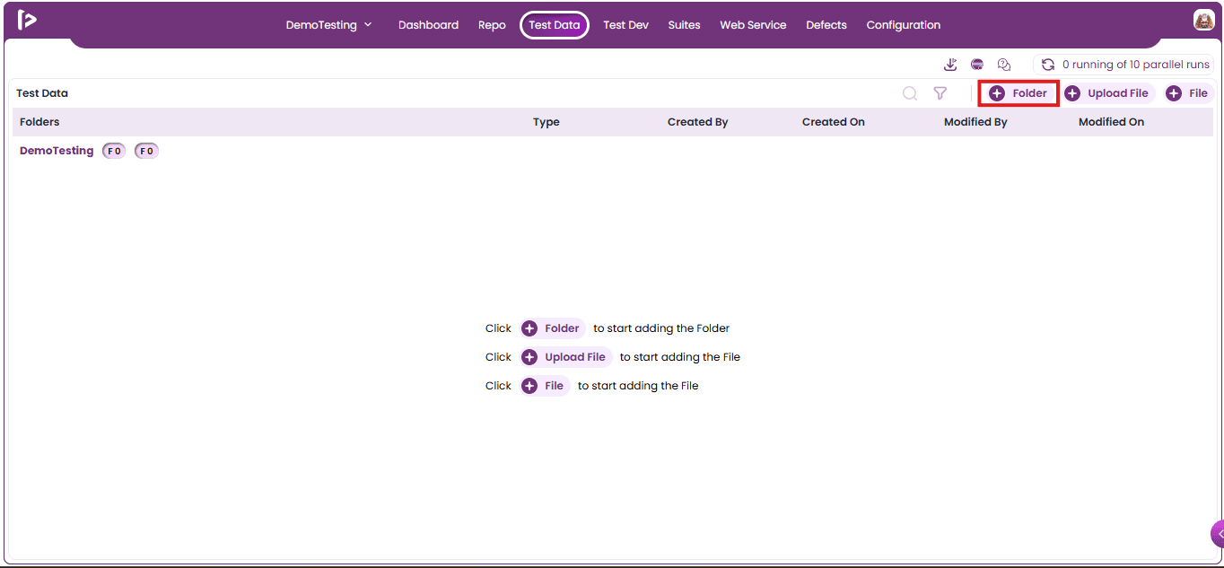
- Click on +Folder button.
- By clicking the +Folder button located in the middle of the page.
Method 1 : Using + Folder Button
- Click on +Folder button as displayed below.
Method 2 : By clicking the ‘+Folder’ button located in the middle of the page.
- By clicking the ‘+Folder’ button located in the middle of the page as displayed below.
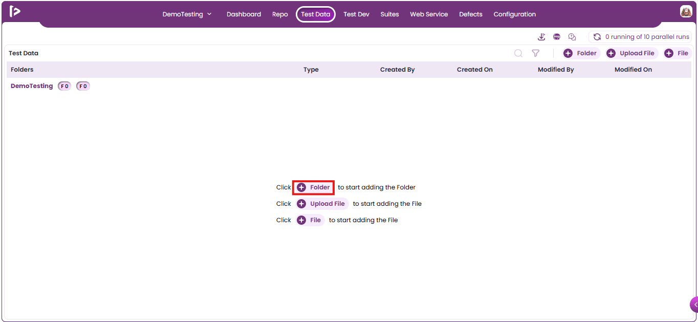
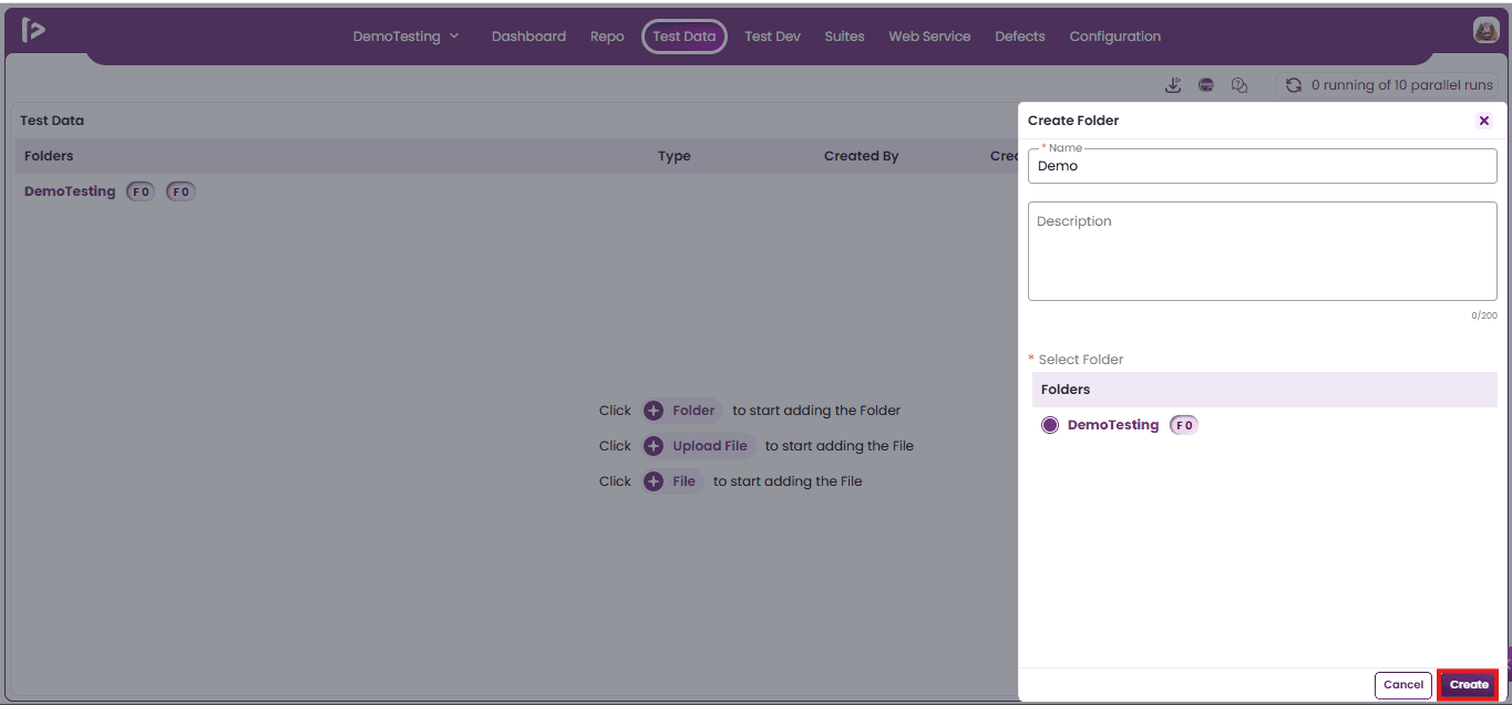
- Create Folder Slider will be displayed
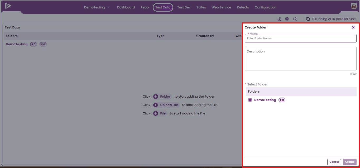
- Fill in the mandatory Name field and, if needed, include a Description in the description section.
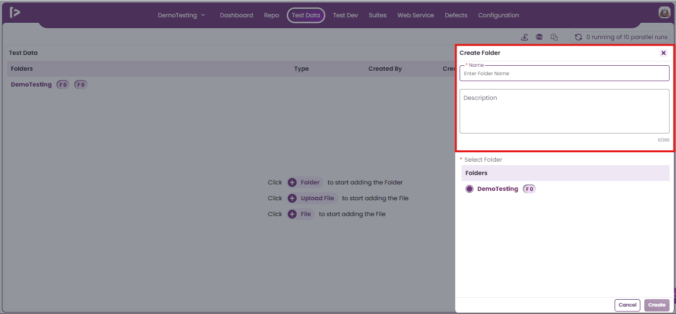
- Select the folder where the user wants to create a new folder.
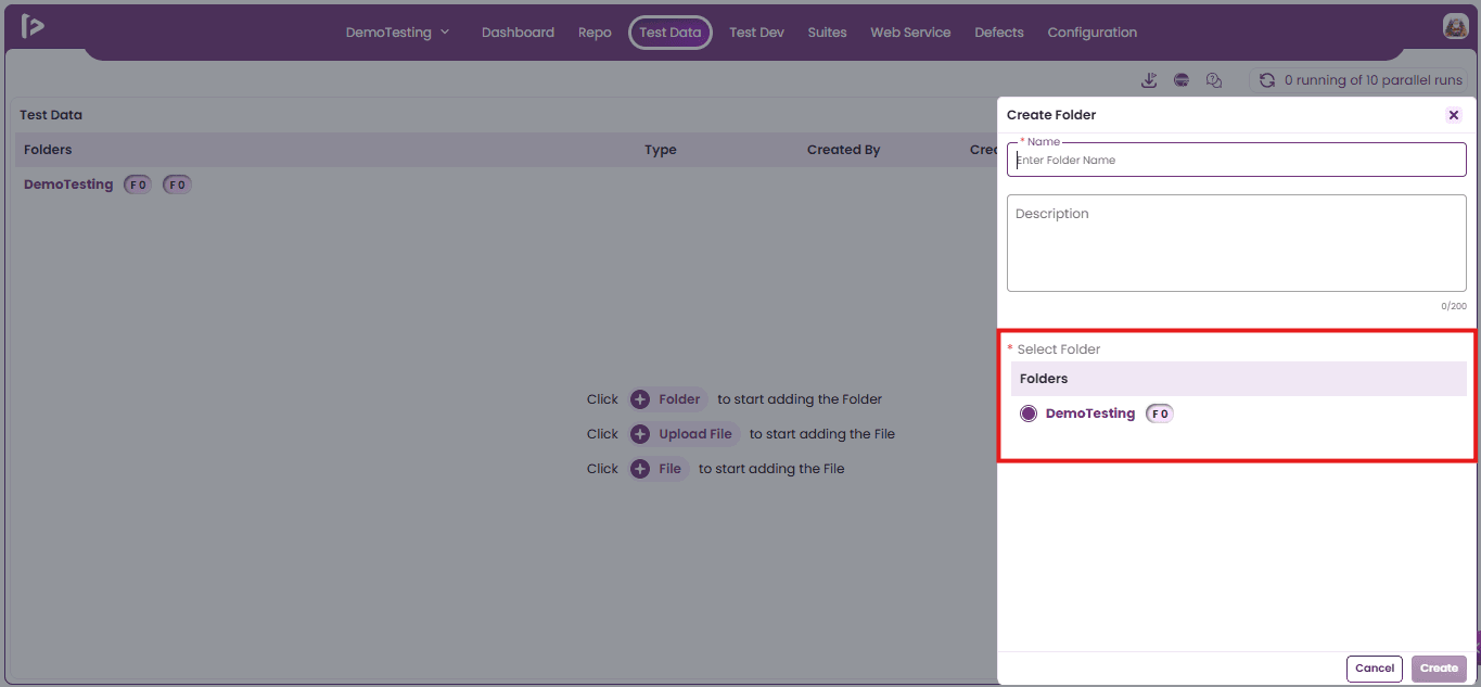
Note : If the user is creating a folder for the first time then the Project Name Folder will be selected as the default folder.
- Click on Create Button.
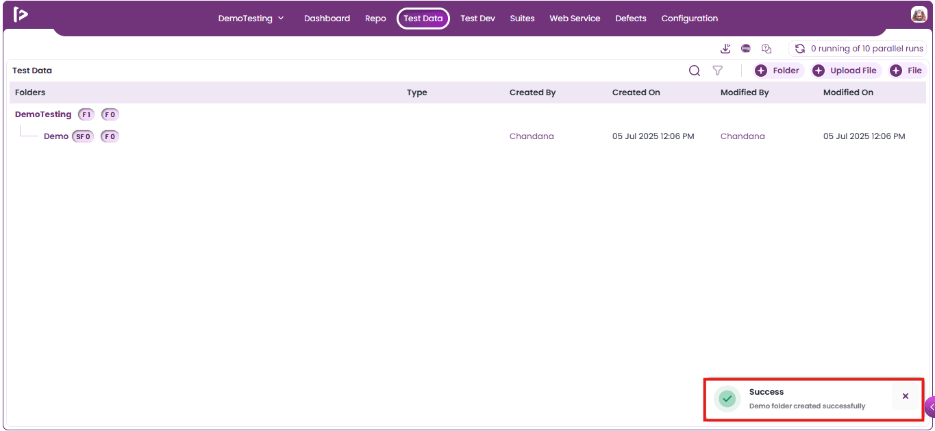
- Folders created successfully message will display.
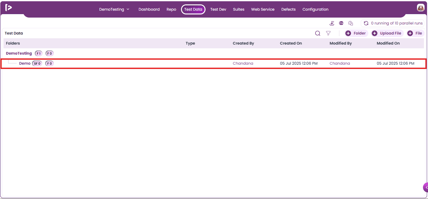
- Folders will be displayed in Test Data.
Introduction to Sub-Folder
- A Sub-Folder is a folder nested within another folder, allowing for hierarchical organization. Users can create multiple Sub-Folders under a single parent folder to enhance structure and maintain modularity.
- Each Sub-Folder can further contain additional folders, files, or scripts, supporting a well-organized and scalable content layout.
Prerequisites
Before creating a Sub-Folder, it is mandatory to first create a Parent Folder.
Steps to Create a Subfolder
There are primarily two methods to add a Sub-Folder within FireFlink.
- Using + Folder Button
- Using ‘+’ icon beside Folder
Method 1: Using + Folder Button
- Click on + Folder button as displayed below.
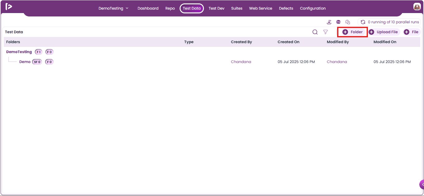
- The Create Folder slider will appear.
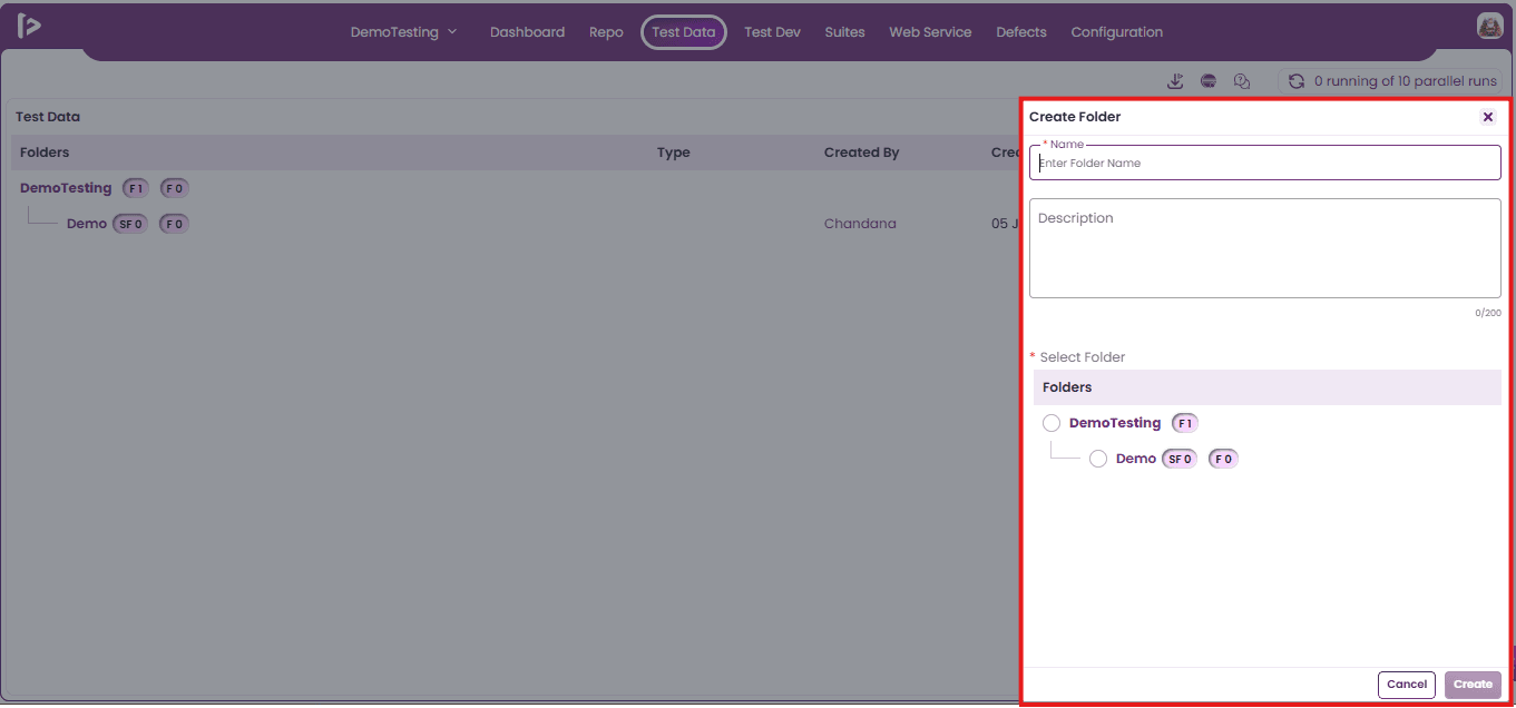
- Fill in the mandatory Name field and, if needed, include a Description for the sub folder
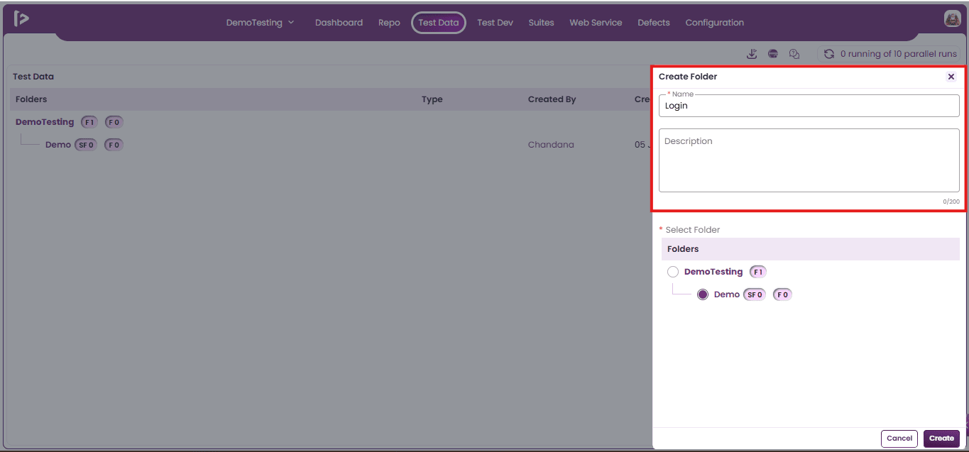
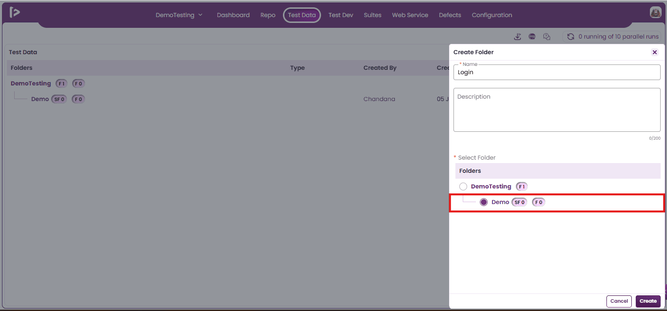
- Select the Parent Folder under which the Sub-Folder will be added.
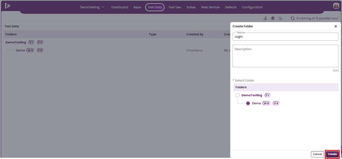
- After selecting the folder, user can click on Create Button
- Successful message will be displayed upon creating a Sub Folder
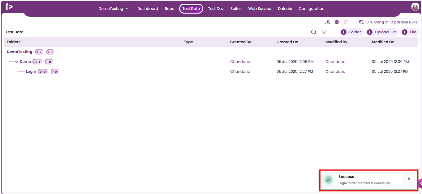
- Once the subfolder is successfully created, it will appear in the Test Data section as shown.
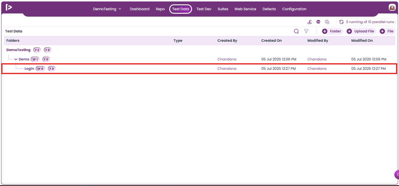
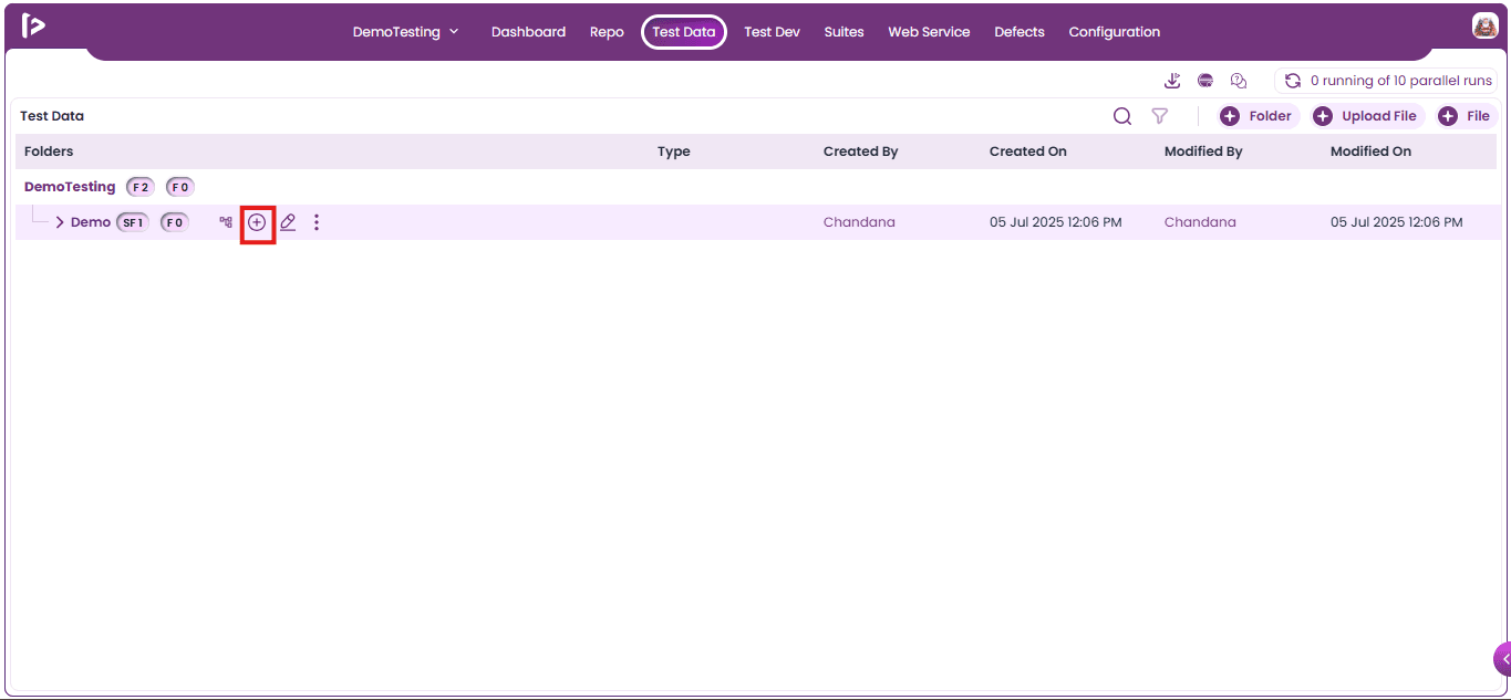
Method 2: Using + icon beside the Folder
- Mouse hover on the + icon for the folder as shown below
- Upon mouse hovering on + icon user can able to see various pointers shown below
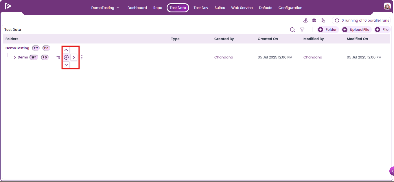
- Click on the Right Arrow Pointer as shown below.
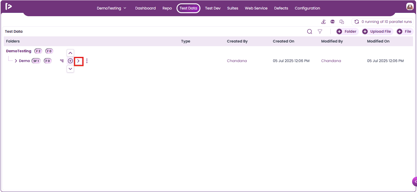
- Multiple options will be displayed after clicking on the right pointer.
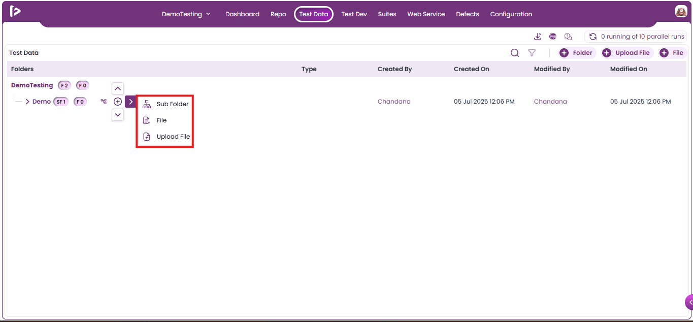
- Click on Sub Folder option as shown below.
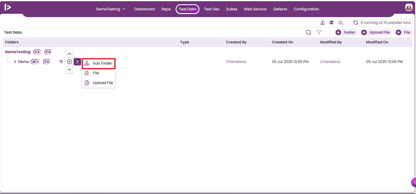
- Sub Folder textfield will appear.
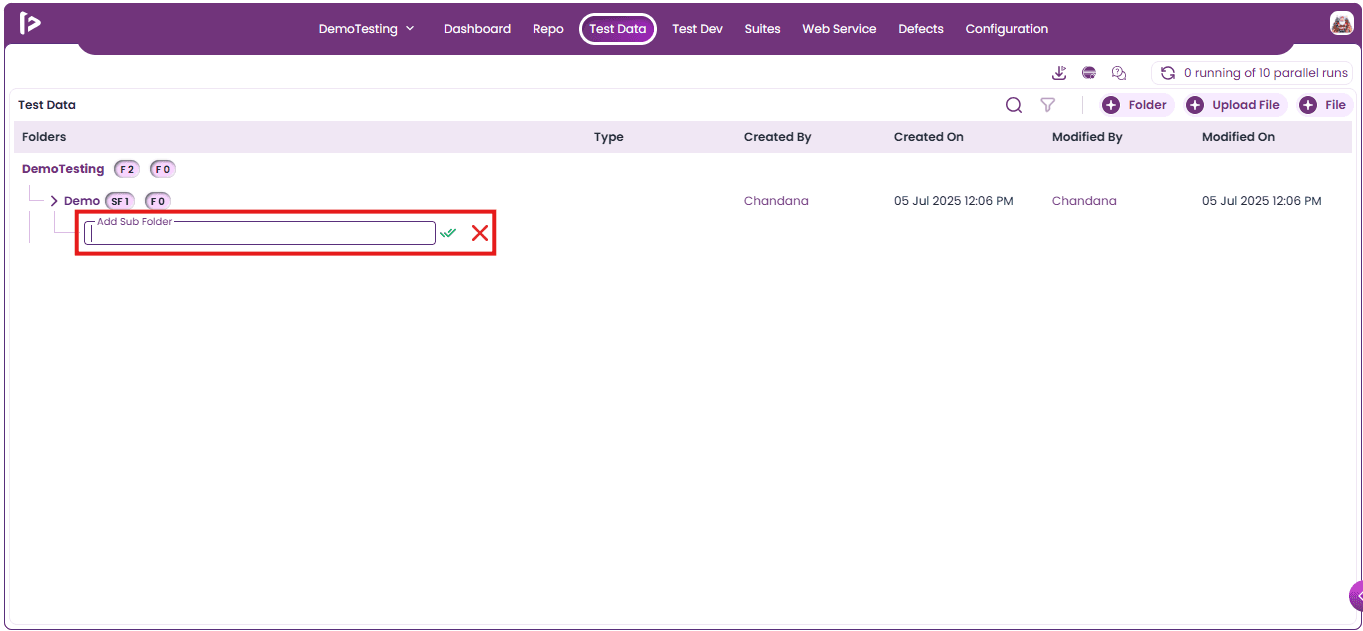
- Enter Sub Folder Name.
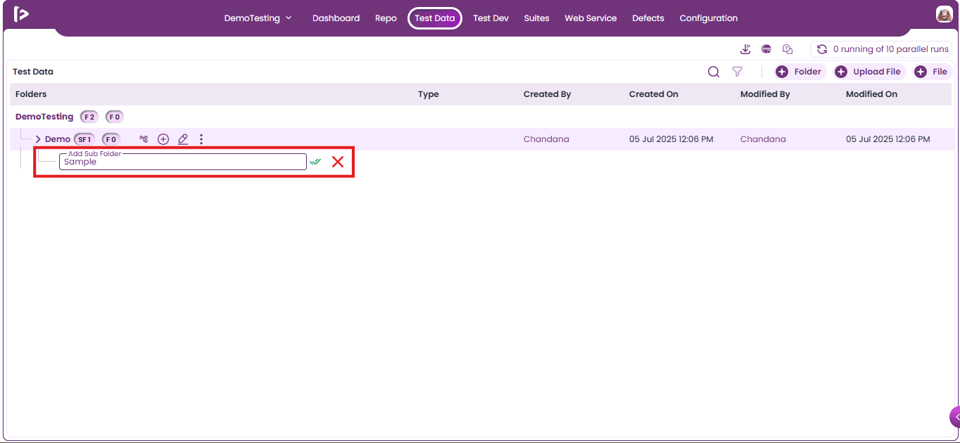
- Click on the Create Button.
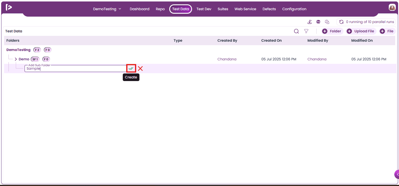
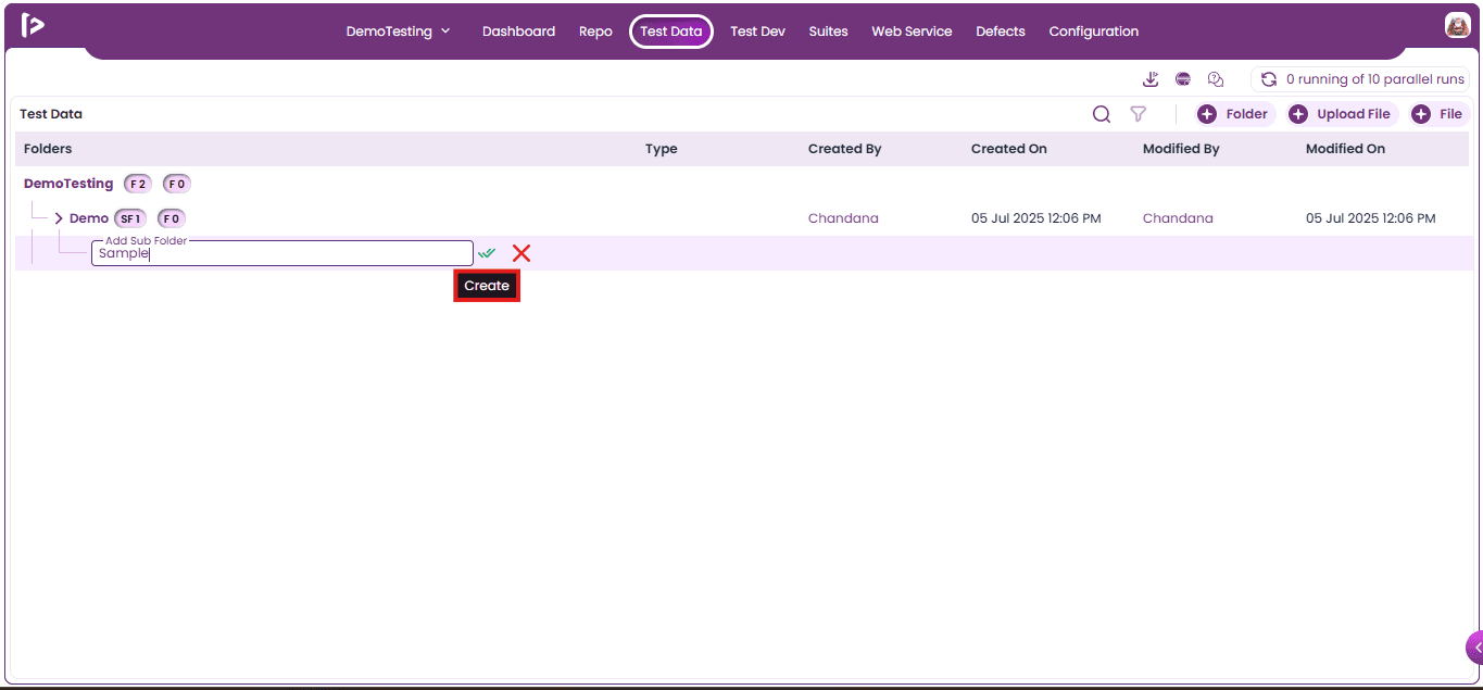
- When user hover the mouse over the tick mark icon, a tooltip labeled "Create" will be displayed.
- Folder created pop-up will appear as shown below.
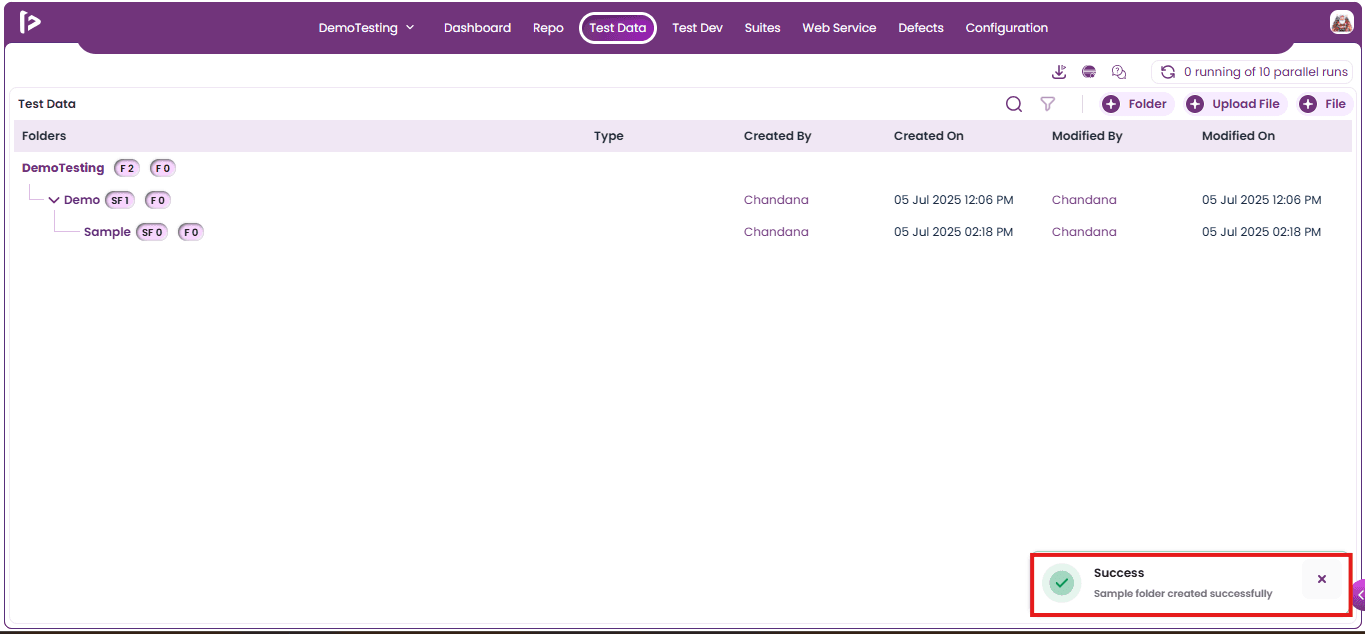
- Subfolders will appear Test Data as shown below.
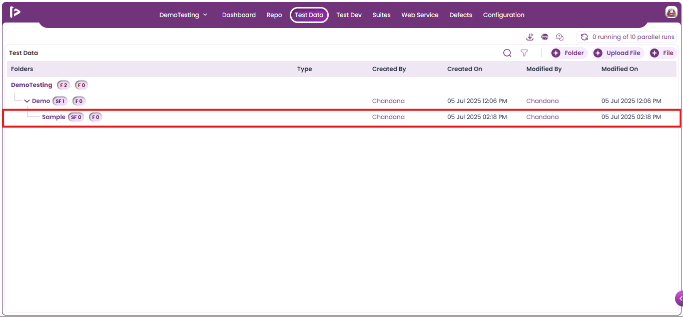
Column Descriptions In Test Data
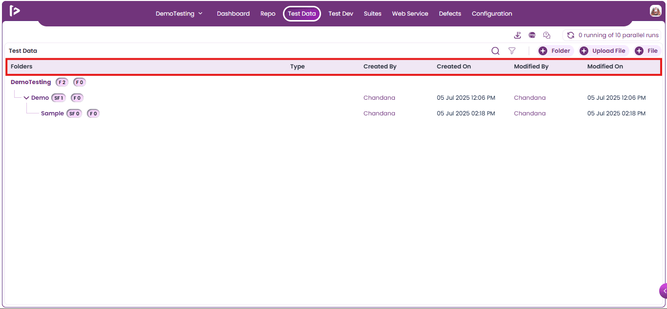
- Folders: This column displays the structure of the FolderTree, including all subfolders and files.
- Type: The Type column, shown only for files, displays the file format of the uploaded item (e.g., xlsx, properties, pdf, XML, JSON, apk, IPA, CSV, mp3, image).
- Created By: This column shows who created the Folder, Sub Folder, and Files.
- Created On: This column shows the creation date and time of the Folder, Sub Folders, and Files.
- Modified By: This column indicates who made the most recent modification to the Folder, Sub Folders, and Files.
- Modified On: This column displays the date and time of the most recent modification to the Folder, Sub Folders, and Files.
Process Of Uploading Files In FireFlink
User can upload files in two ways
- Using +Upload file button
- Using + icon beside folder
Method 1: Using +Upload file Button
- To upload a file, click on the "+Upload File" button, provided in the right corner of the screen as shown below.
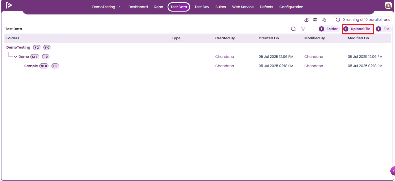
- Upon clicking on the “+Upload File” icon button, the “Upload File” slider will be displayed as shown in the below screen.
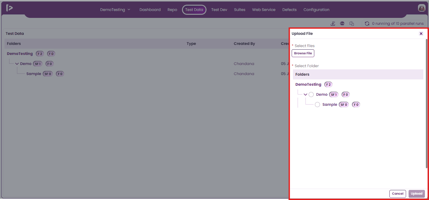
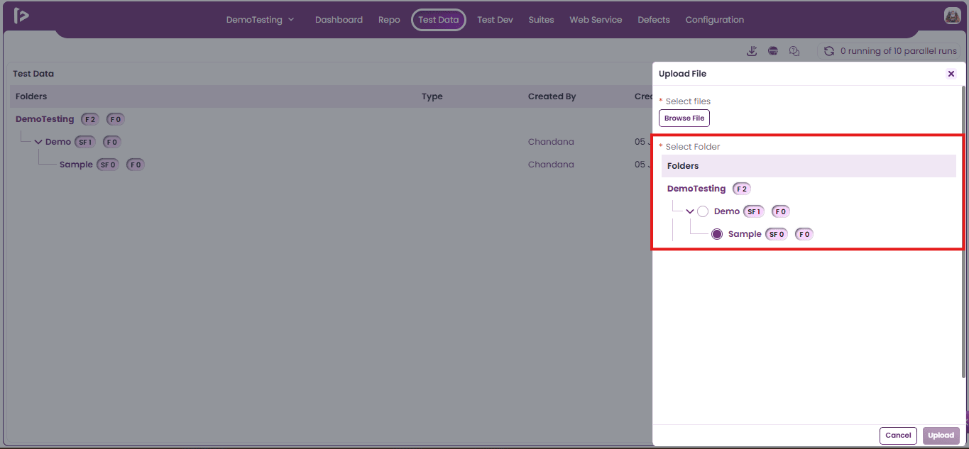
- Select the folder under which user need to upload a file.
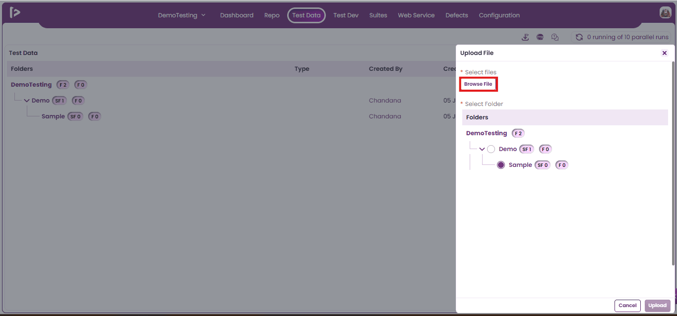
- Click on the "Browse Files" button to open the file selection window.
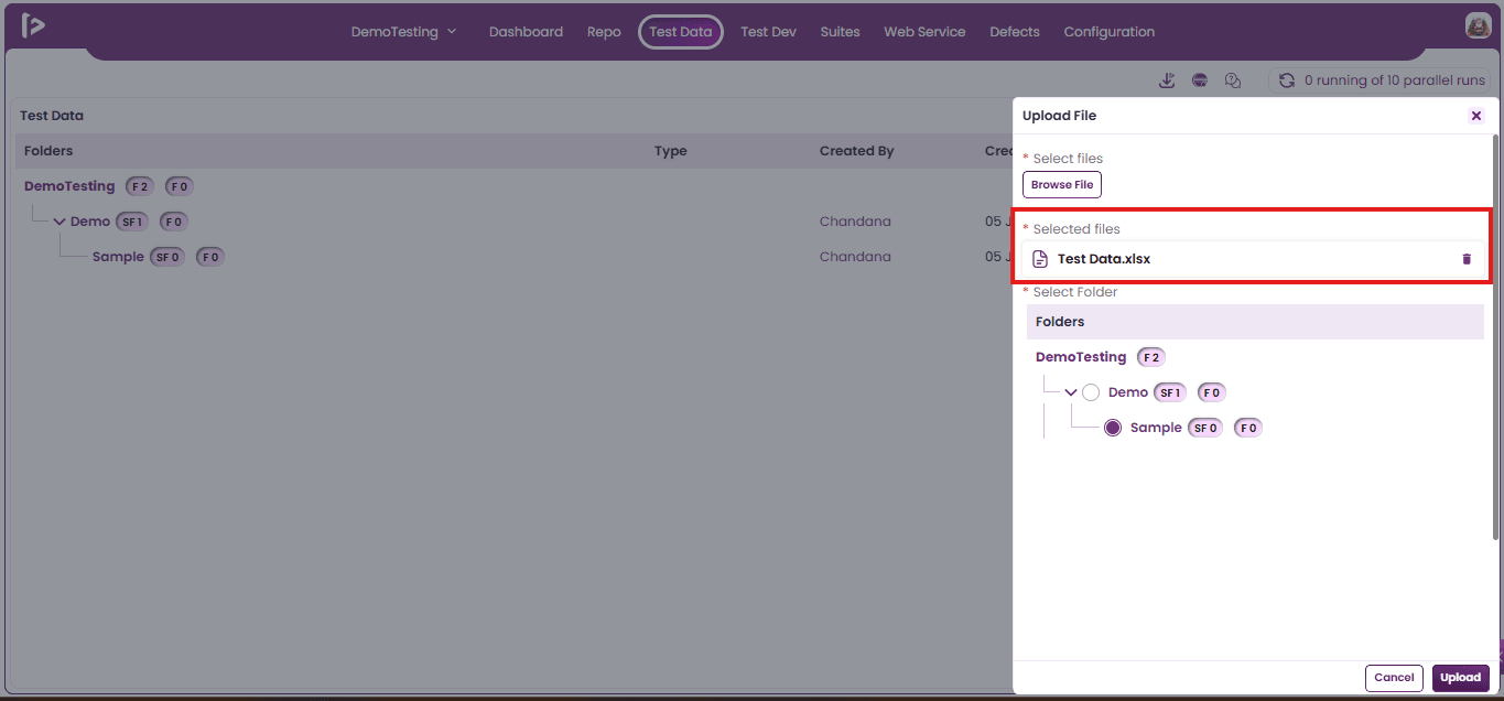
- Select the file(s) user want to upload from the file selection window.
- Note: A user can select and upload up to 5 files at a time.
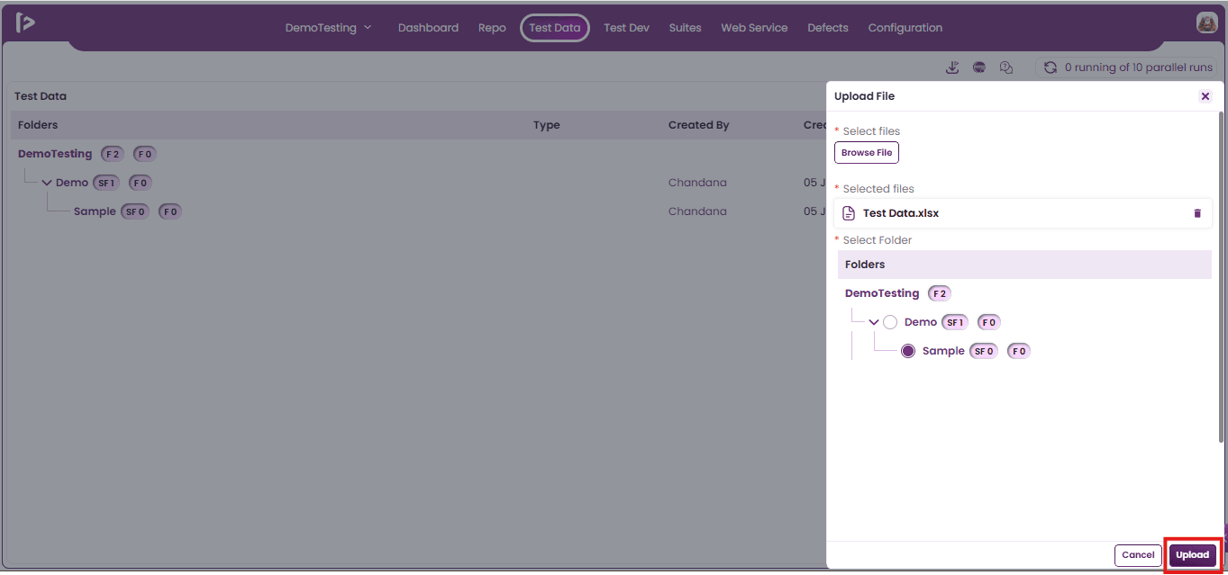
- Click on Upload Button.
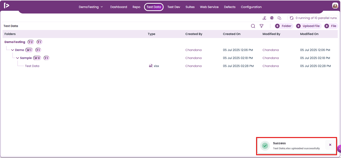
- A successful message will be displayed upon adding the file.
Method 2: Using + icon beside folder
- Mouse hover on the + icon for the folder in which user wants to add file as shown below
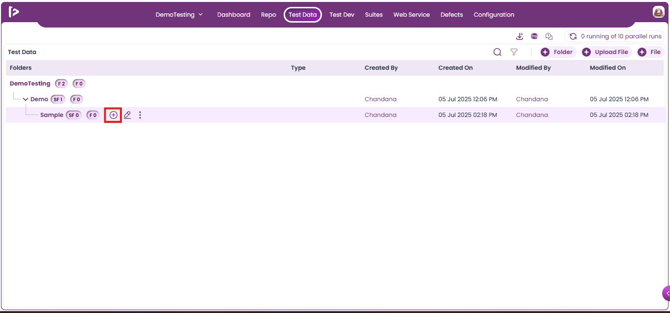
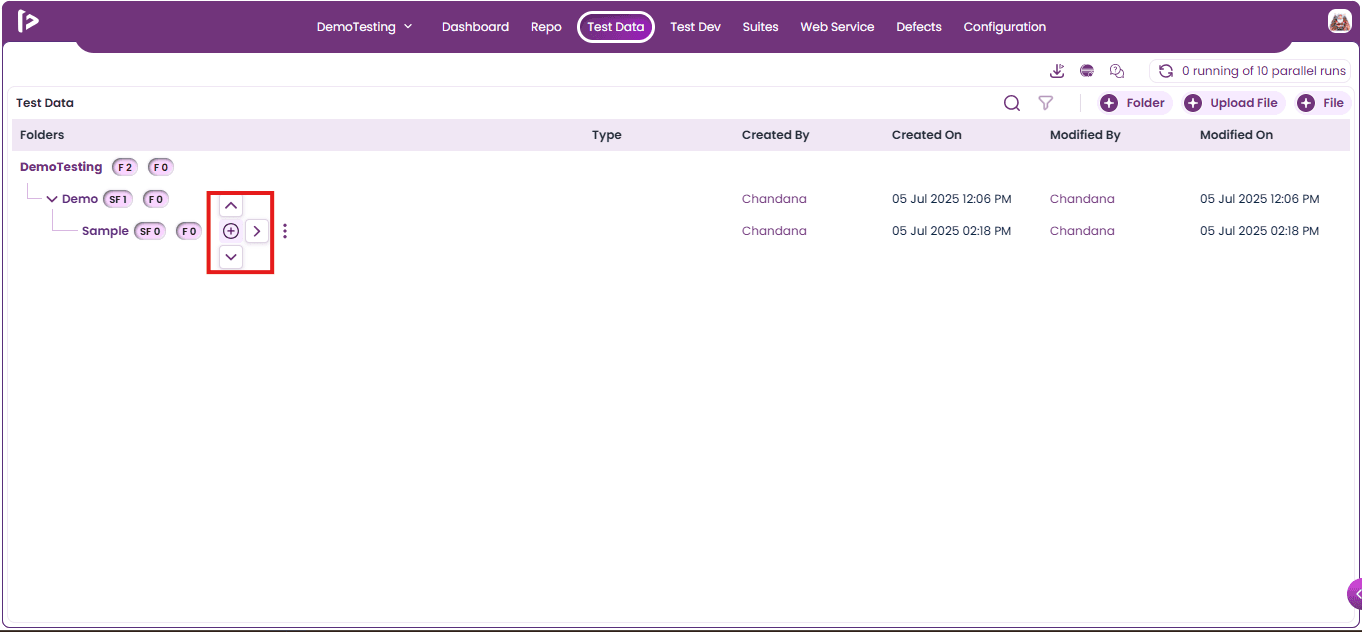
- Upon mouse hovering on + icon user can able to see various pointers shown below
- Click on right pointer, upon clicking options will be displayed as shown below
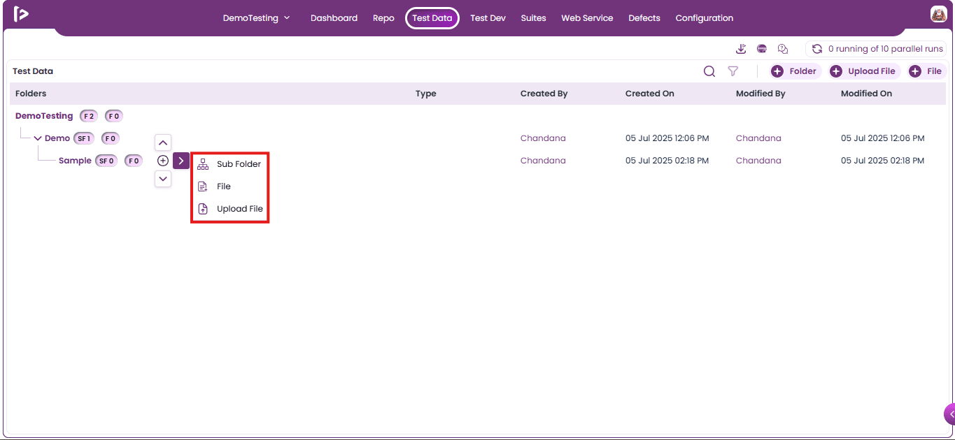
- Click on the Upload file option as displayed below
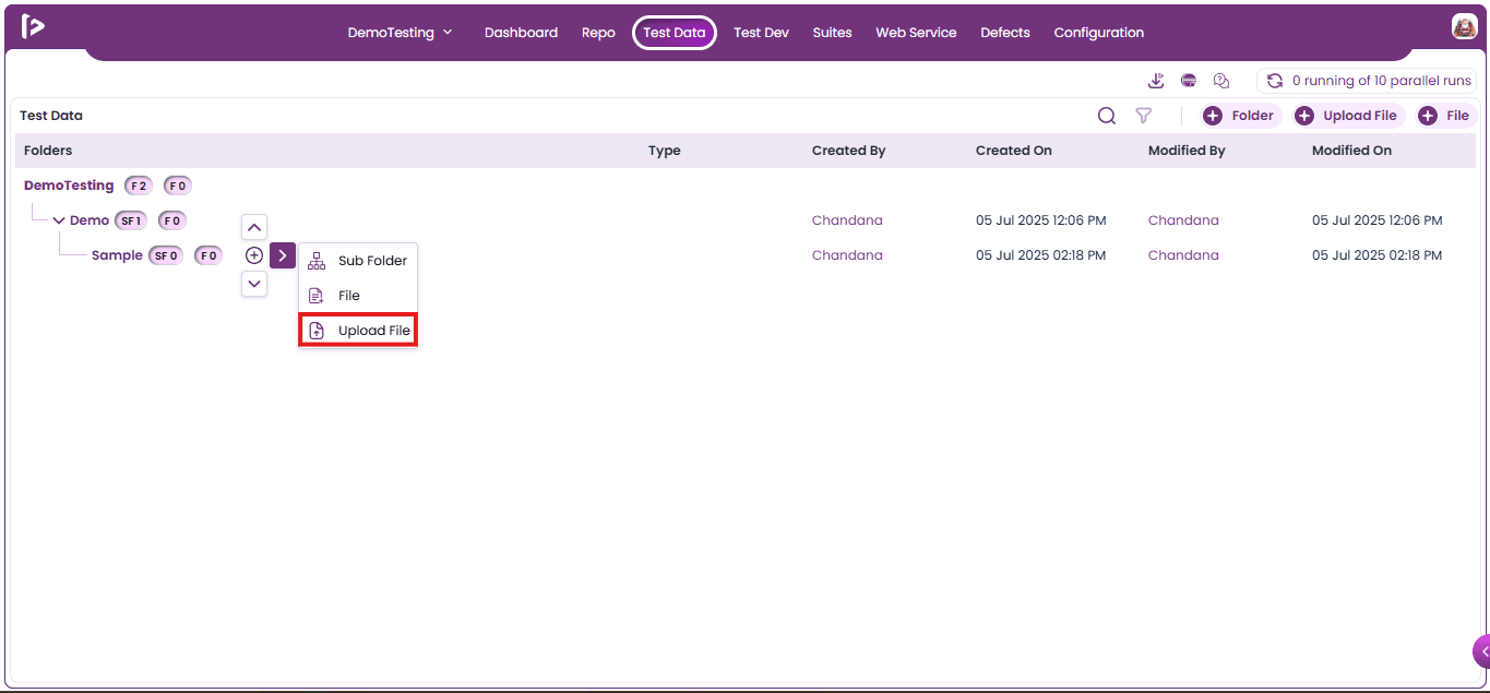
- Upon clicking on the “Upload File” icon button, the “Upload File” slider will be displayed as shown in the below screen.
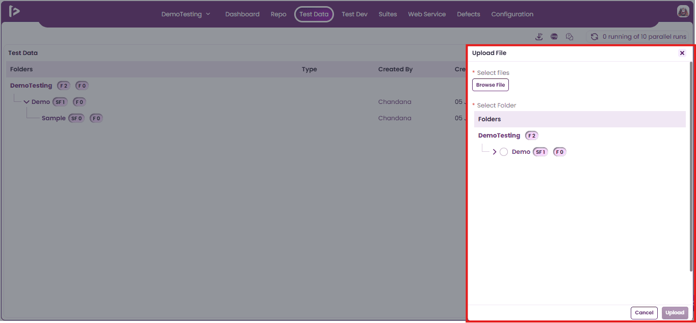
- The folder will be selected by default under which the user wants to upload the file..
- Click on the "Browse Files" button to open the file selection window.
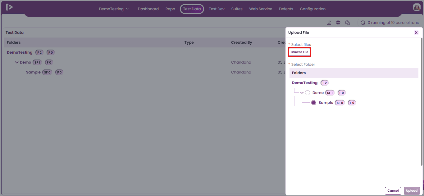
- Select the file(s) user want to upload from the file selection window.
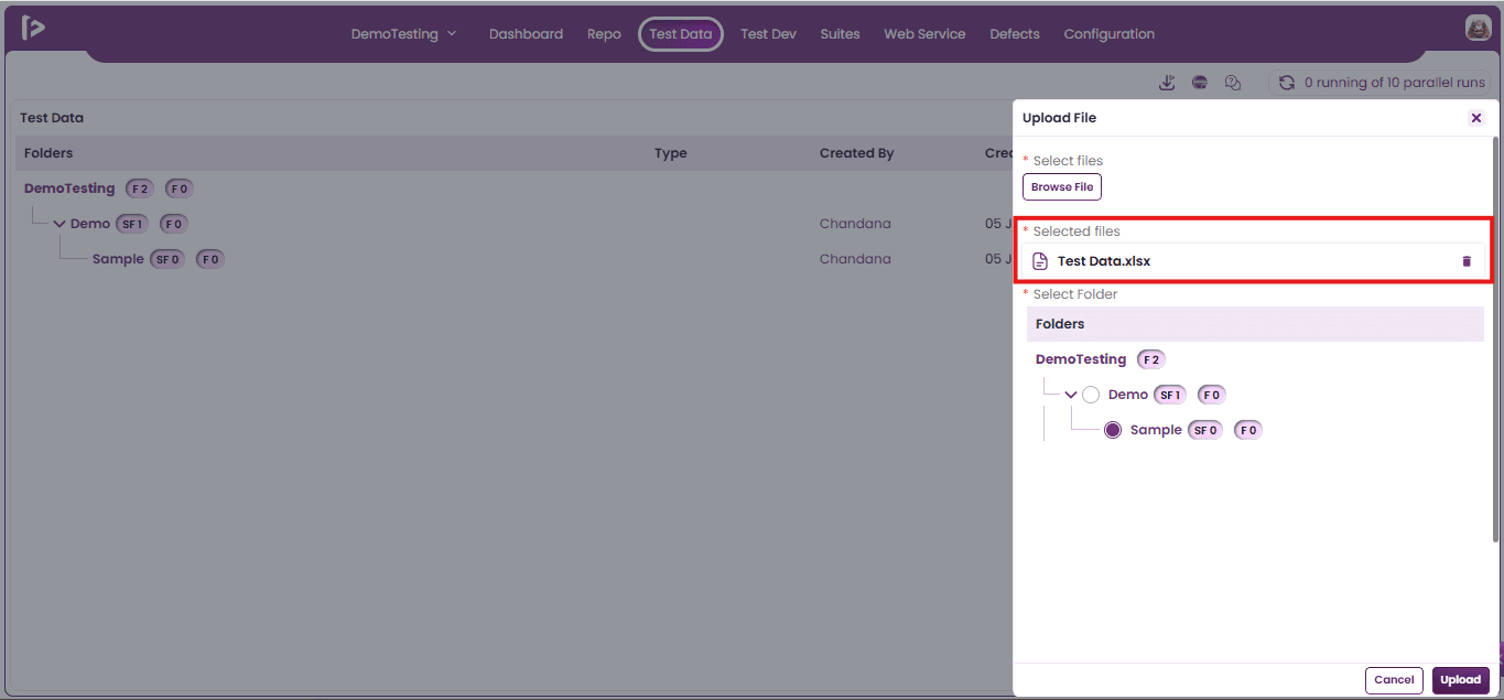
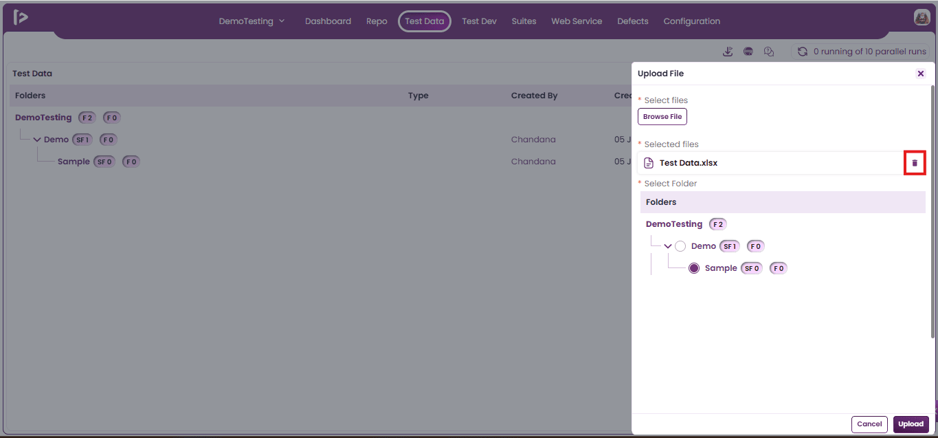
Note: Users can delete any incorrectly selected file, as demonstrated below.
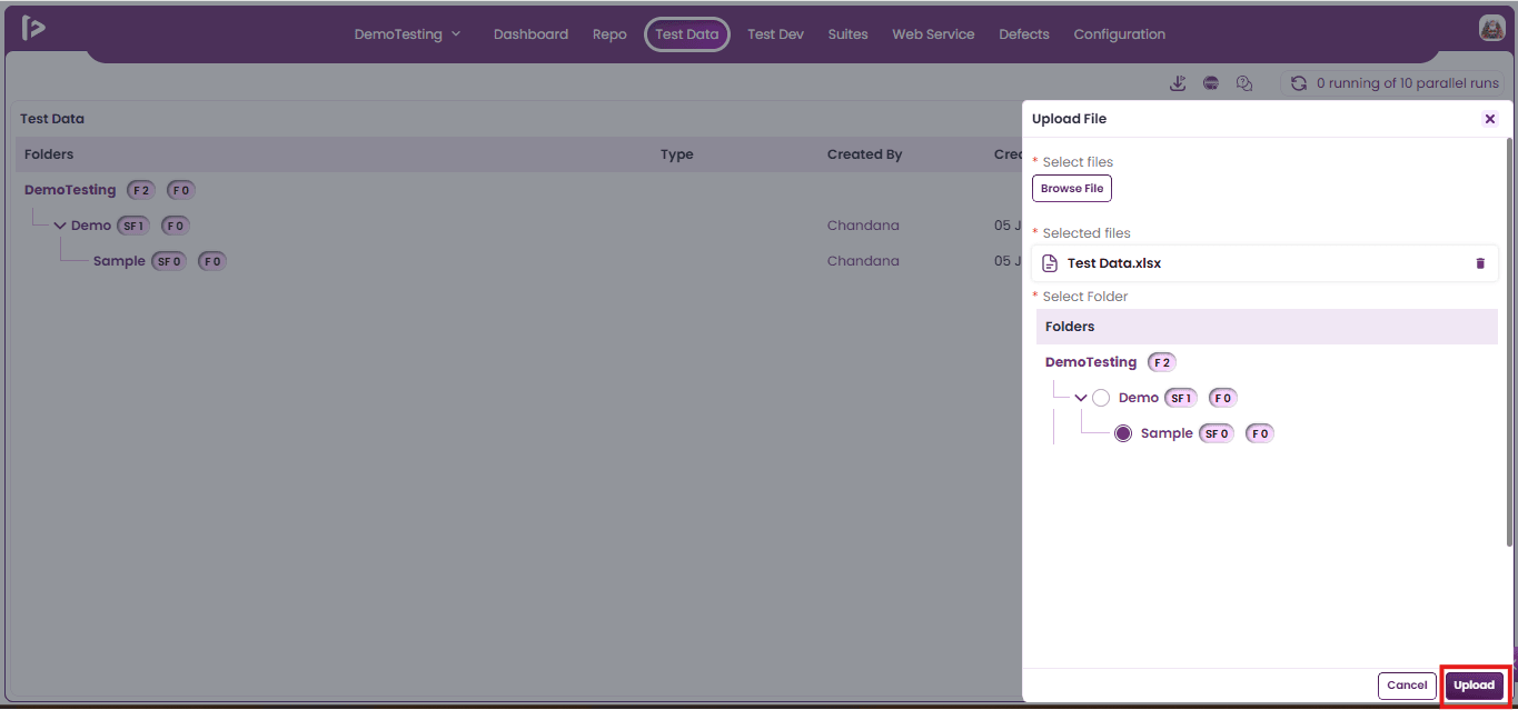
- Click on Upload Button.
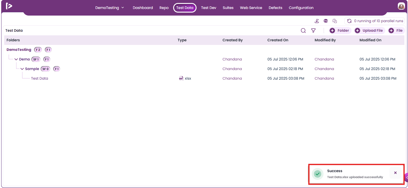
- A successful message will be displayed upon adding the file.
Process to create a File
User can create files in two ways
- Using +File button
- Using + icon beside folder
Method 1: Using +File button
- Upon clicking on +File button
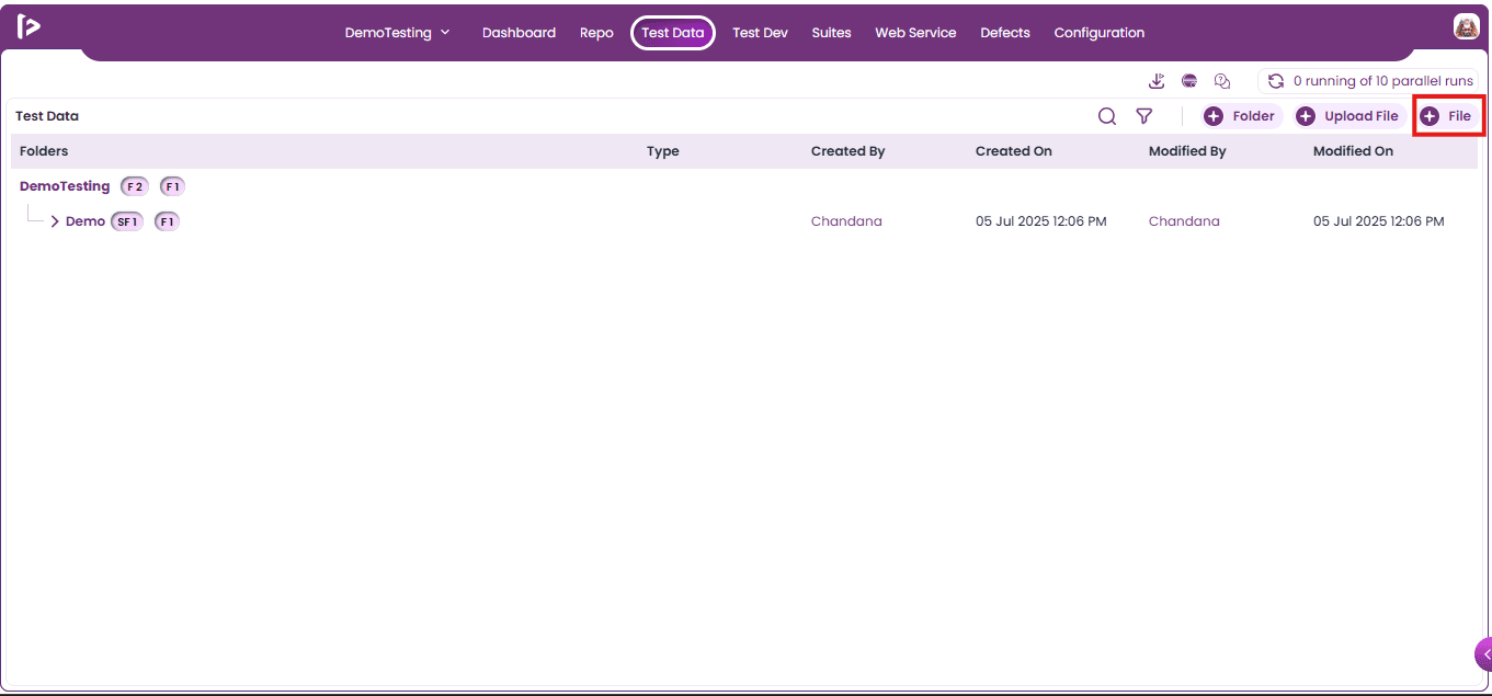
- Upon clicking on +File button create file slider will appear as shown below
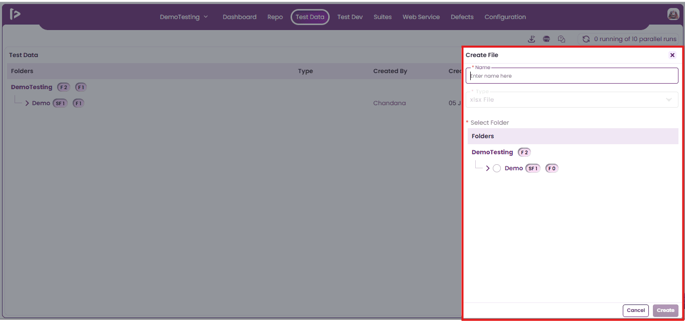
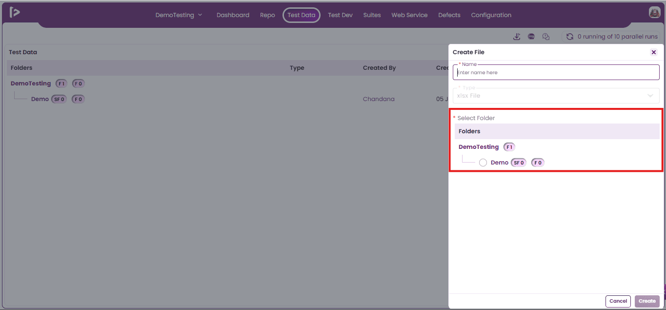
- Select the folder under which file has to be created.
- Enter the file name.
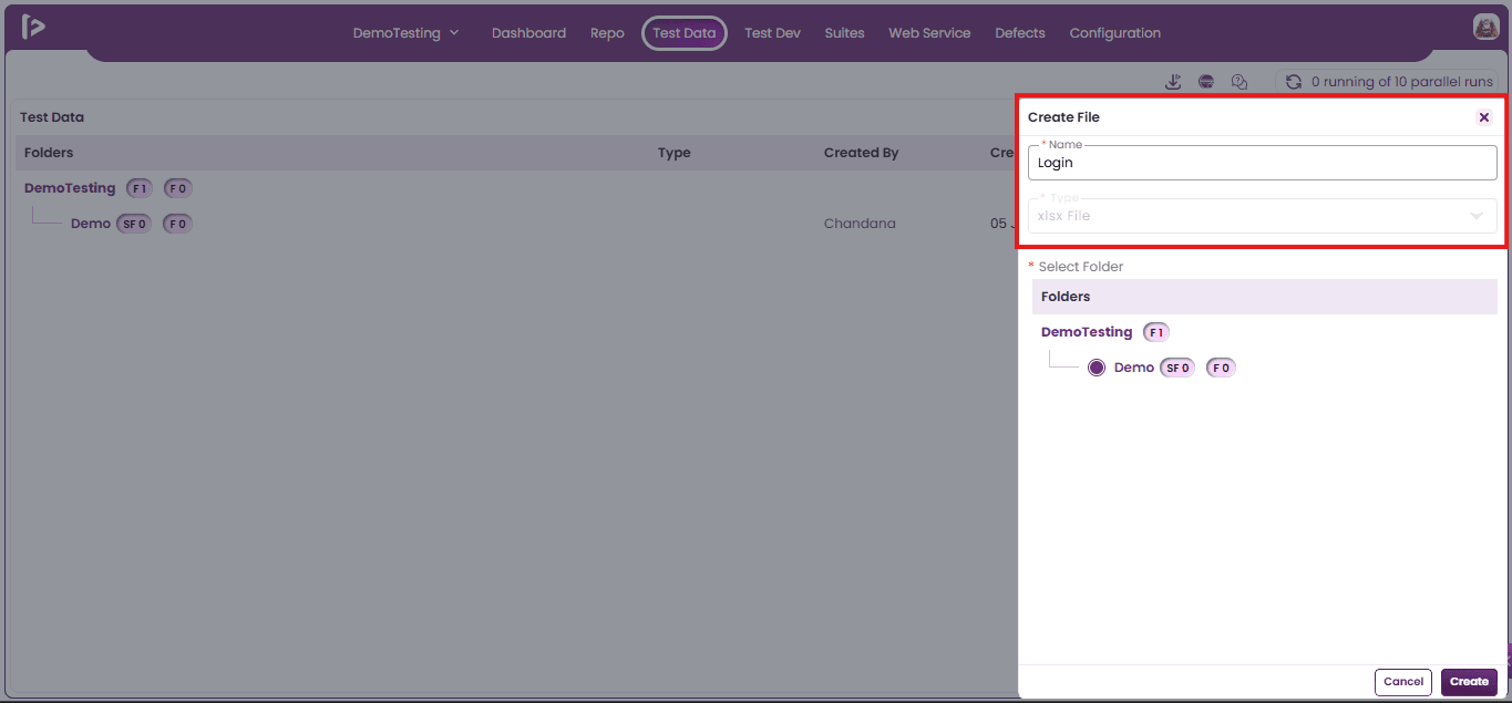
Note: Default file type will be .xlsx.
- Click on the create button.
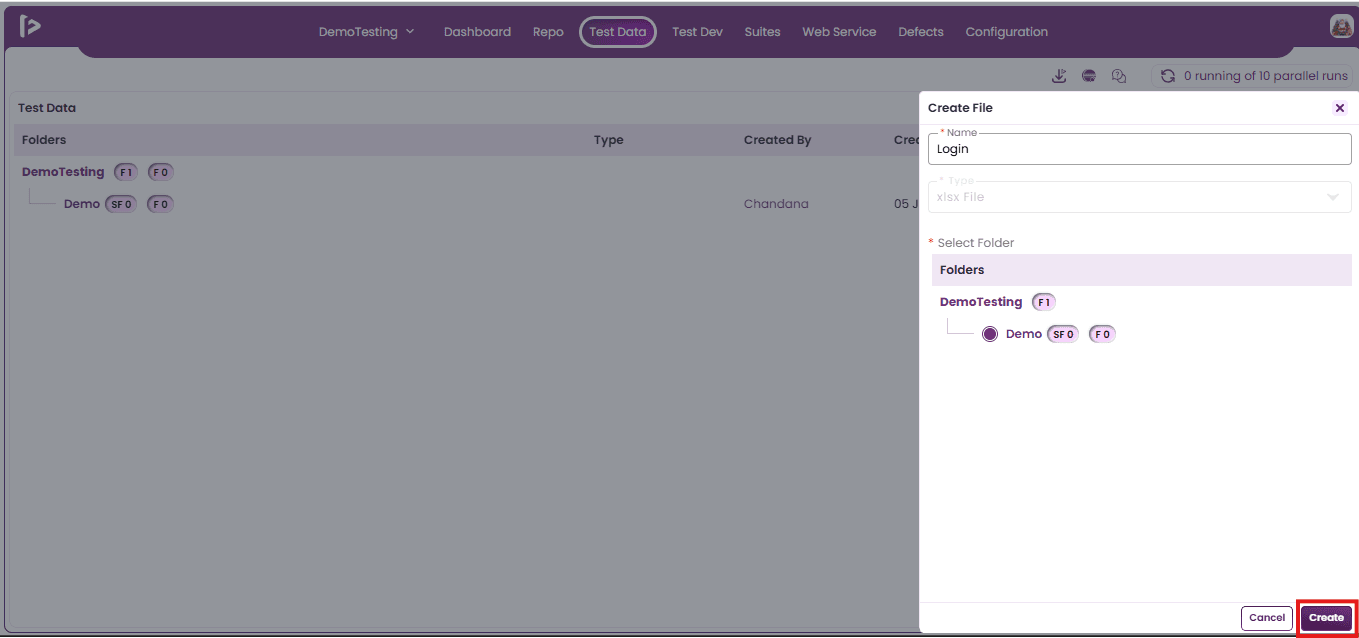
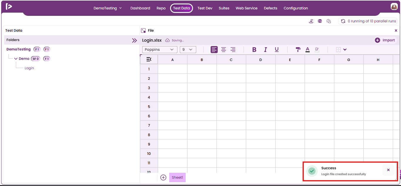
- A successful message will be displayed upon clicking on the create button.
- Note: The data added within the Excel File will be automatically saved.
Method 2 : Using + icon beside folder
- Mouse hover on the + icon for the folder in which user wants to add file as shown below
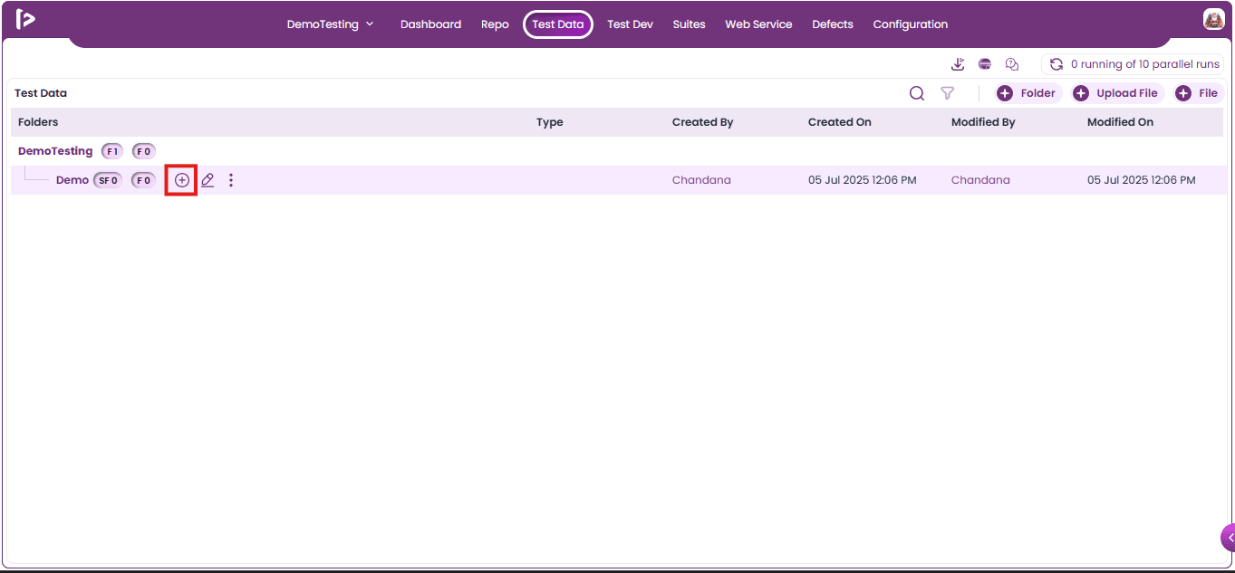
- Upon mouse hovering on + icon user can able to see various pointers shown below
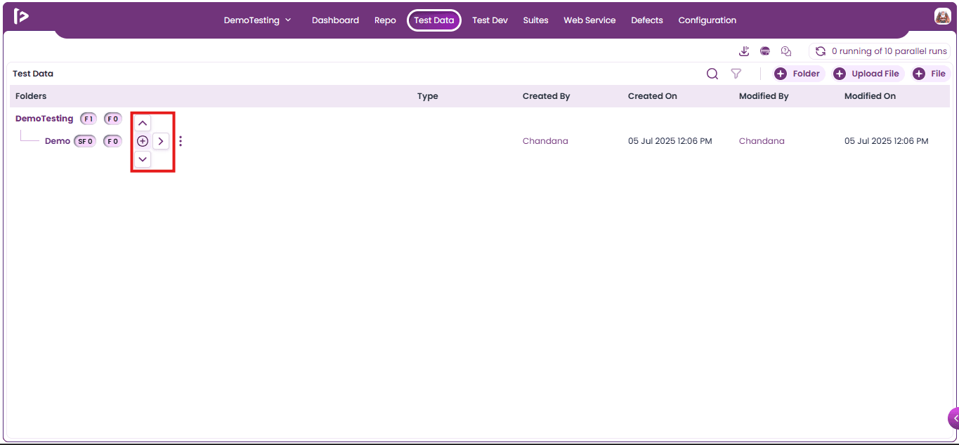
- Click on Right Arrow pointer, upon clicking options will be displayed as shown below
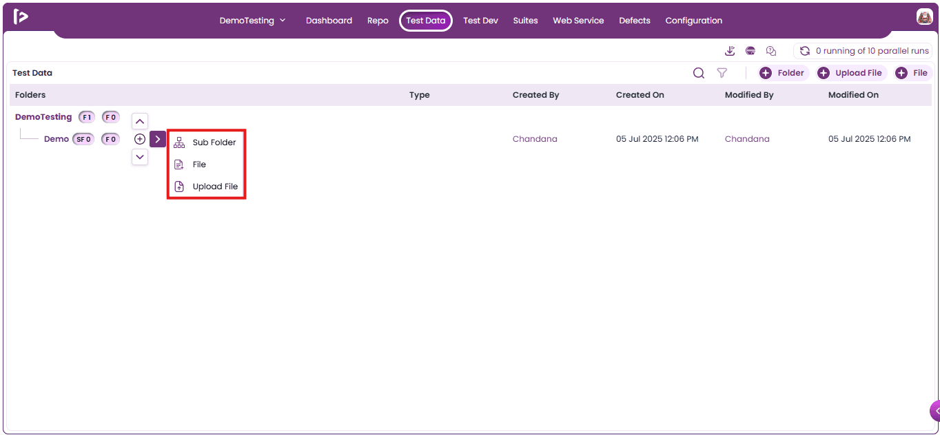
- Click on the file option as displayed below
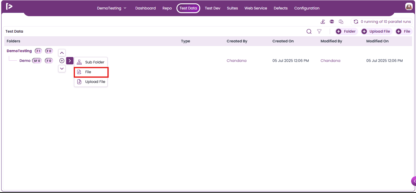
- Upon clicking on file option add file text field will appear as shown below.
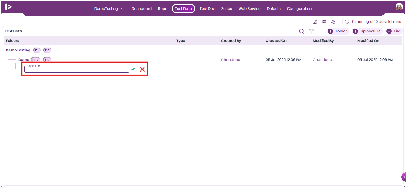
- Enter the file Name and click on create option.
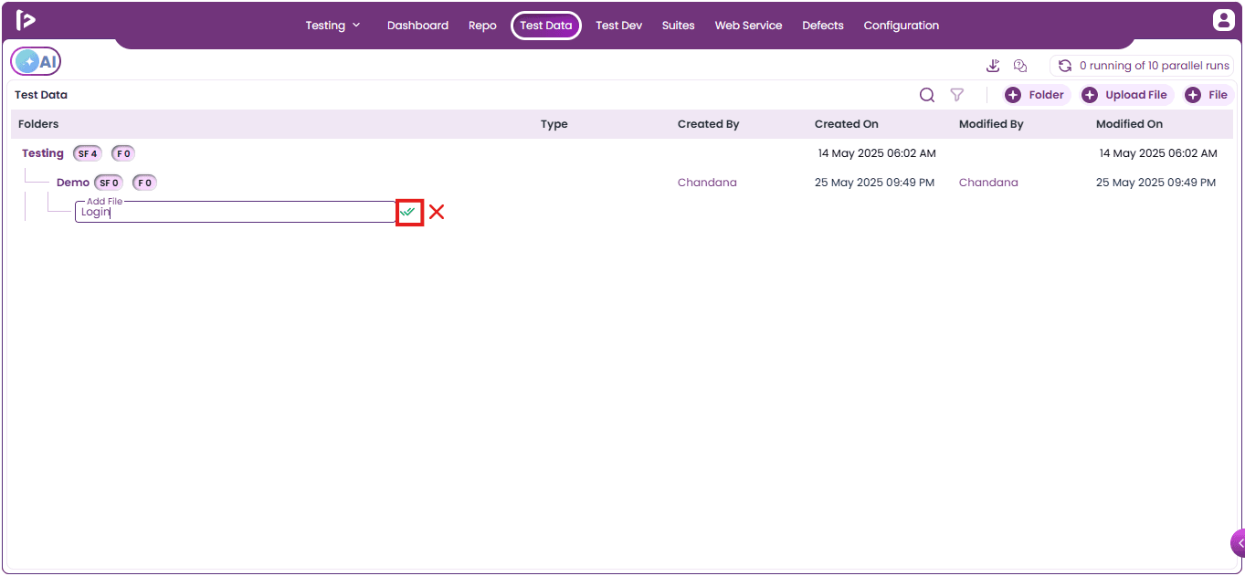
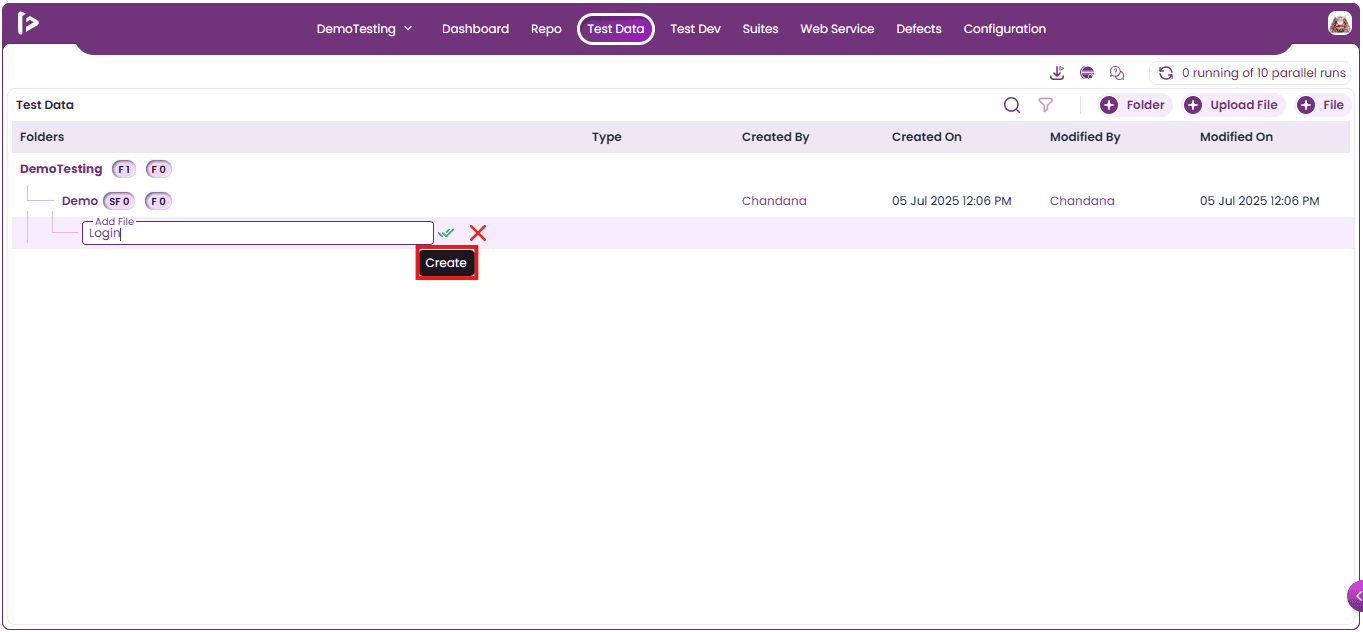
- Upon mouse hovering on tick mark it will display tooltip as shown below.
- A successful message will be displayed upon adding the file.
Note: Users are able to create only Excel related files.
Addition Features for a Project Folder
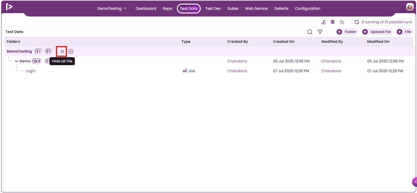
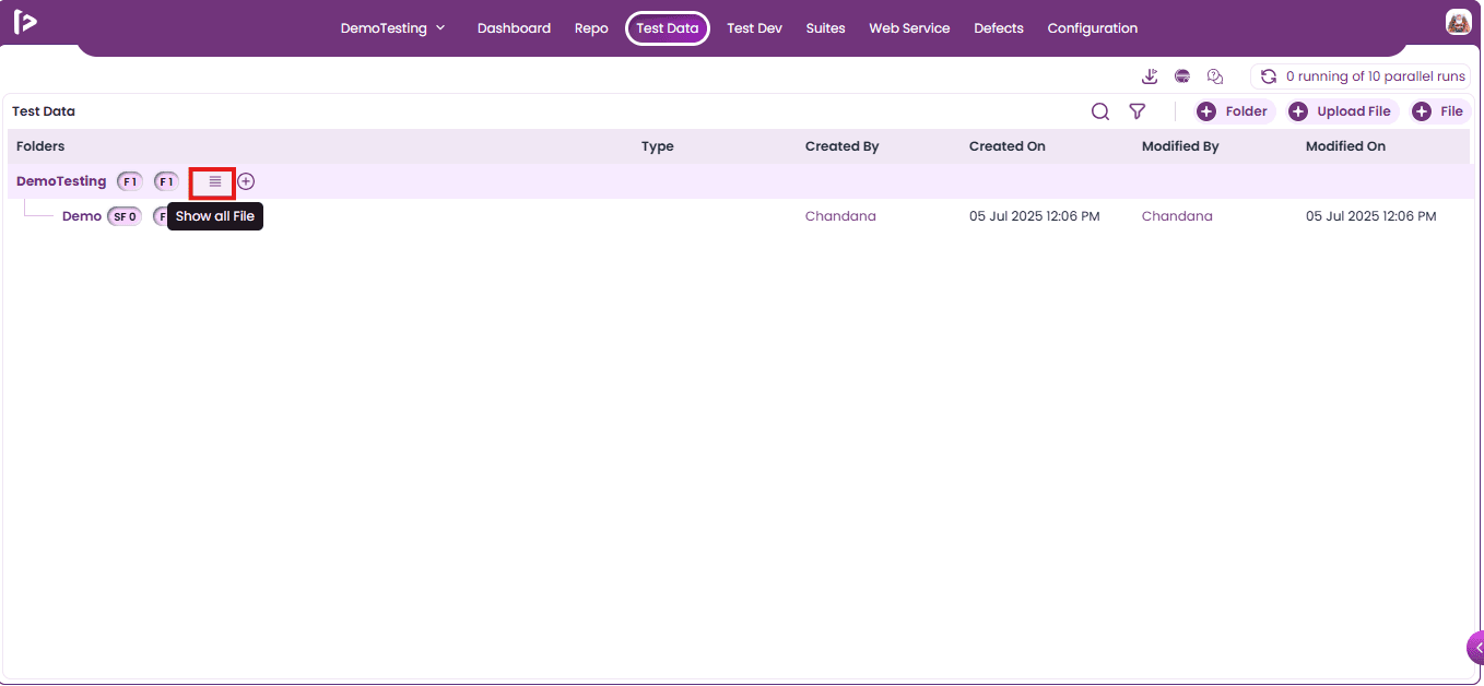
Hide All Files / Show All Files:
- Hide All Files: Upon clicking on this feature it collapses or hides the files list to reduce on-screen clutter and provide a cleaner workspace, especially useful when working with large sets of files.
- Show All Files: Upon clicking on this feature it expands and displays all files, making it easier to review, navigate, or select specific files for further actions.
Add Icon : It consists of other features which are present inside Right Arrow Pointer.
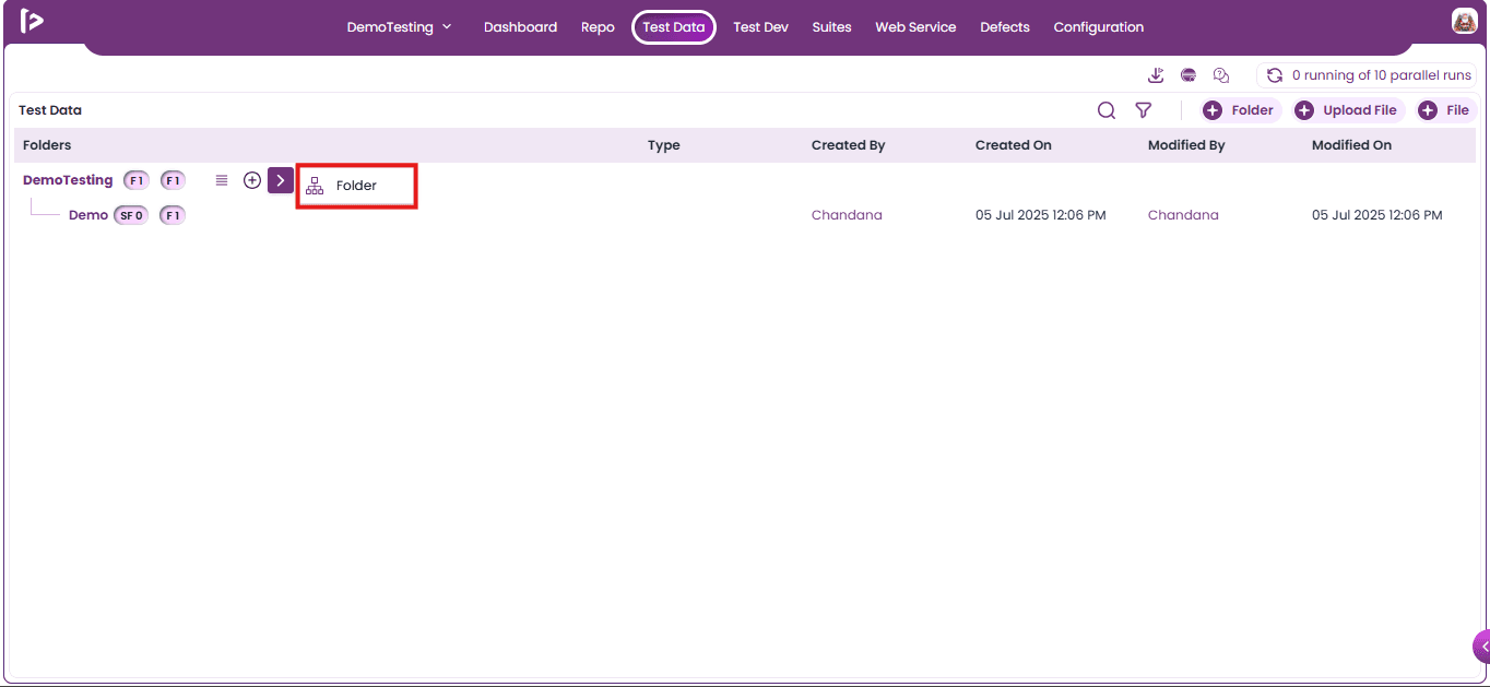
- Folder: This feature enables the addition of folders to the project.
Additional Features For Folder and Sub Folder
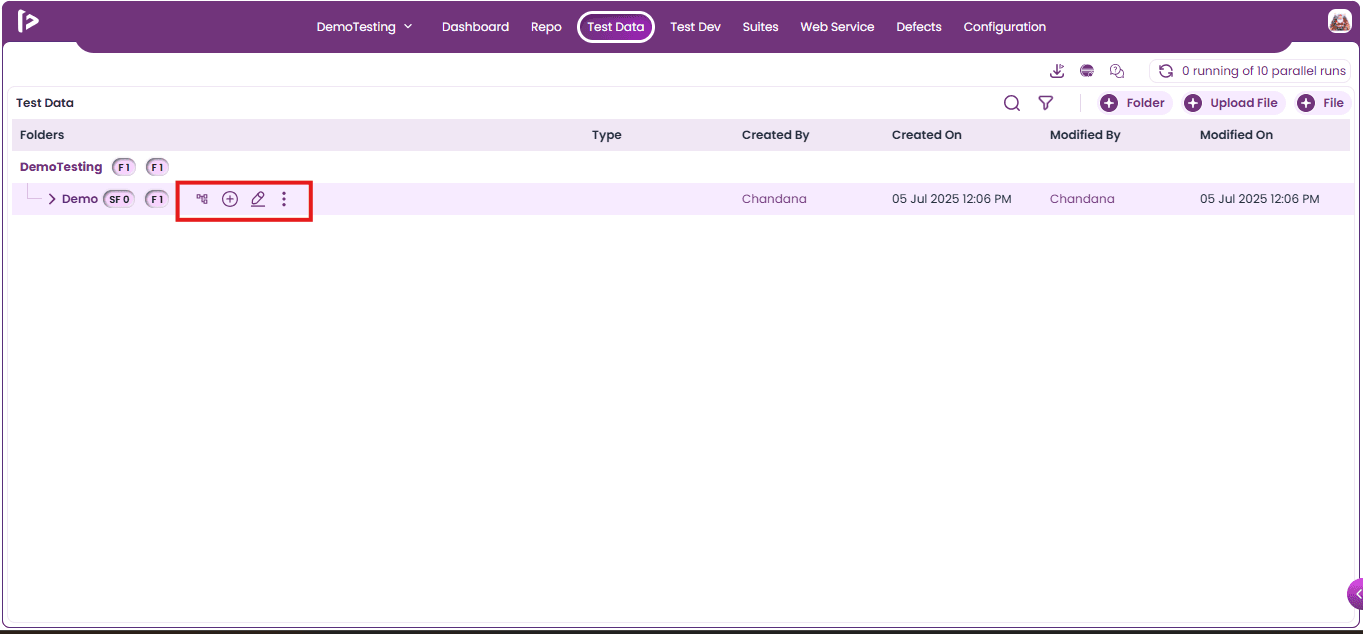
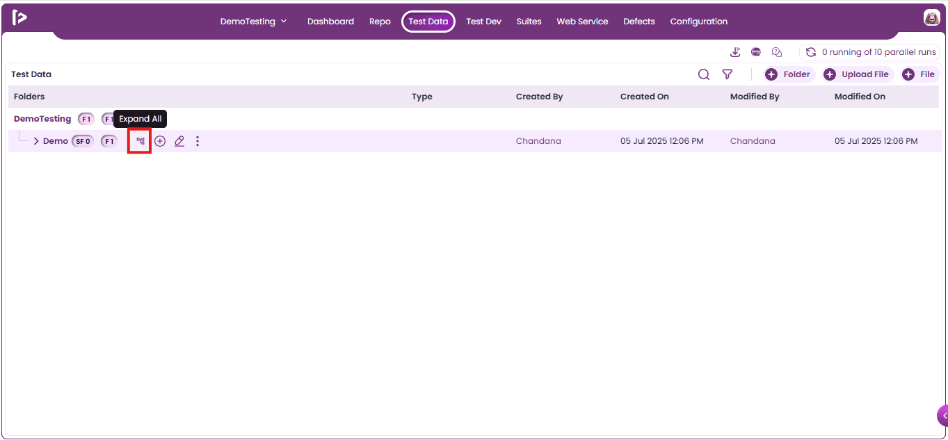
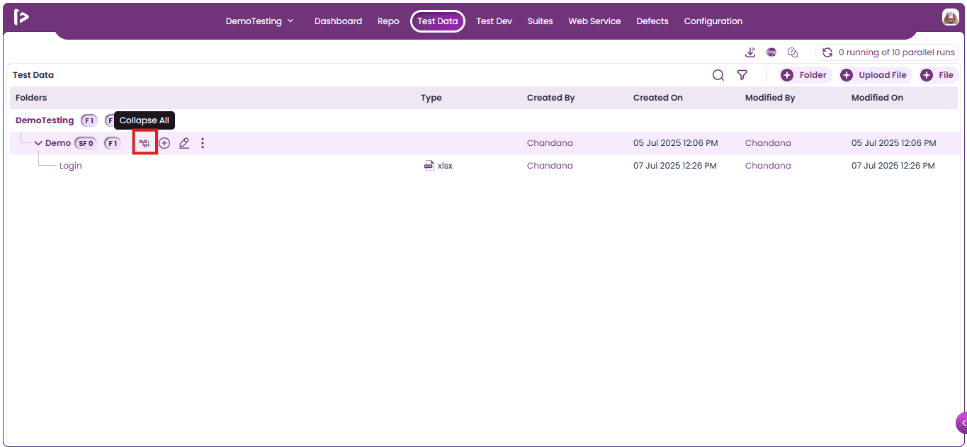
Expand all / Collapse all : This feature will be enabled only when there are files present inside that folder or sub folder.
- Expand All: Upon clicking on it displays all files along with their associated sub-files, providing a complete view of the project structure along with the files. This is especially useful for reviewing or navigating complex module trees.
- Collapse All: Upon clicking on it hides all sub-folders under their parent folder, giving a cleaner and more focused view. This helps reduce visual clutter and simplifies navigation when working with large projects.
Add Icon: This comprises of three Arrow Pointer in different direction as displayed
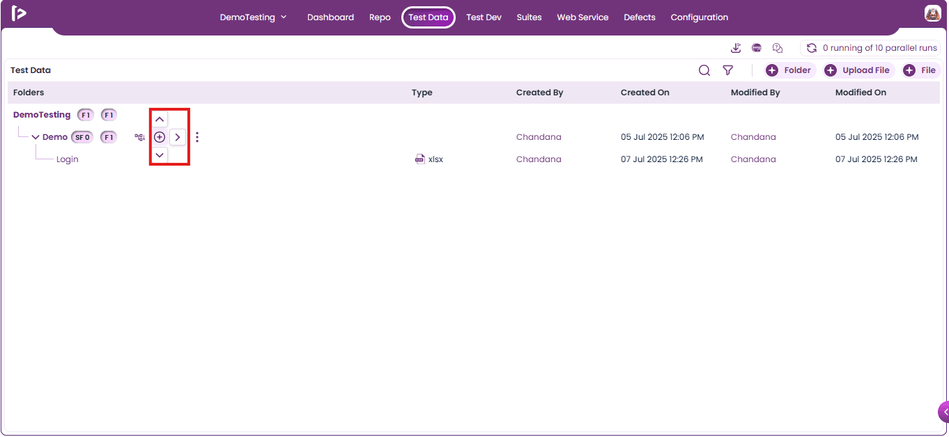
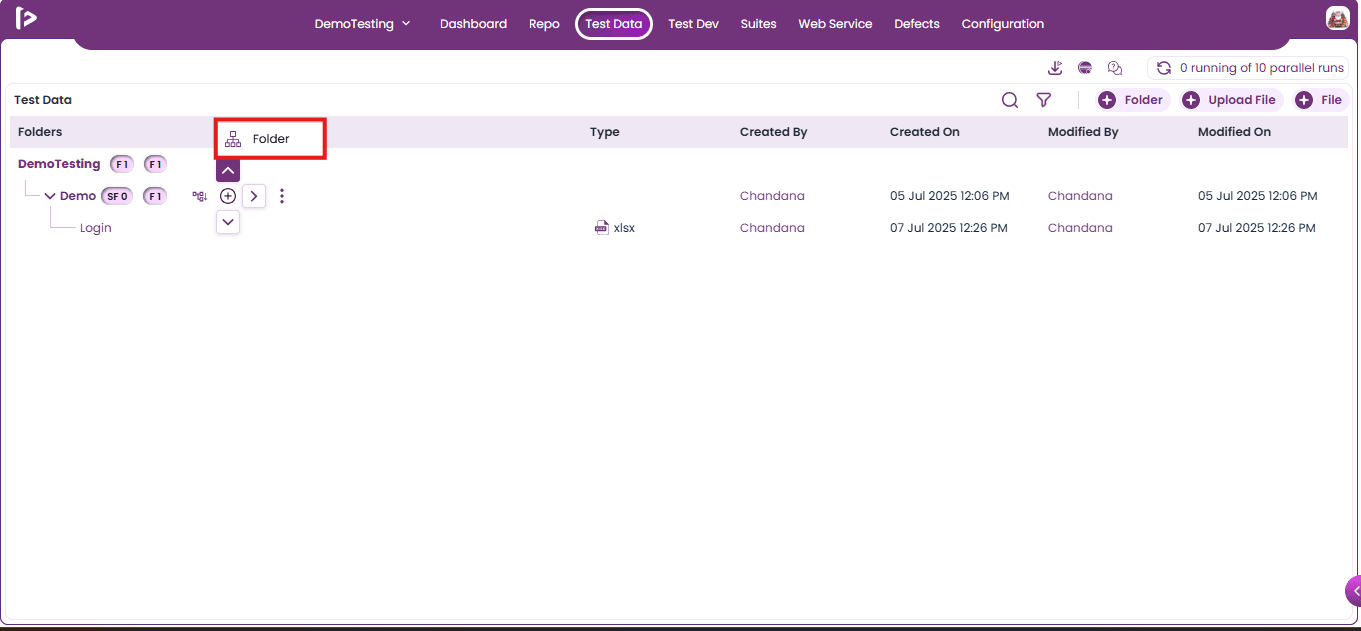
- Up Arrow Pointer : Upon clicking on the Up Arrow Pointer , Folder feature will be displayed as shown below.
-
Upon clicking the folder icon, users can add a new folder above the current folder or sub-folder.
-
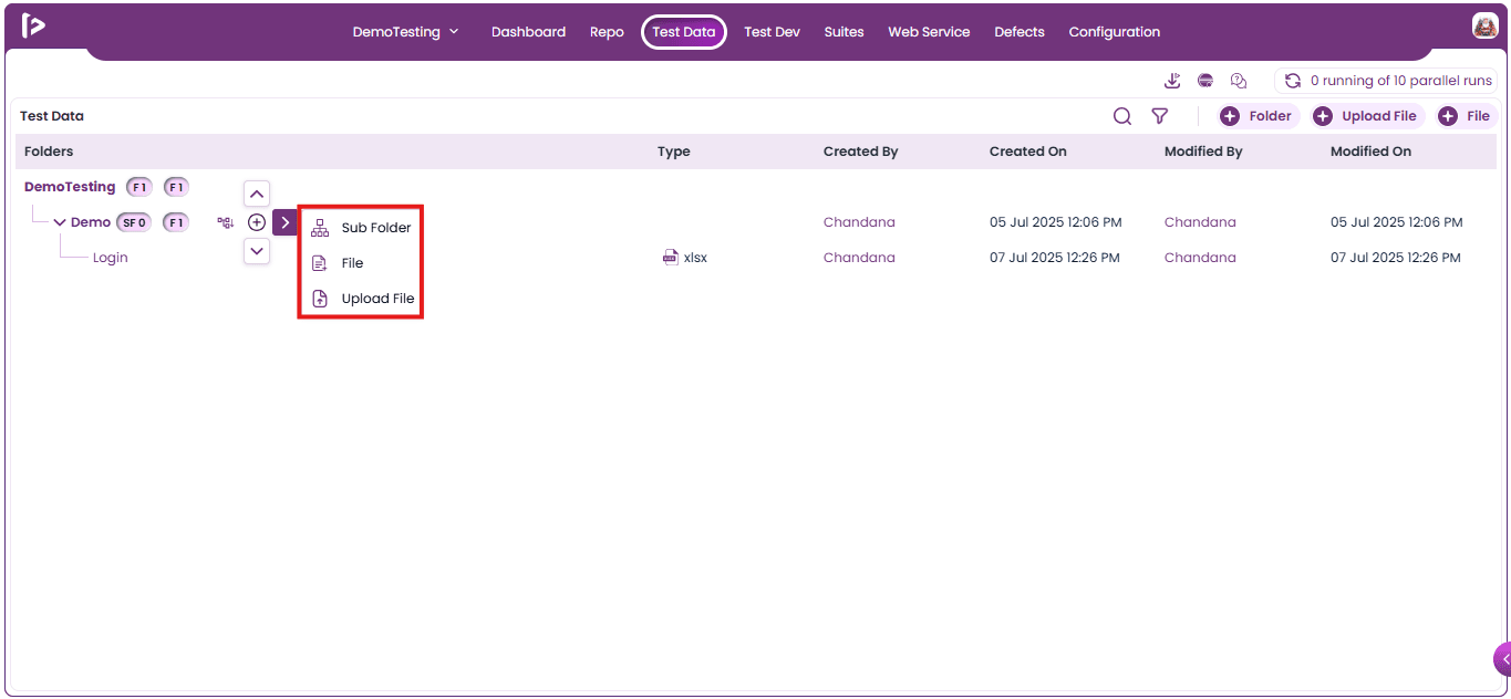
Right Arrow Pointer: Upon clicking on the Right Arrow Pointer, multiple features will be displayed as shown below
- Sub Folder : This feature allows users to add a sub-folder to the selected folder.
- Files : This feature allows users to add files to the selected Folder.
- Upload File : This feature allows users to upload files to the selected folder.
- Down Arrow Pointer : Upon clicking on the Down Arrow Pointer , Folder feature will be displayed as shown below.
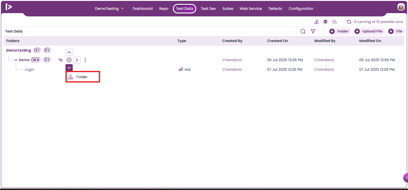
- Upon clicking the folder icon, users can add a new folder below the current folder or sub-folder.
Edit: User can edit the folders and sub folders by following the steps given below
- Click on edit button as shown below
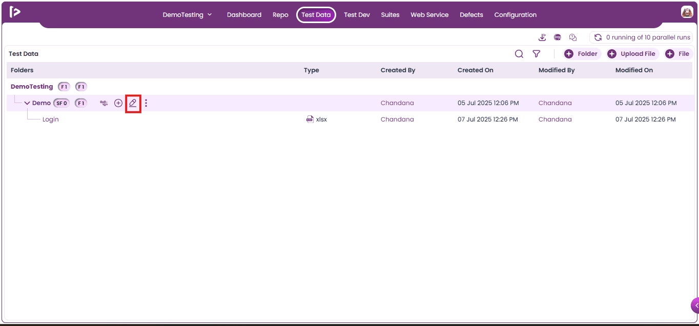
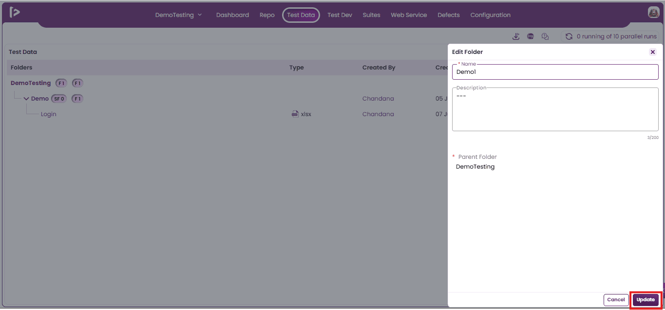
- Upon clicking on the edit button, user can view edit folder slider as shown below
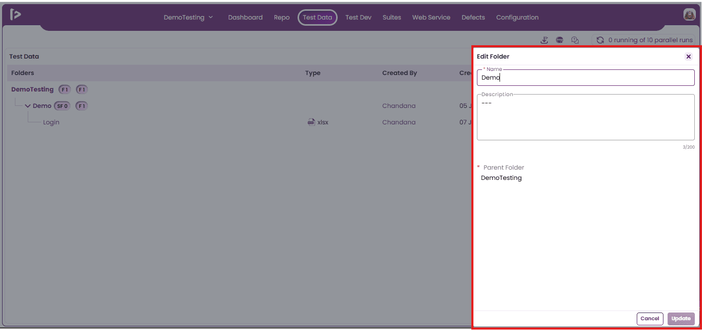
- Users can update the name and description of the folder. Once the changes are made, click the Update button as shown below.
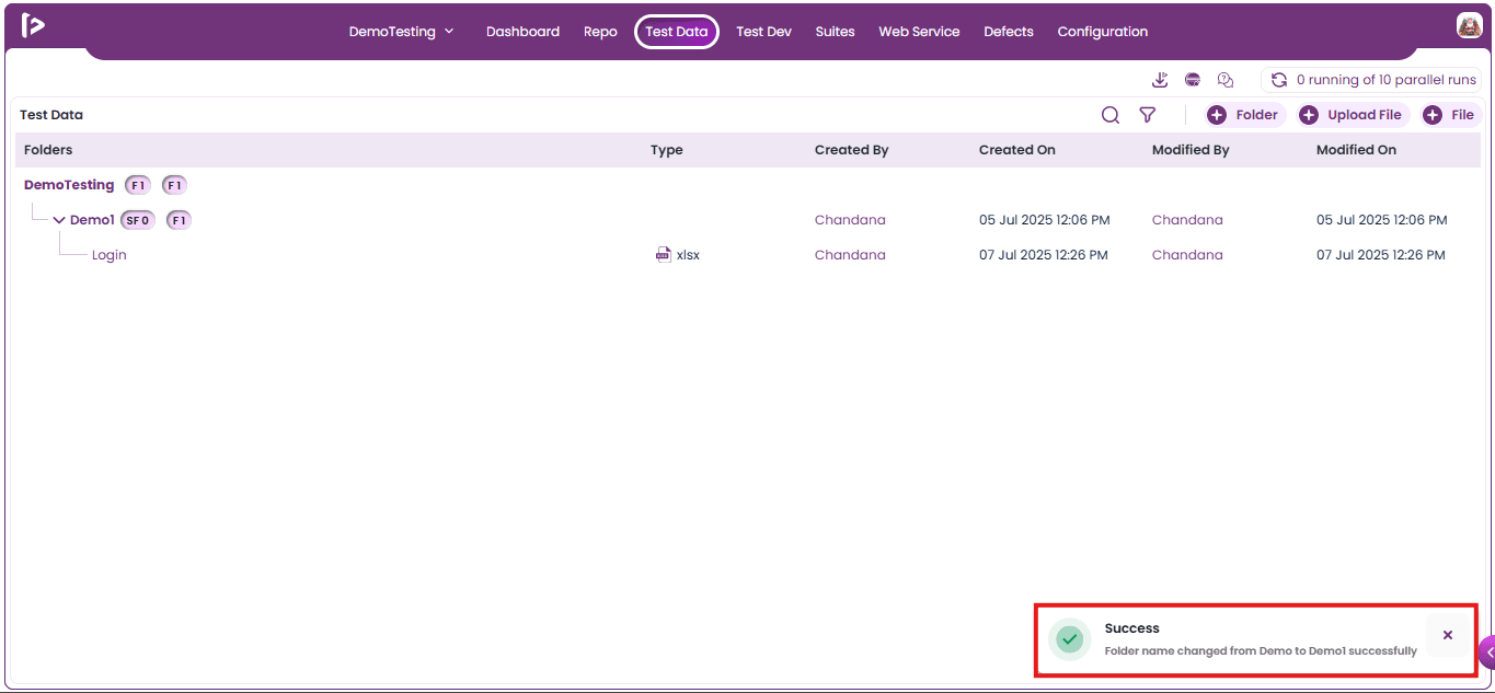
- Upon clicking on the Update button, a successful message will be displayed as shown below.
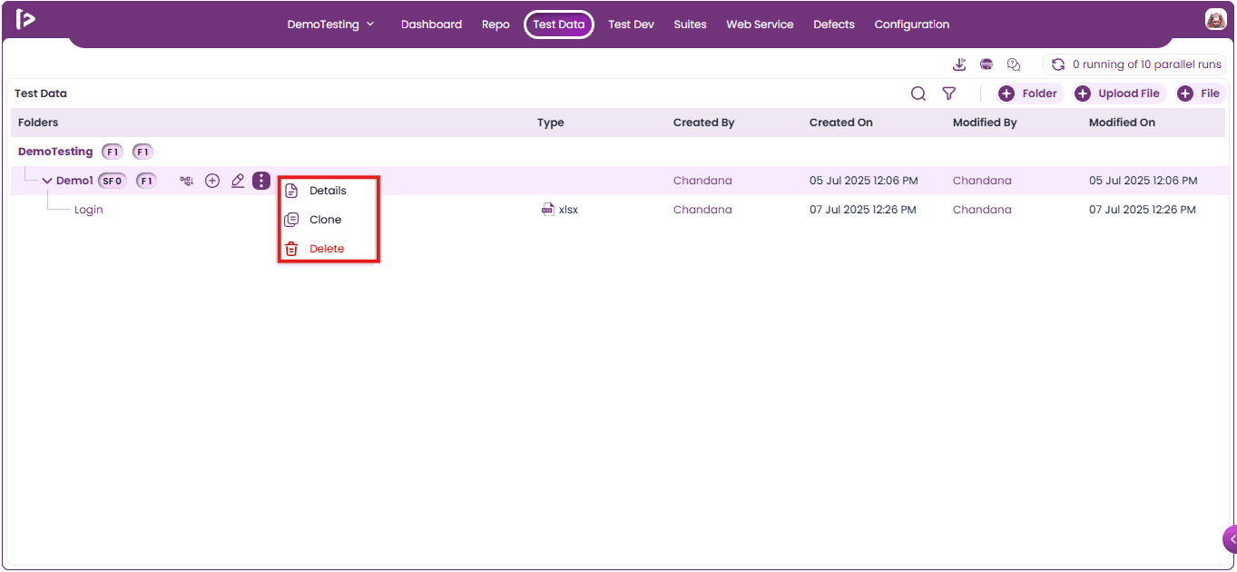
More Features : Upon clicking on the more option user can able to get some additional features for details, clone and delete , those are listed below
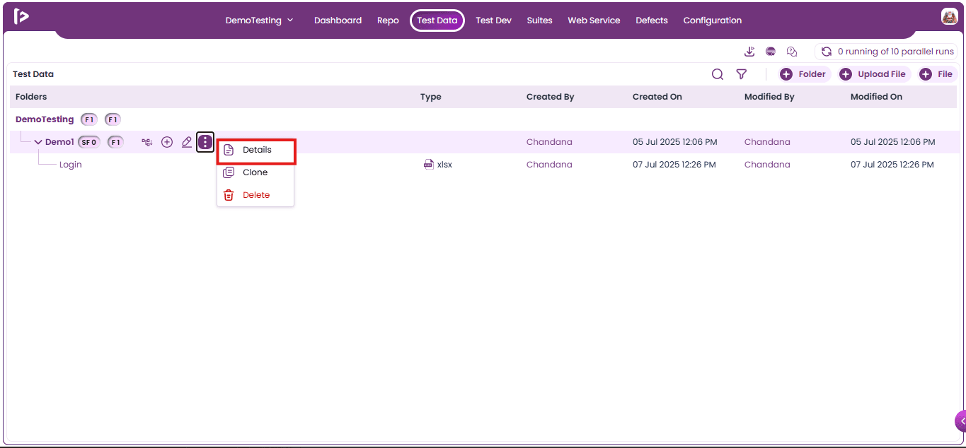
1. Details : To view the details for folder or sub folders, users need to follow the steps given below:
- Click on the Details option as shown below
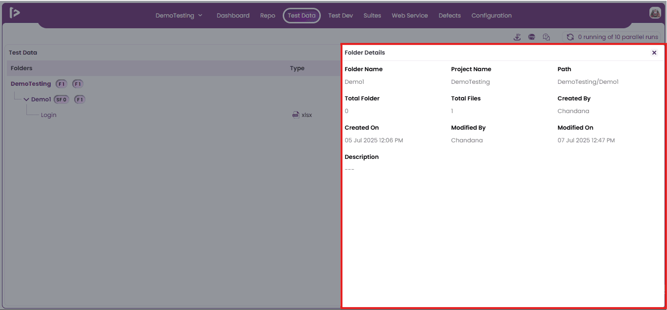
- Upon clicking on Details option, user can able to view the details for the folder as shown below
- Name: It displays the name of the current Folder or Sub Folder
- Project Name: It displays the project name under which folder is present
- Path: This displays the hierarchical path from the ProjectName Folder to the selected sub-folder.
- Total Folder: It displays the number of folders present inside the current folder.
- Total files: It displays the number of files present inside the current folder.
- Created By: It displays the name of the user who created this folder.
- Created On: It displays the date and time when this folder was created.
- Modified By: It displays the name of the most recent user who modified this folder.
- Modified On: It displays the date and time of the most recent modification of this folder.
- Description:It displays the description provided by the user during the creation or modification of the folder.
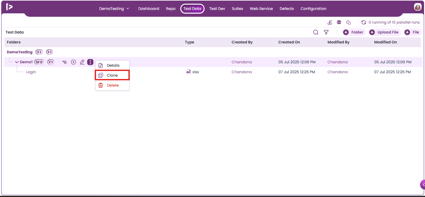
2. Clone: Users can clone folders and sub-folders by following the steps below.
- Click on the Clone option for the folder as displayed below
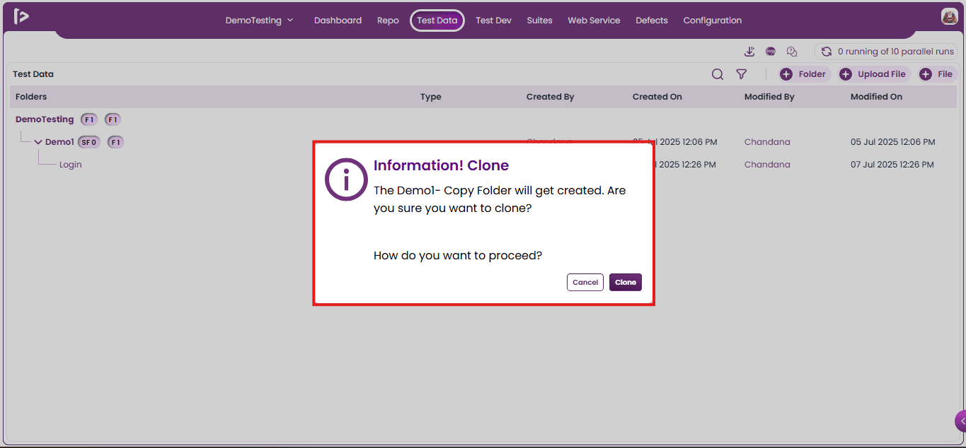
- Upon clicking on Clone option user will able to view an information popup as shown below
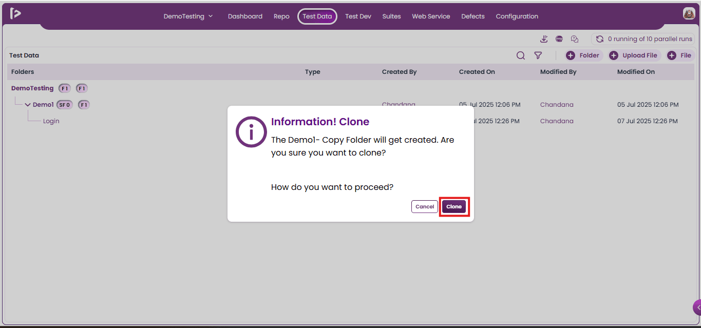
- Click on the clone button.
- Upon clicking on Clone button, user can able to view a successful message as displayed below
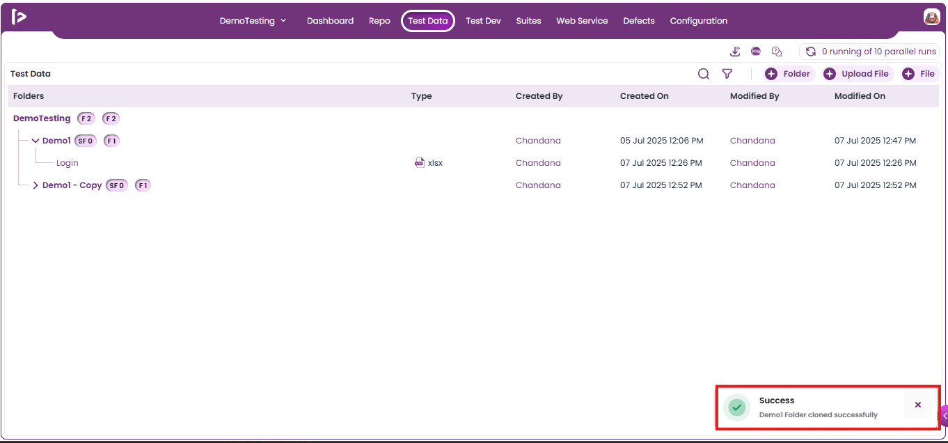
3. Delete: User can delete a Folder or Sub Folder by following the steps given below
- Click on the delete button as shown below
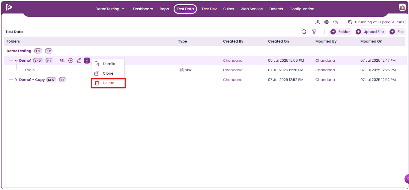
- Upon clicking on the delete button, the Delete popup will be displayed as shown below.
- Note: Folders that contain sub-folder or files cannot be deleted directly.
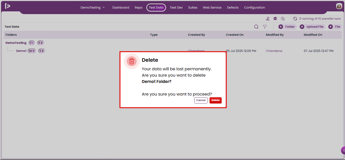
- Click on delete button
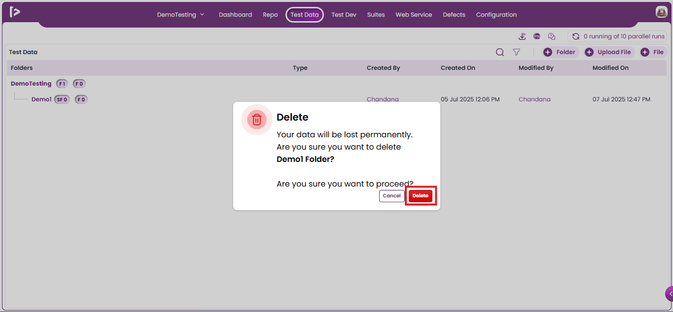
- Upon clicking on delete button, a successful message will appear as shown below
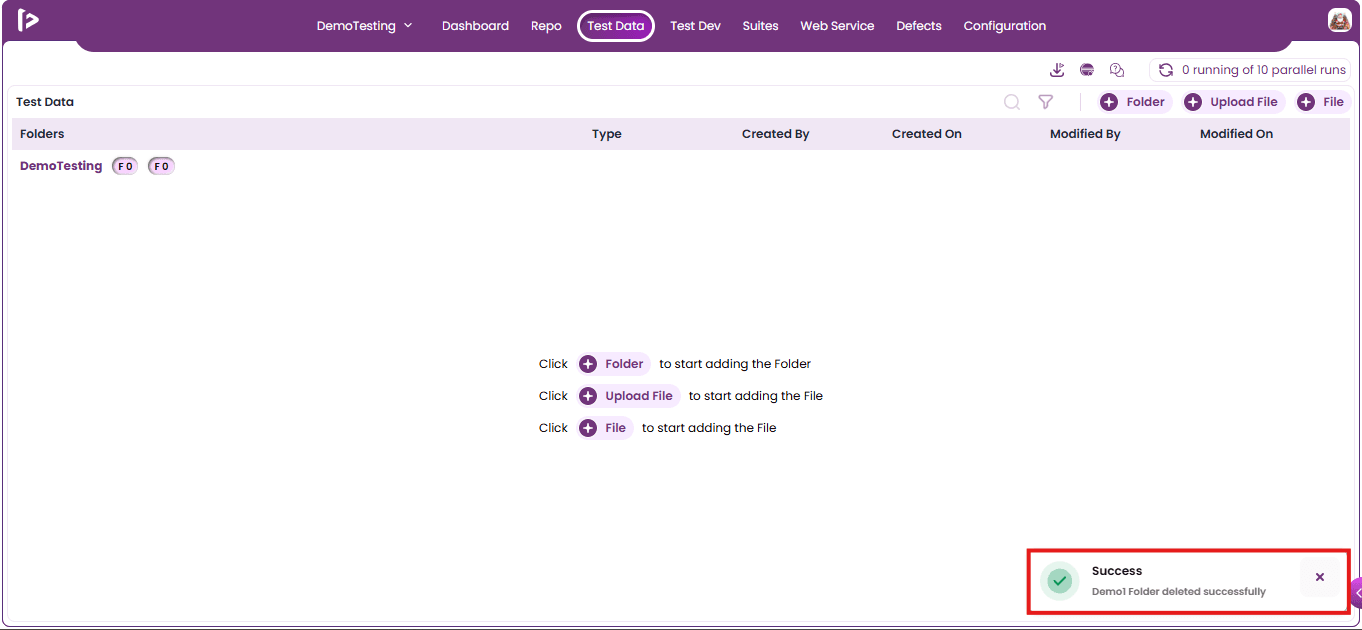
Additional Features For Files
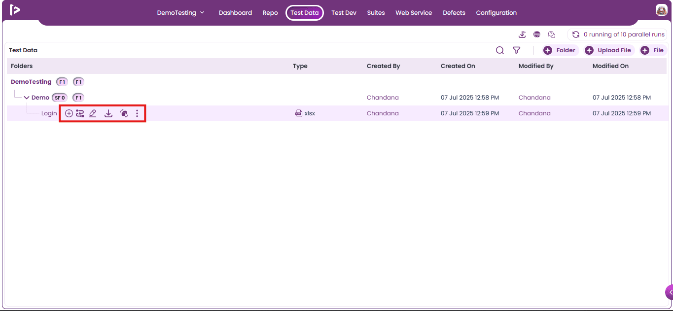
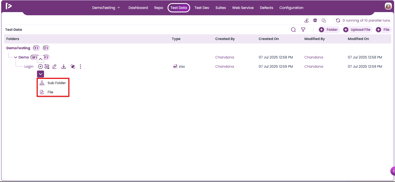
Add icon : Upon mouse hovering on Add icon user can able to view multiple icons as displayed below
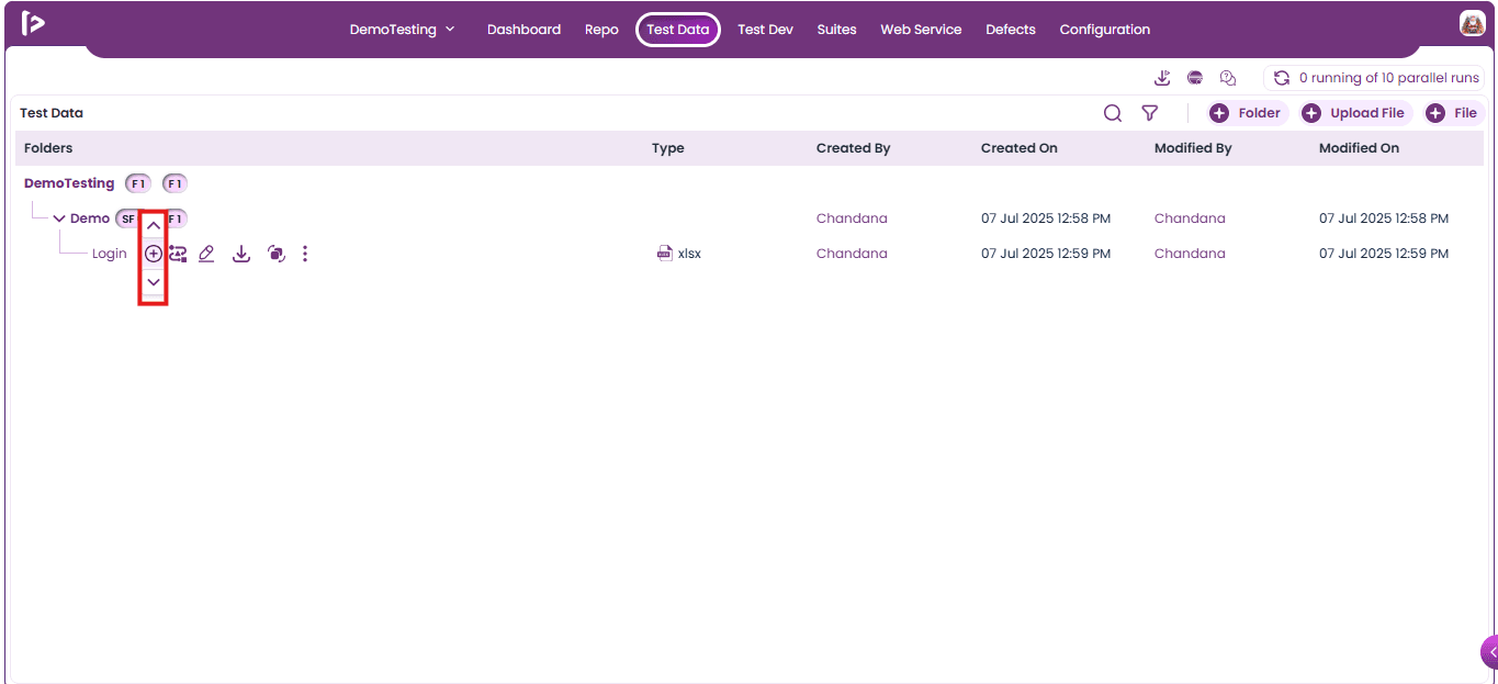
- Up Arrow Pointer : Upon clicking on the Up Arrow Pointer, multiple features will be displayed as shown below
- Sub Folder: This feature allows users to add a sub-folder above the selected folder.
- File: This feature allows users to add a file above the selected folder
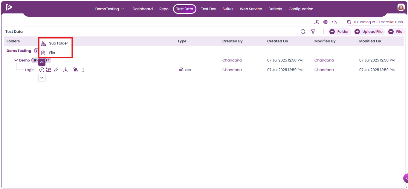
- Down Arrow Pointer : Upon clicking on the Down Arrow Pointer, multiple features will be displayed as shown below
- Sub Folder: This feature allows users to add a sub-folder below the selected folder.
- File: This feature allows users to add a file below the selected folder
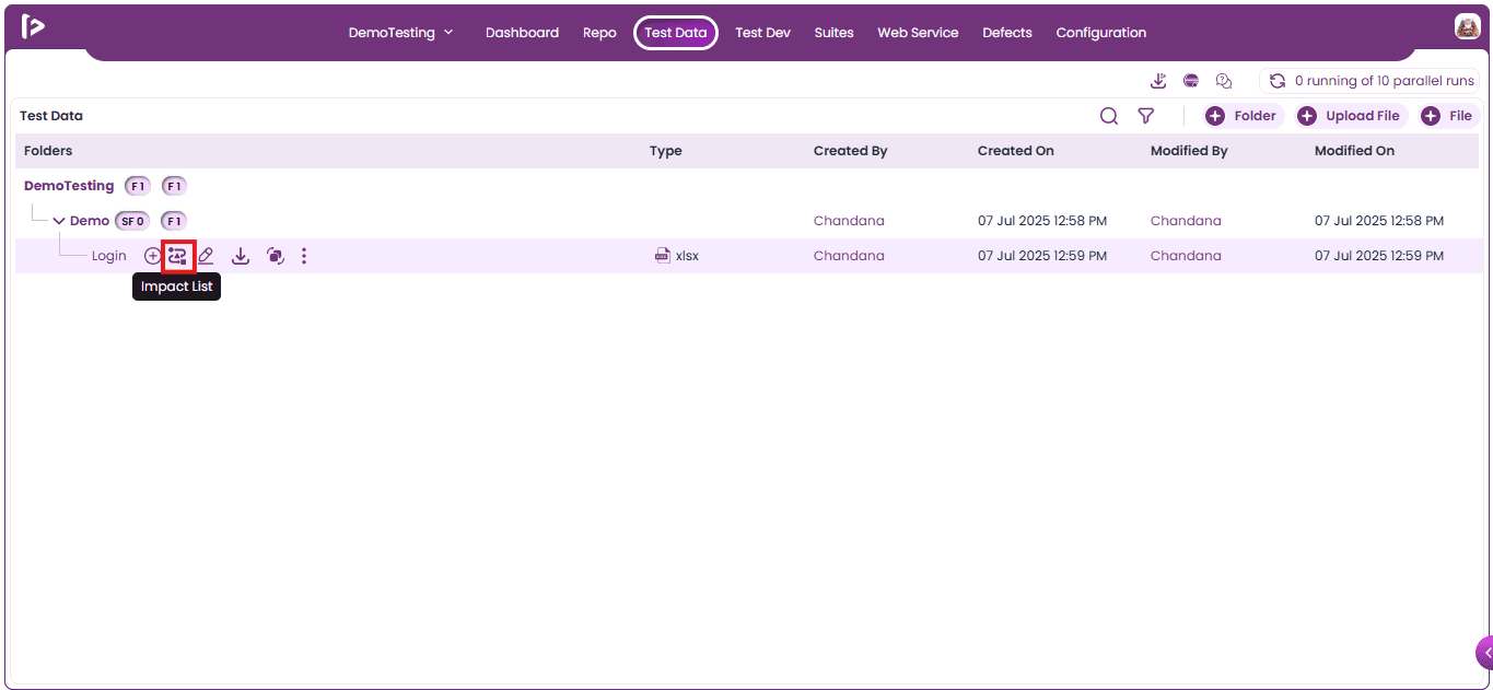
Impact list : When the user hovers the mouse over the element, the Impact List is displayed
- Note: It shows all fields where the feature has been implemented, along with the total count
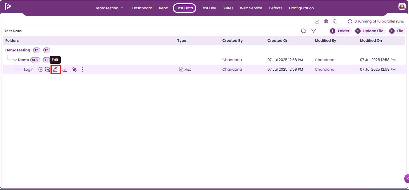
Edit : User can edit the files by following the steps given below
- Click on edit button as shown below
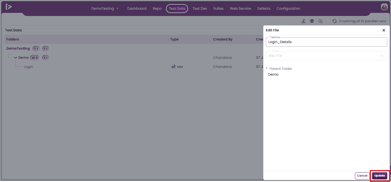
- Upon clicking on the edit button, user can view edit file slider as shown below
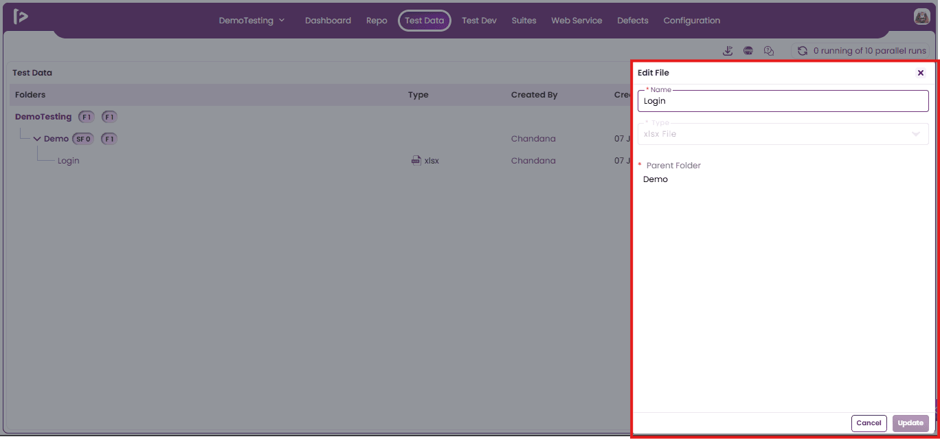
- Users can update the name and of the file. Once the changes are made, click the Update button as shown below.
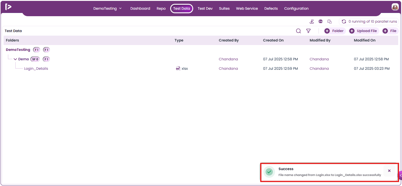
- Upon clicking on the Update button, a successful message will be displayed as shown below.
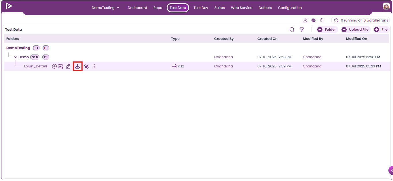
Download : This feature downloads the file that is available under the Test Data section.
- Click on the download button as shown below.
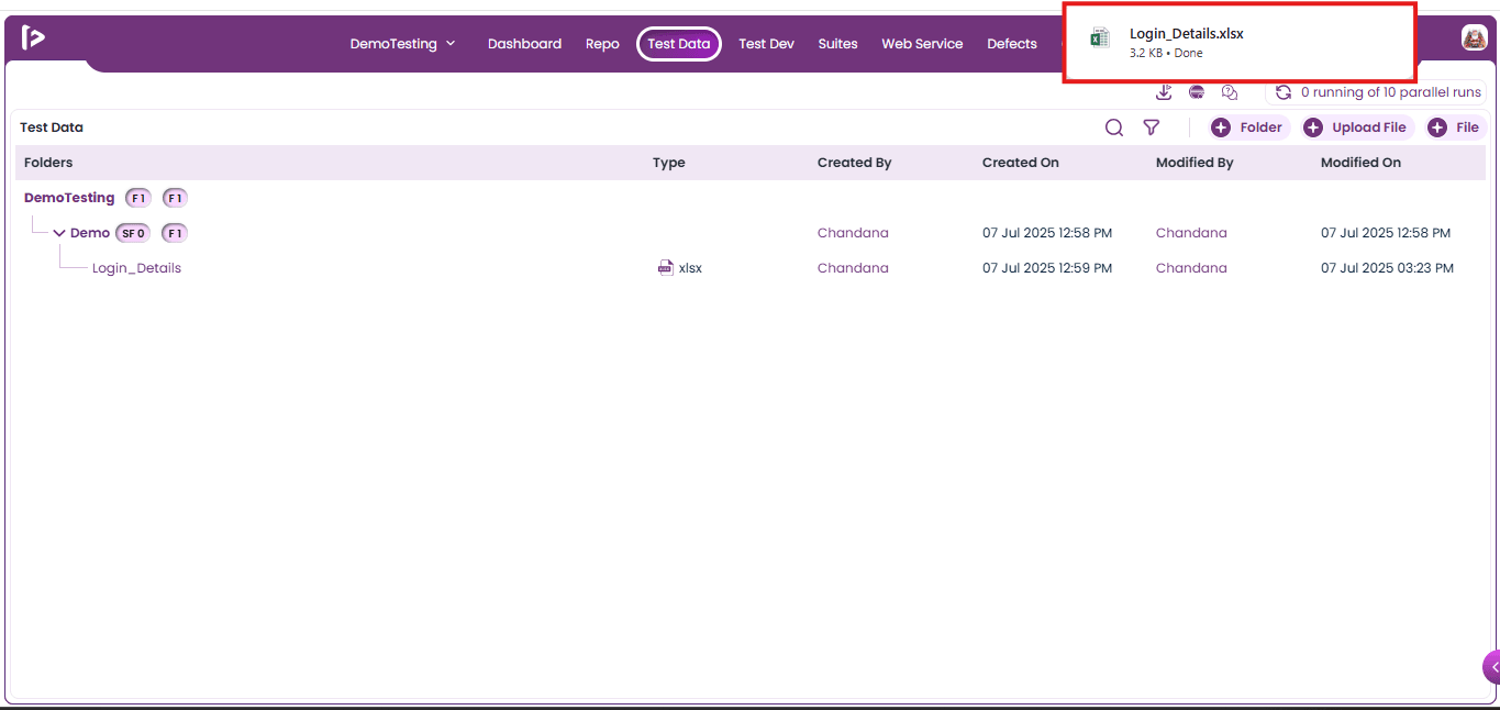
- Upon clicking the download button, the file will be saved to the Downloads folder on the local drive.
Replace : This feature replaces the test data file available under the Test Data section. For replacing the file user can follow the steps mentioned below
- Click on the replace button as shown below.
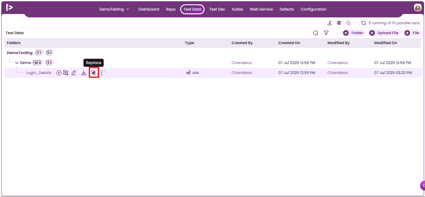
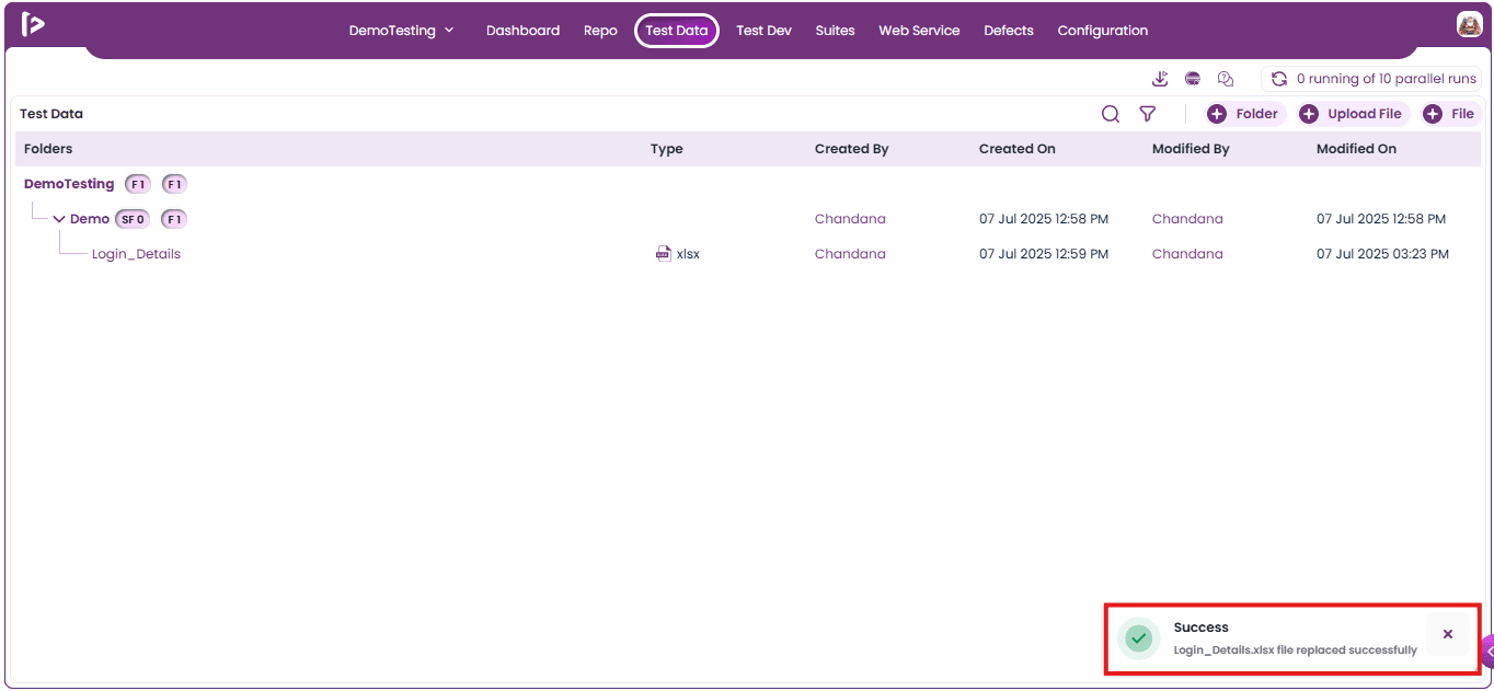
- When the user clicks the Replace button, they can replace an existing file. It is important to ensure that the file name and file type are identical to those of the original file; otherwise, the replacement will fail. If the replacement is successful, a confirmation message will be displayed as shown below.
More Features : Upon clicking on the more option user can able to get some additional features for details, clone and delete , those are listed below
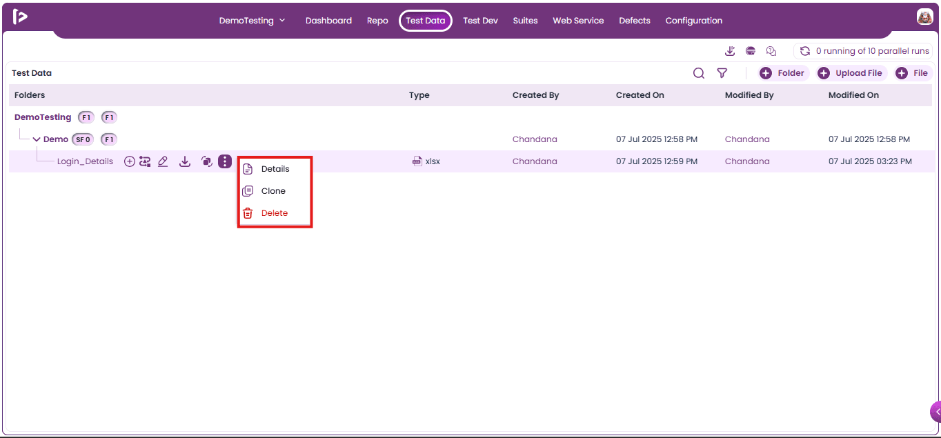
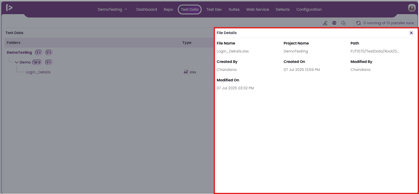
1. Details : To view the details for file, users need to follow the steps given below:
- Click on the Details option as shown below
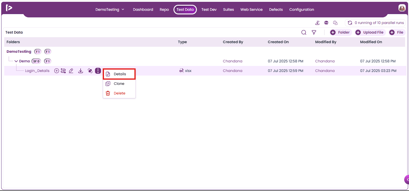
- Upon clicking on Details option, user can able to view the details for the folder as shown below
- Name: It displays the name of the current File.
- Project Name: It displays the project name under which file is present
- Path: This displays the hierarchical path from the root module to the selected file.
- Created By: It displays the name of the user who created this file.
- Created On: It displays the date and time when this file was created.
- Modified By: It displays the name of the most recent user who modified this file.
- Modified On: It displays the date and time of the most recent modification of this file.
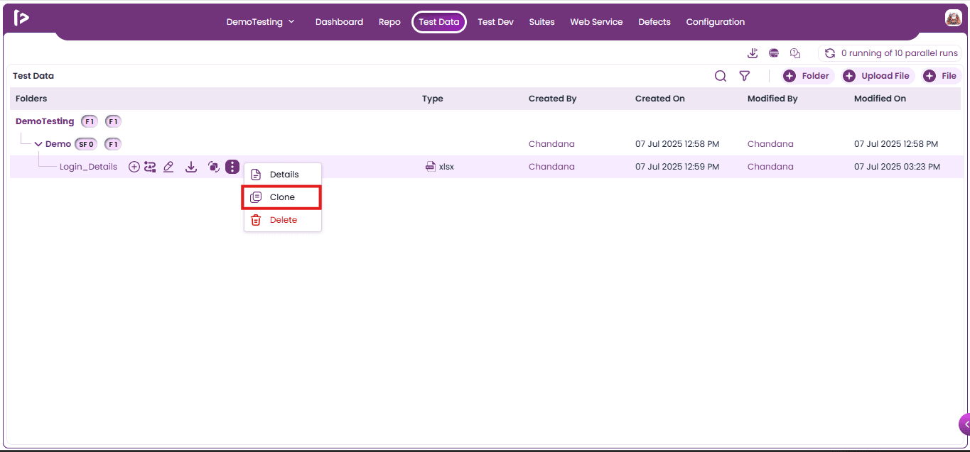
2. Clone: Users can clone files by following the steps below.
- Click on the Clone option for the file as displayed below
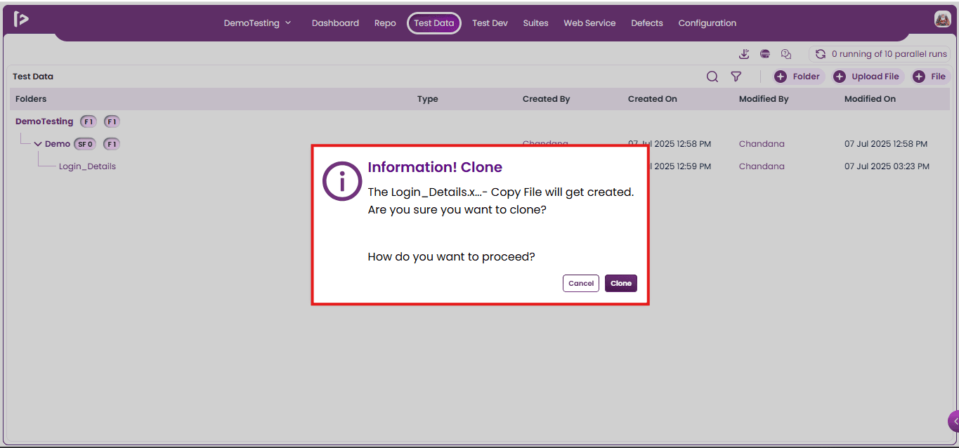
- Upon clicking on Clone option user will able to view an information popup as shown below
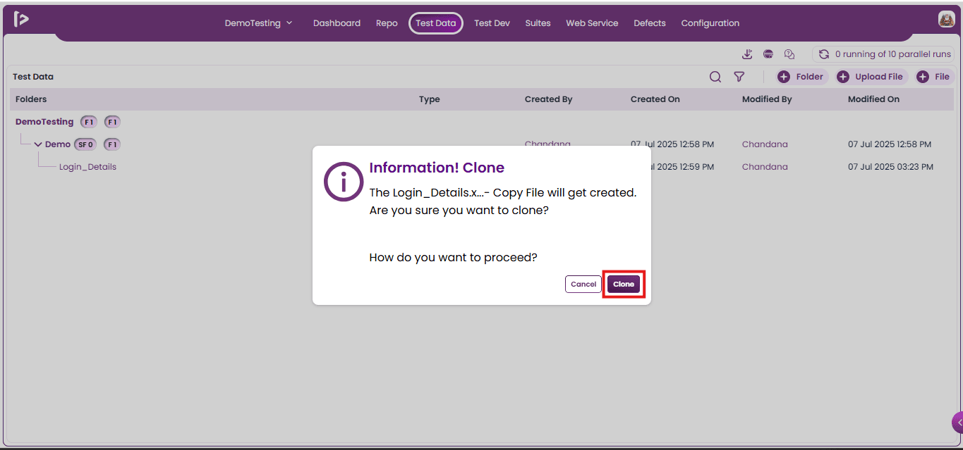
- Click on the clone button.
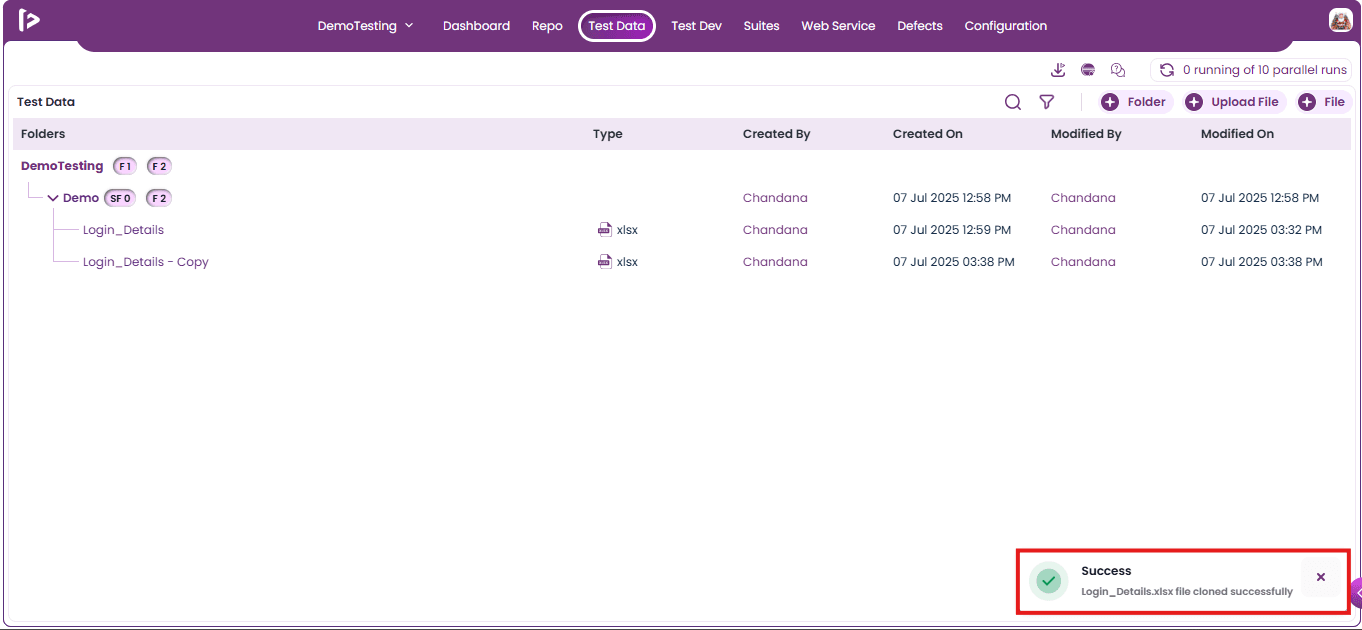
- Upon clicking on Clone button, user can able to view a successful message as displayed below
3. Delete: User can delete a File by following the steps given below
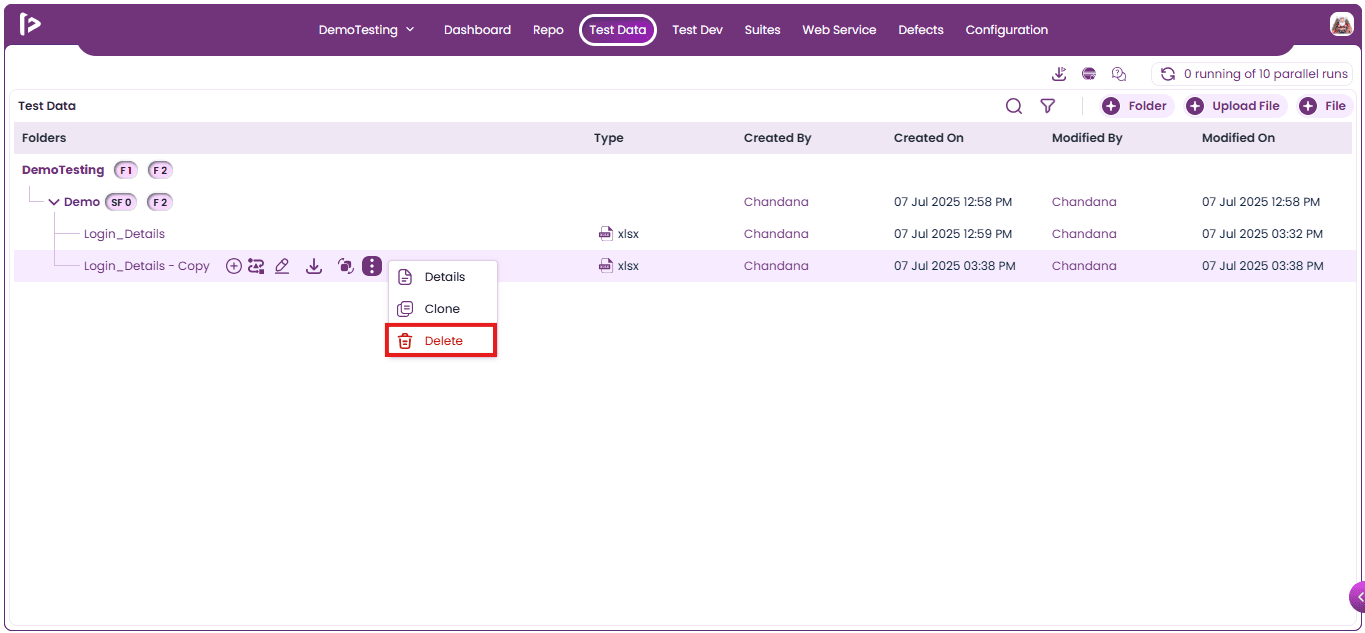
- Click on the delete button as shown below
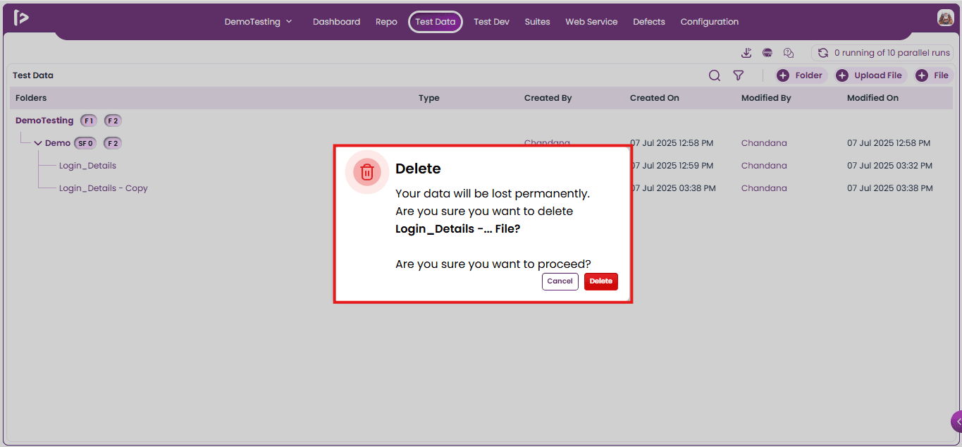
- Upon clicking on the delete button, the Delete popup will be displayed as shown below.
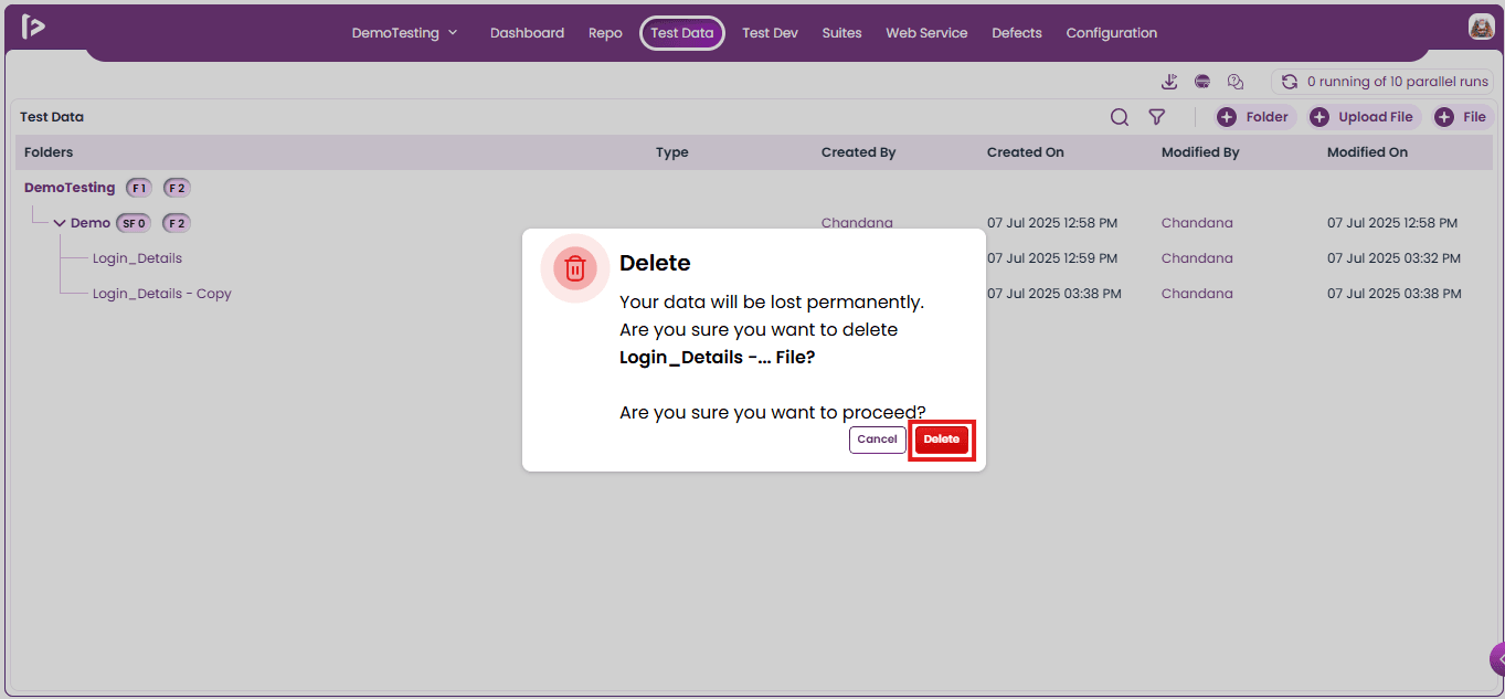
- Click on delete button
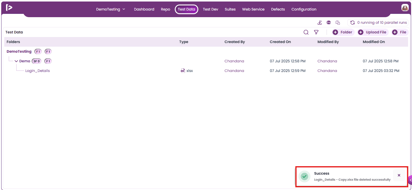
- Upon clicking on delete button, user can able to view a successful message as displayed below
Miscellaneous Features
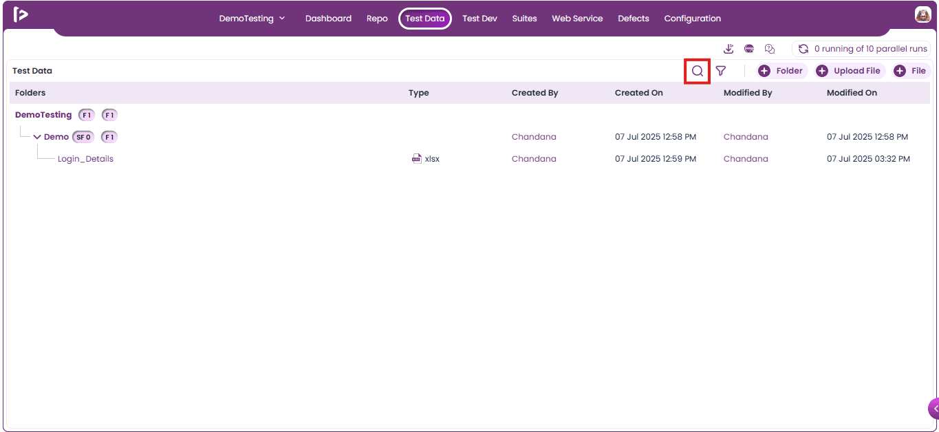
Search: User can search file or folder present inside the folder by following the steps given below
- Click on the search button as displayed below.
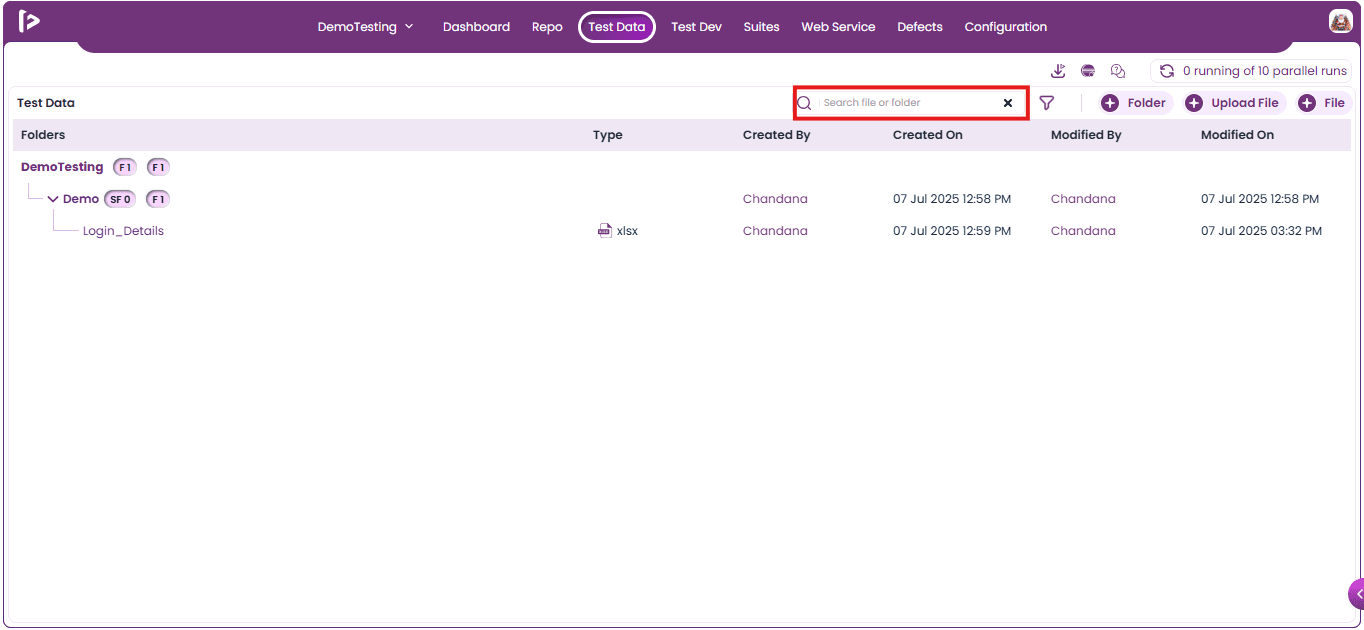
- Upon clicking user is able to view a text field where the user can enter the data as shown below.
- After entering the data, users may click the Enter button to retrieve the desired results, which will be displayed as highlighted fields, as illustrated below.
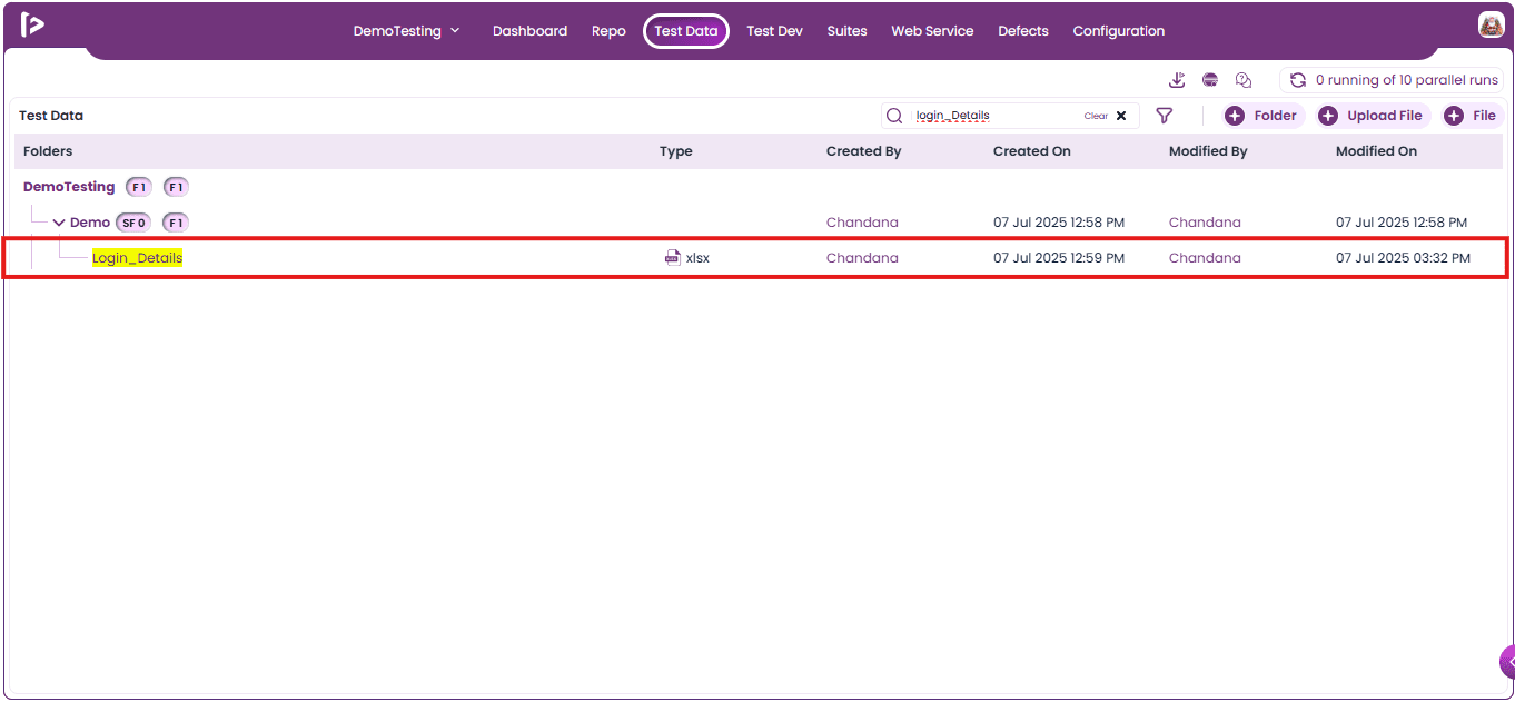
- User can close the search by clicking on cross button as shown below
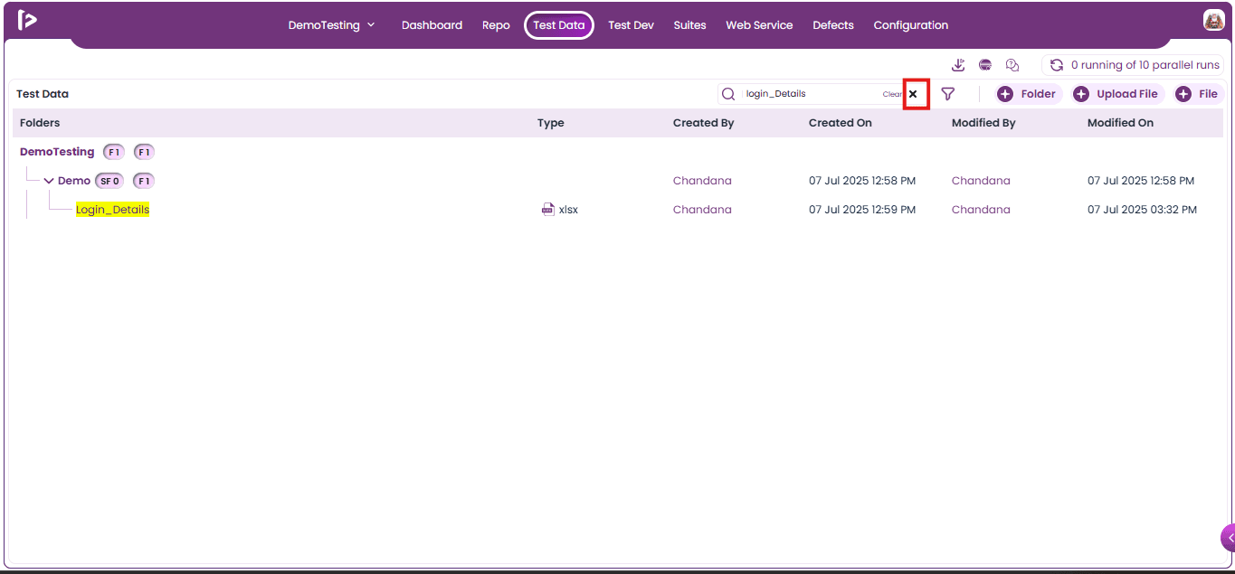
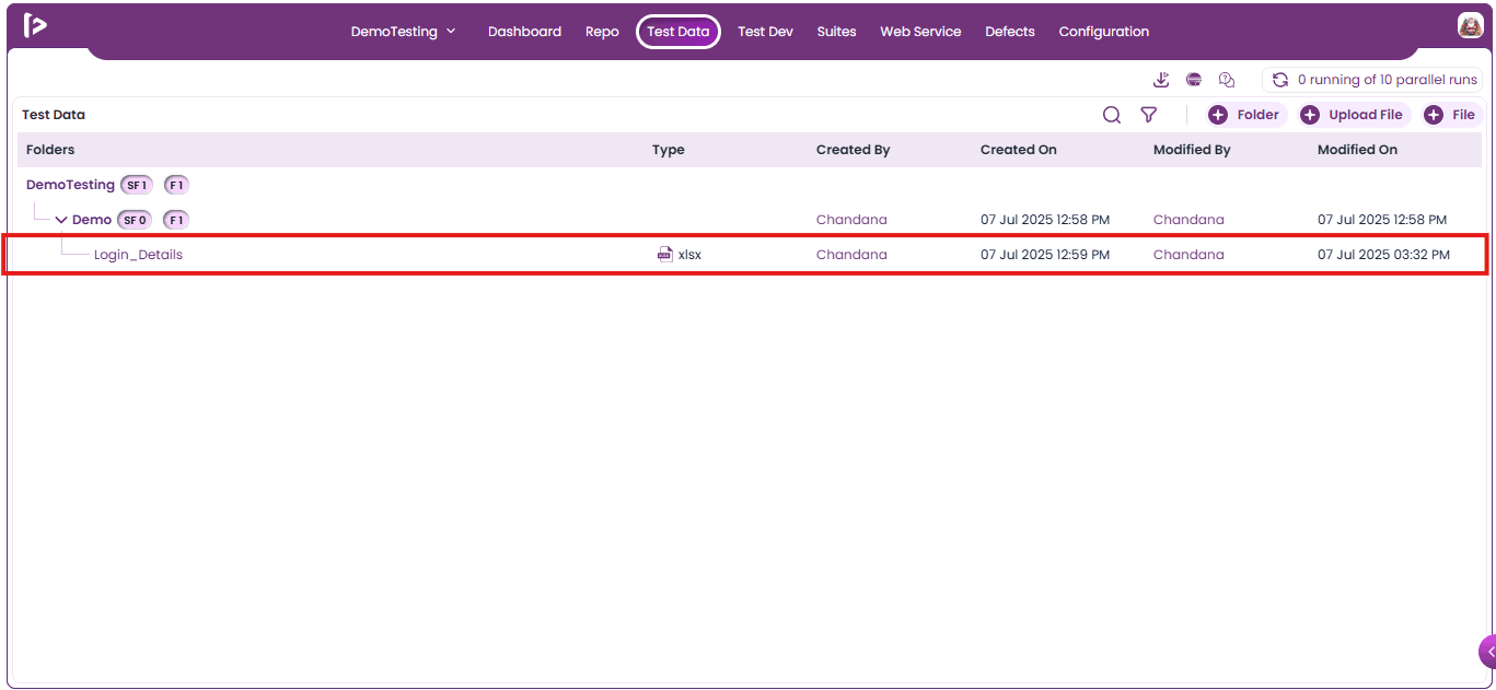
- Upon clicking the cross button, the highlight on the searched data will be removed.
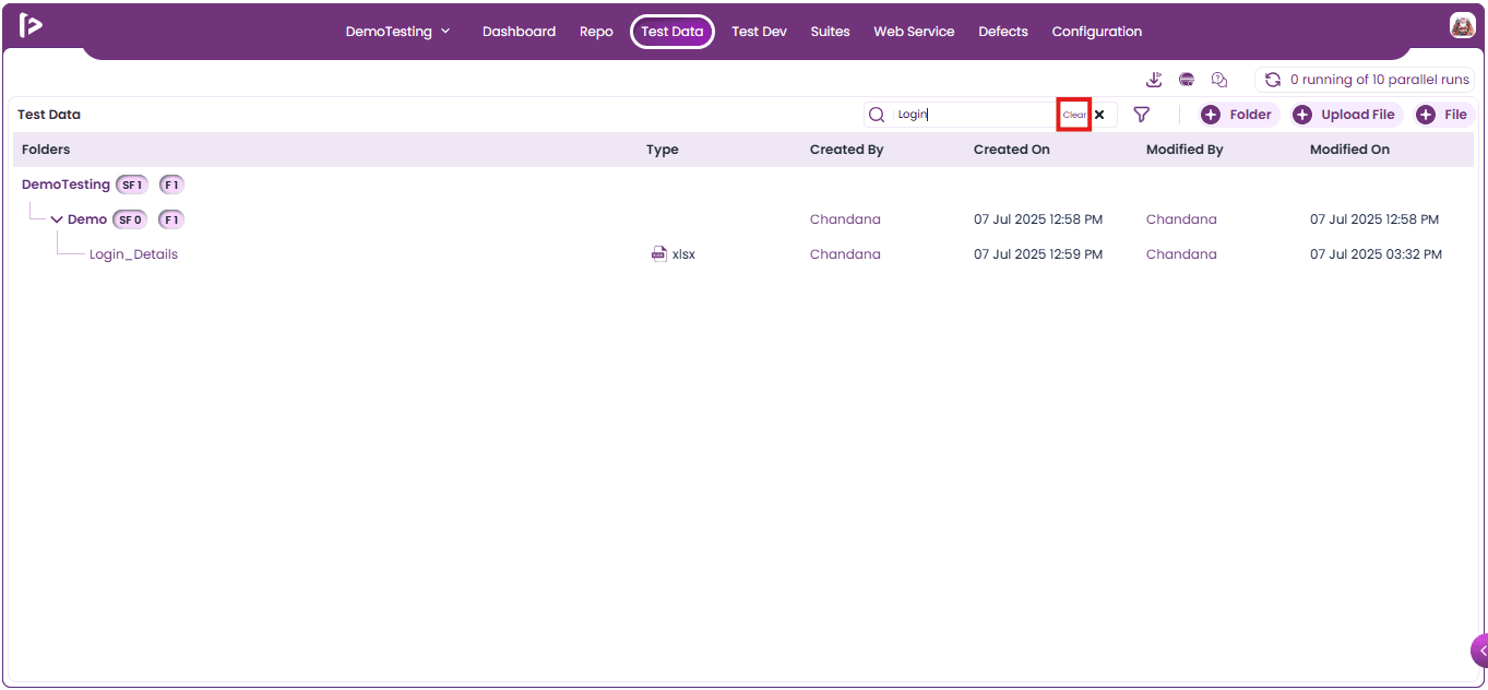
- Clear: Removes all selected data or resets the input fields to their default state as displayed below
Filter Functionality: User can able to filter out the files by following the steps given below
- Click on the filter icon as shown below
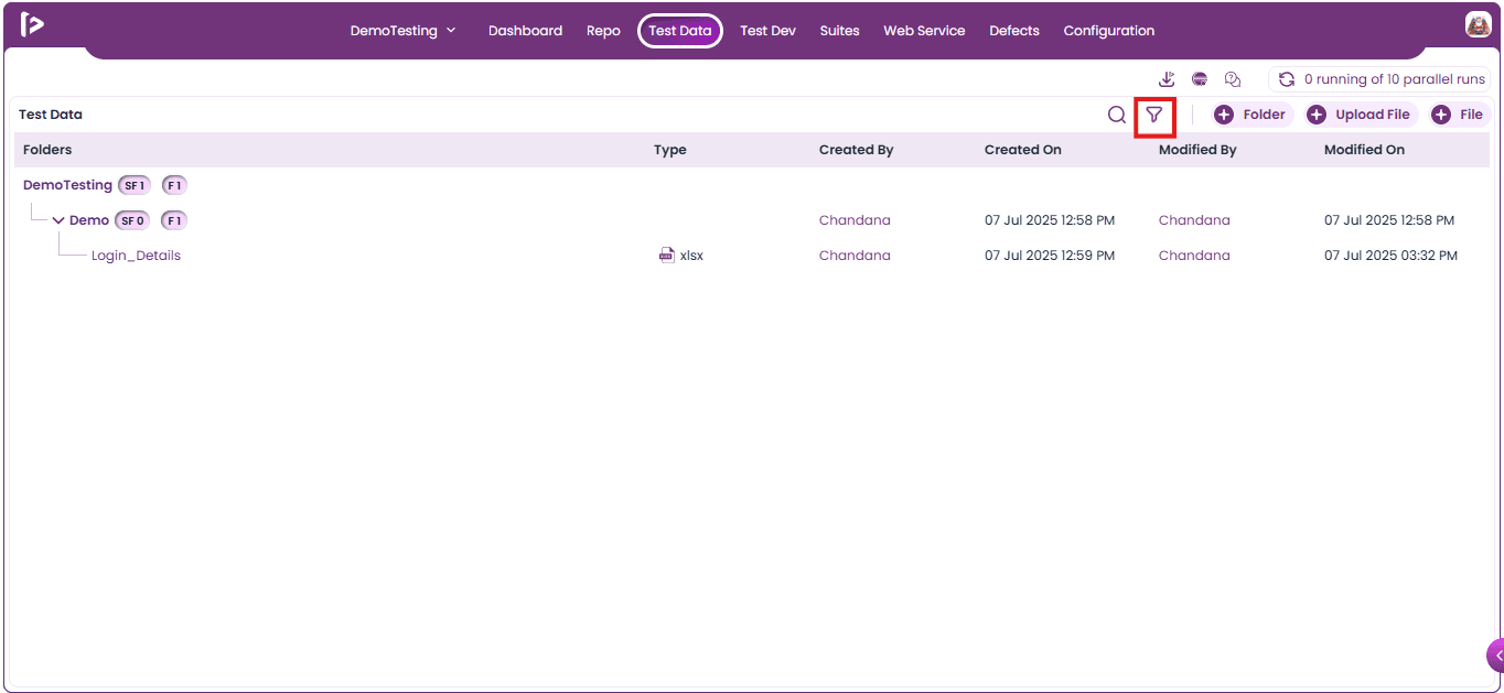
- Upon clicking on filter icon, a filter section will be popup up as displayed below
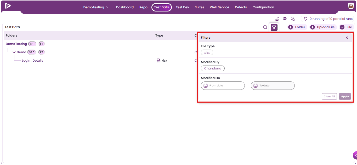
- Users can provide the desired filters by selecting the options present inside the popup and once the options are selected, Click on apply button.
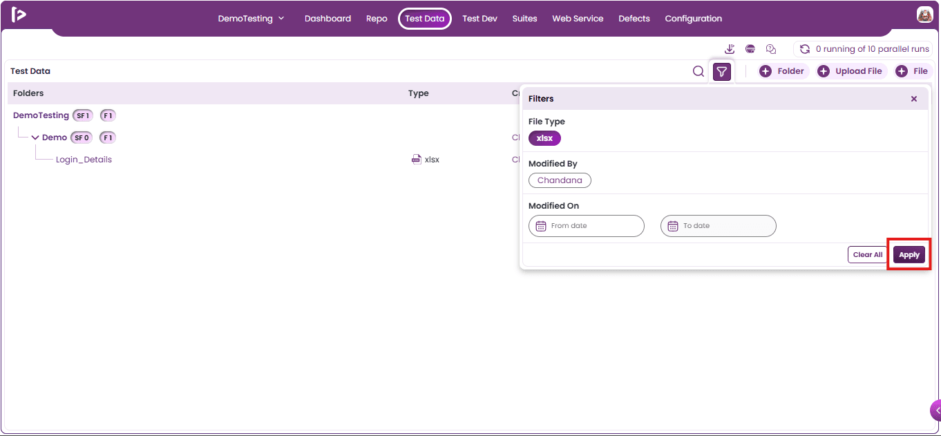
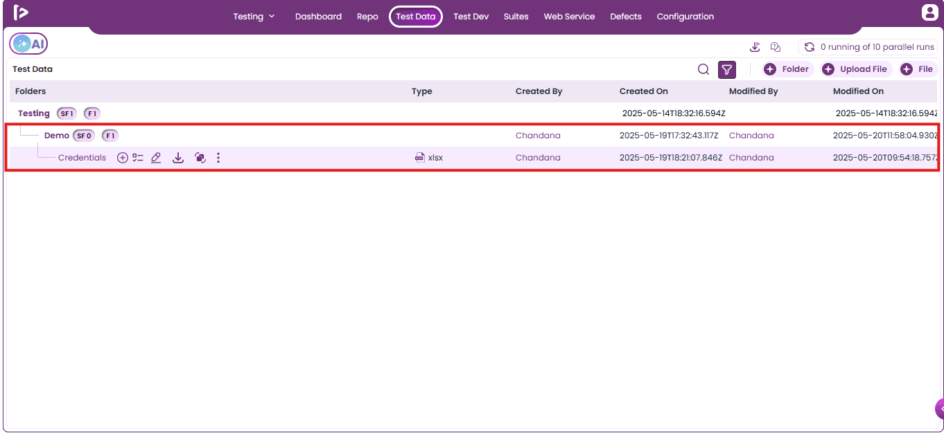
- Upon clicking on apply button, user can able to get the filtered results as shown below
Test Data Optimizer
The Test Data Optimizer helps identify unused test data within the project and enables bulk deletion of data sets that have no impact on execution. It improves efficiency by removing redundant data, reducing clutter, and providing better visibility into test data usage and dependencies.
How to Use Test Data Optimizer
- Click on the Optimizer icon.
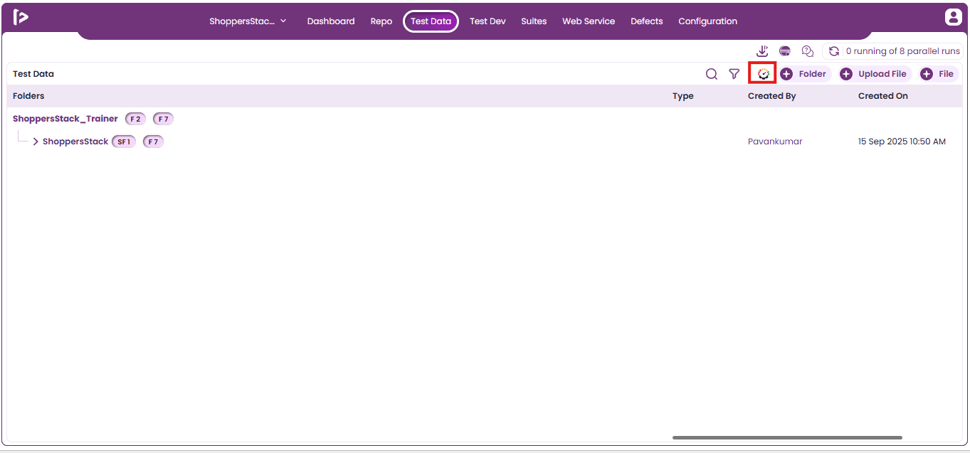
- The Test Data Optimizer slider will be displayed, unused test data.
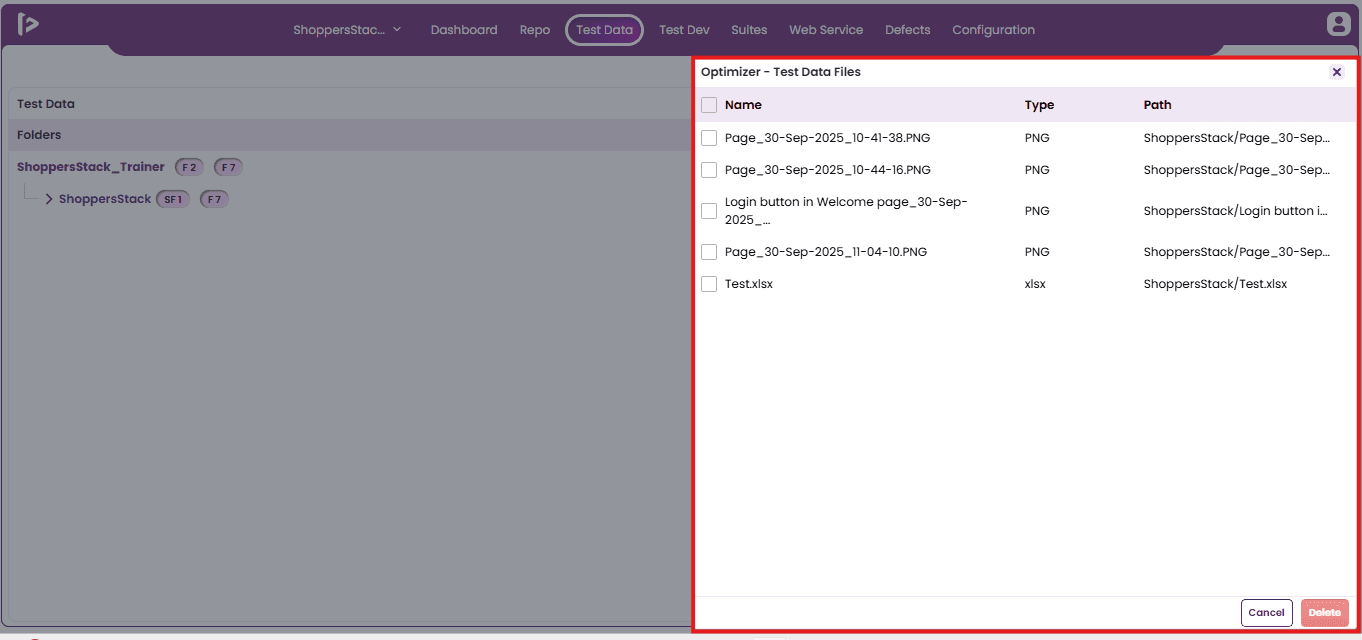
- Select the test data that the user wishes to delete.
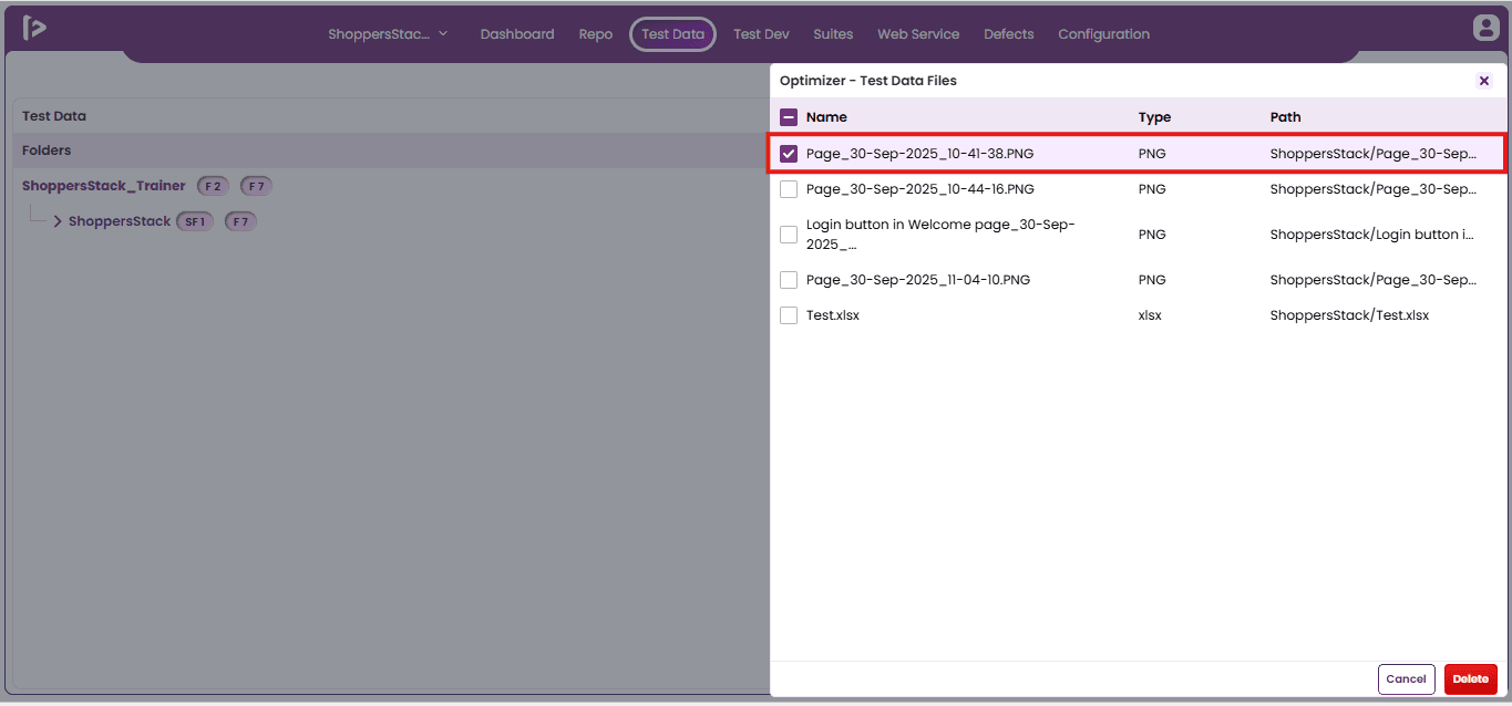
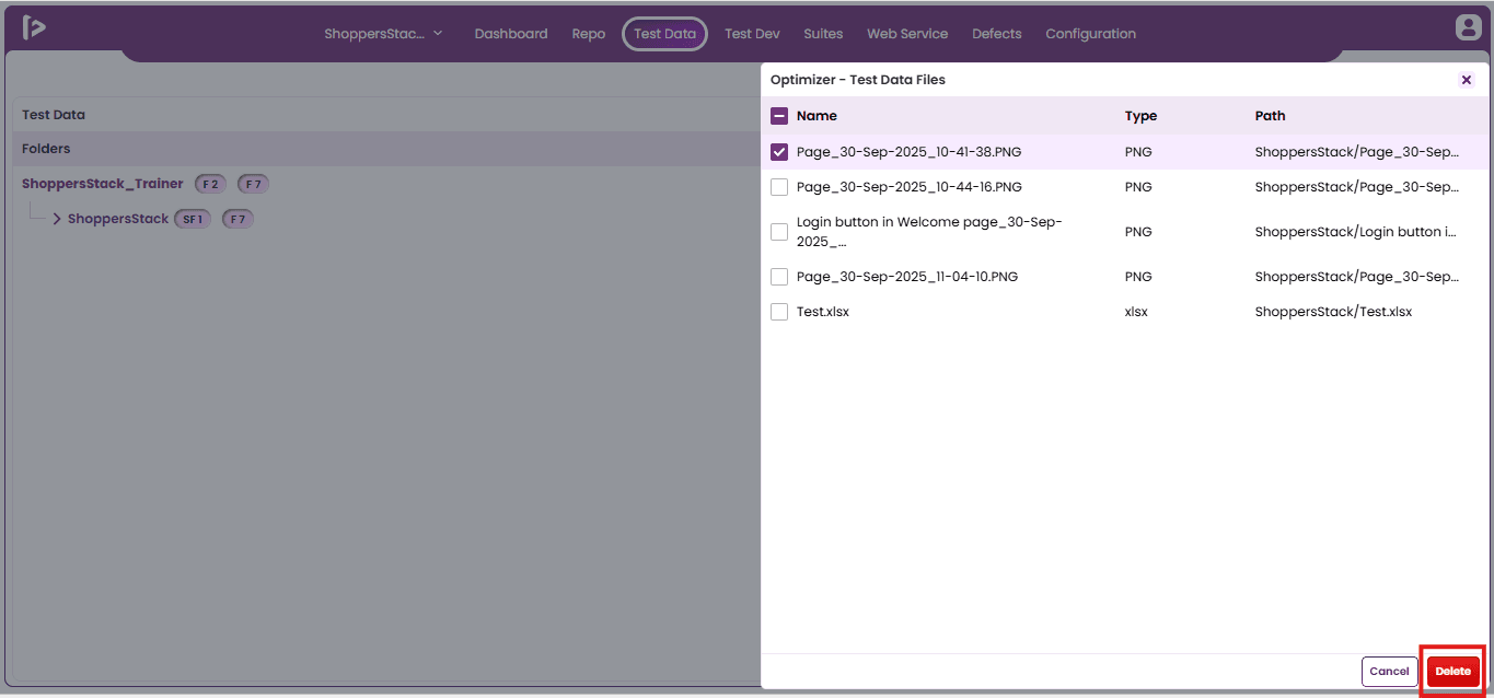
- After selecting the test data, click on the Delete button.
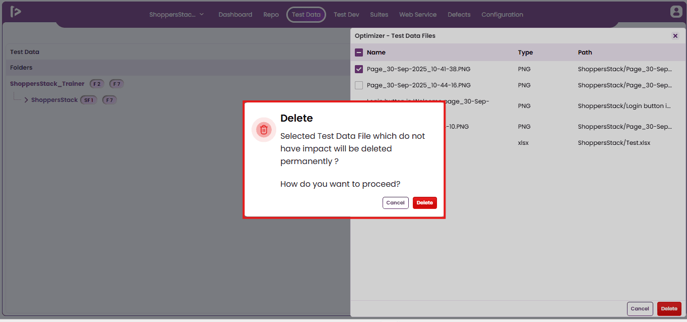
- A confirmation pop-up will be displayed. Click on the Delete button to proceed.
- A success toast message will be displayed confirming that the selected test data has been deleted successfully.
Accessing Test Data via Quick Access Panel
Process to access Test Data Section using Quick Access Panel
- Quick Access Panel in Test Dev
- Quick Access Panel in Step Groups
Method 1 : Quick Access Panel in Test Dev
- Navigate to the Test Development Section as shown below.
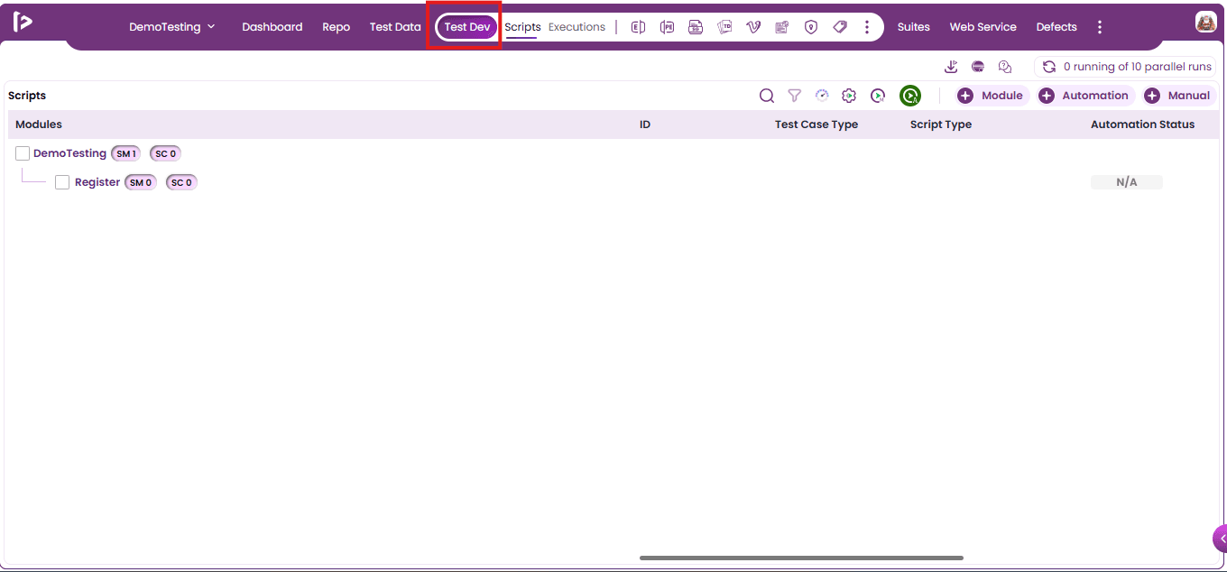
- In the Test Development section, users can access the Quick Access toolbar from the top navigation bar and click on "Test Data" icon as illustrated below.
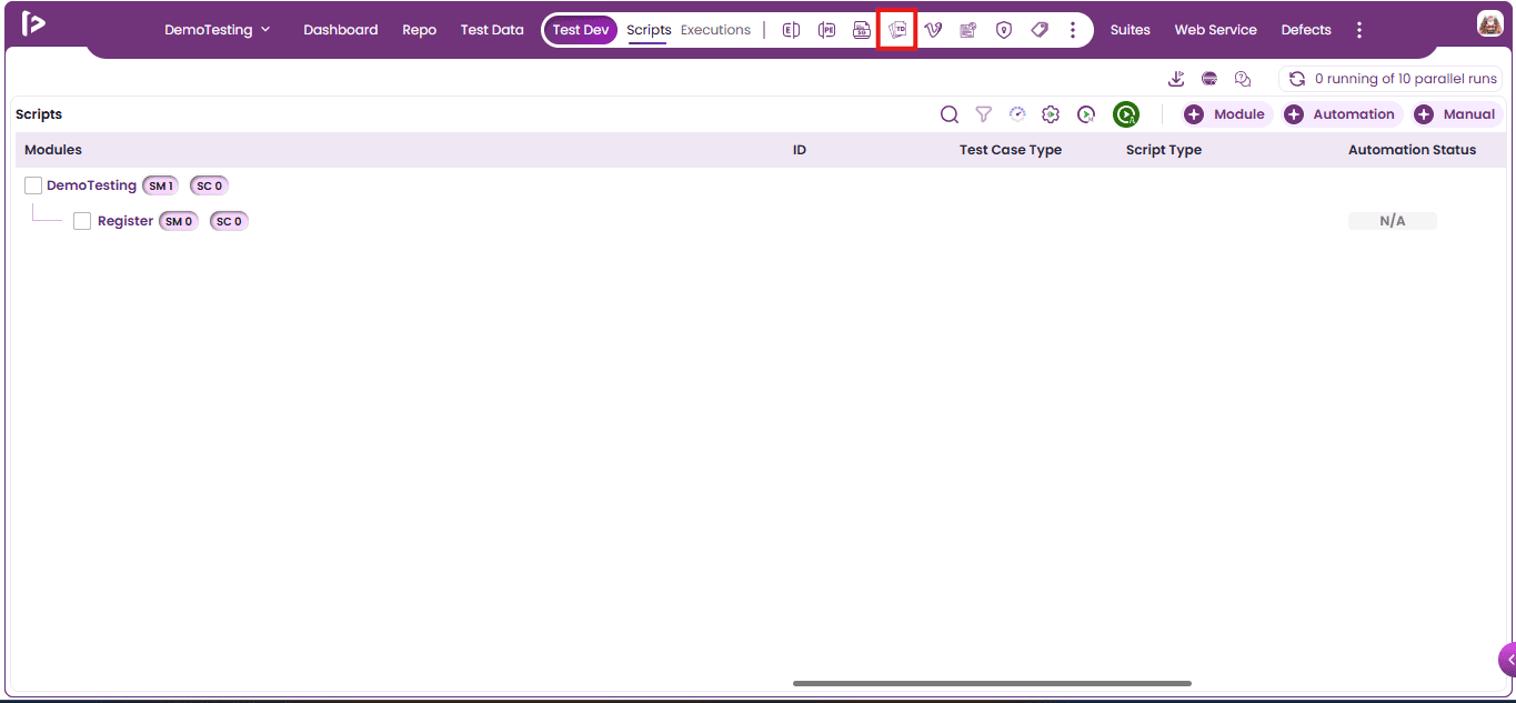
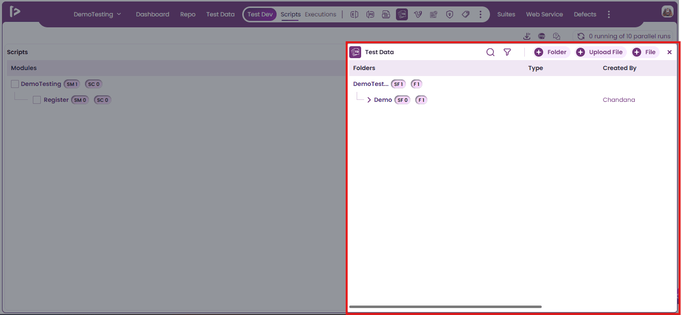
- Upon clicking on test data section “Test Data Slider” will appear as shown below
Note :
- The Test Data slider is located within the Test Development section.
- Users can perform all the same actions as in the main Test Data section.
- This ensures a consistent experience across both interfaces.
- It also provides a streamlined workflow for managing test data.
Method2 : Quick Access Panel in Step Groups
- Navigate to the Repository.
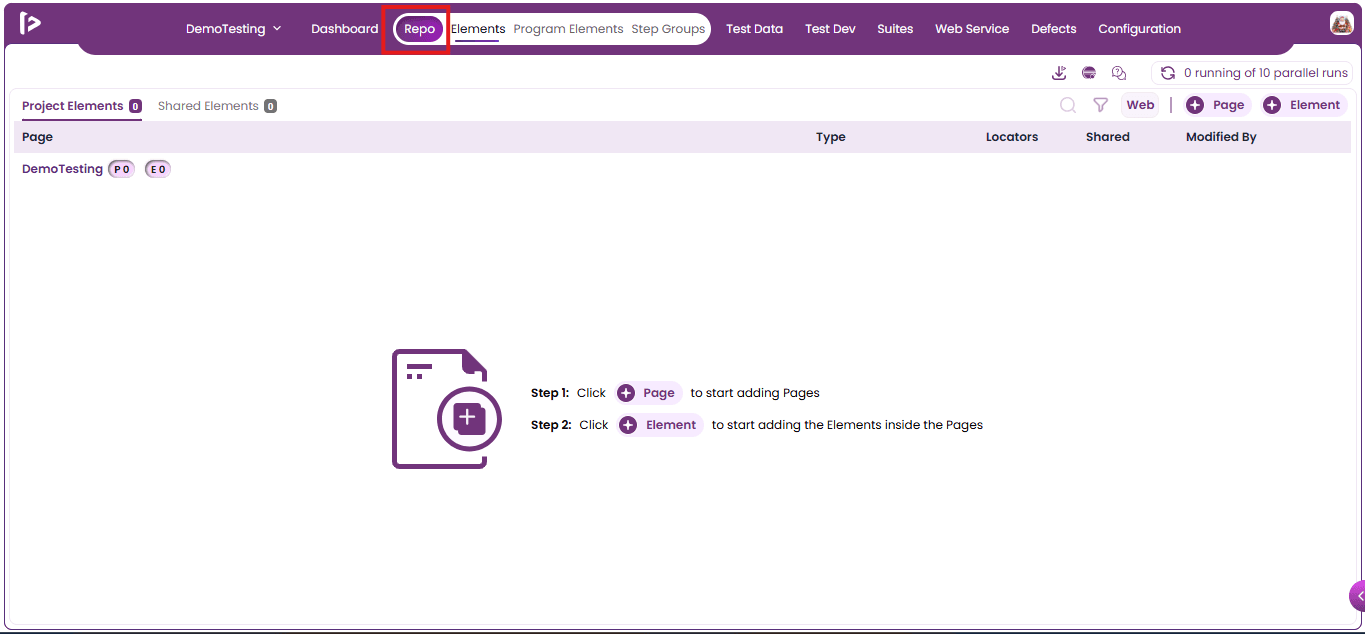
- Click on Step Group.
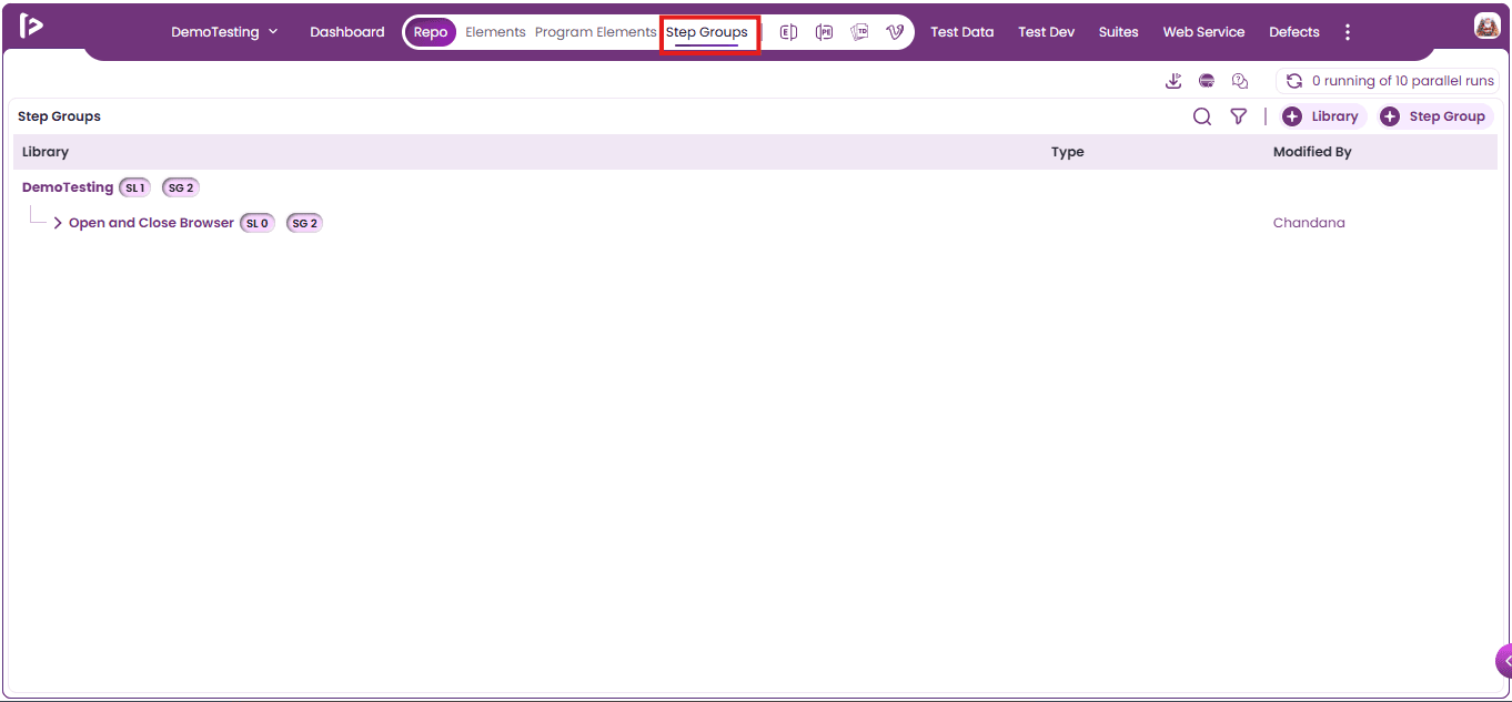
- Click on Test data as shown below.
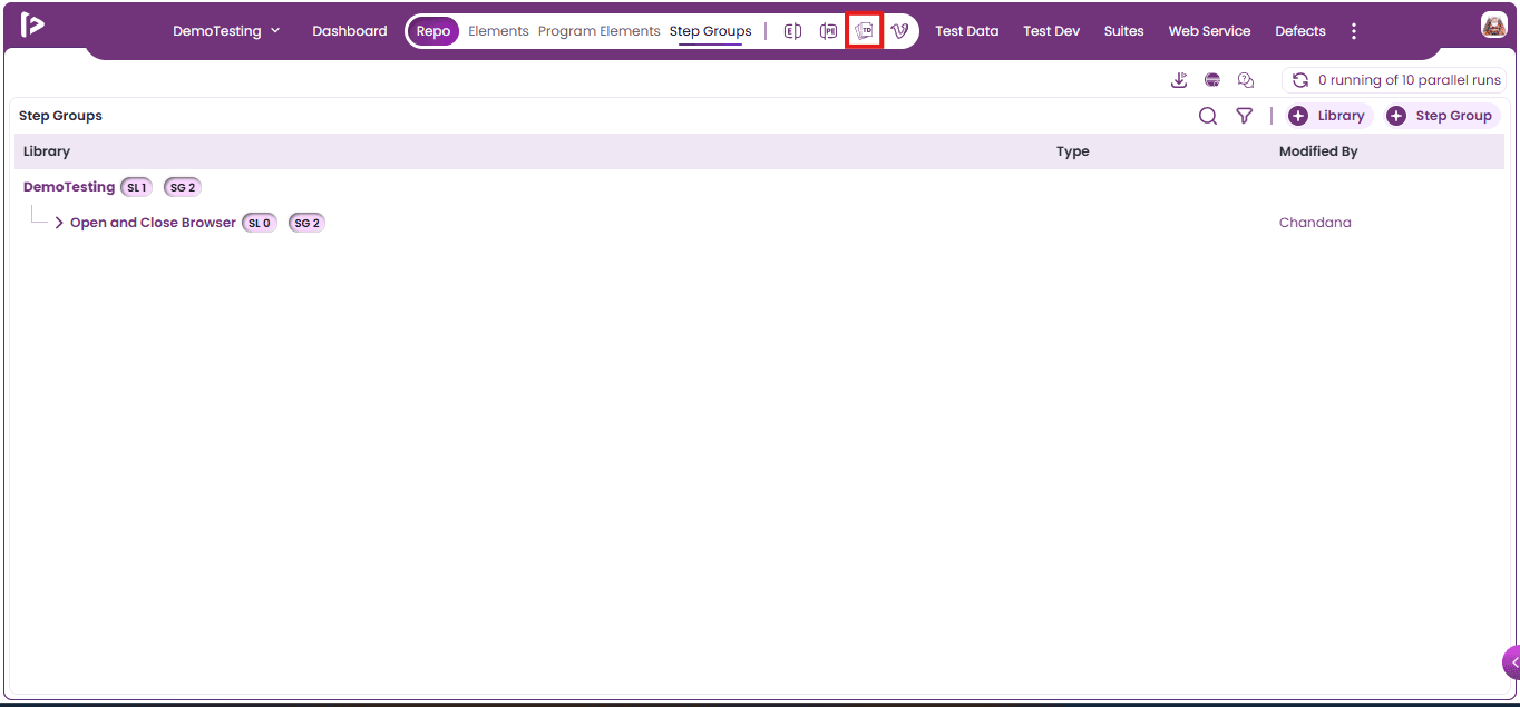
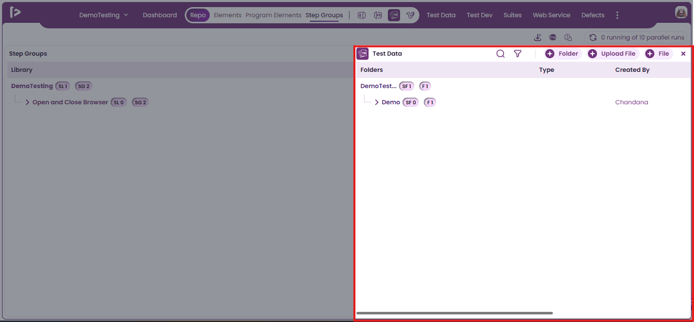
- Upon clicking on Test Data a slider will appear.
Note:
- The Test Data slider is located within the Step Group section.
- Users can perform all the same actions as in the main Test Data section.
- This ensures a consistent experience across both interfaces.
- It also provides a streamlined workflow for managing test data.