Project Elements
Repo : A repository (Repo) is a centralized storage location that organizes and maintains UI elements (Web, Android, iOS, Mobile, MobileWeb), program elements, and step groups in a structured way. These components are reusable across multiple test scripts, ensuring consistency, efficiency, and easier maintenance in automation projects. By storing elements in a central location, teams can collaborate effectively and streamline the development of automated test scripts.
Key Benefits:
- Consistency: Standardized components are used across all scripts.
- Reusability: Components can be created once and reused across multiple scripts.
- Simplified Maintenance: Updates made in a single location automatically apply wherever the component is used.
Prerequisites
To maintain proper organization and manageability, at least one Page must exist before creating or adding any Project Element within the repo.
Navigation
All Projects > Individual Projects > Repo > Elements > Project Elements
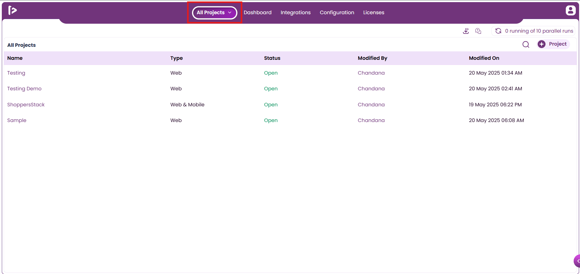
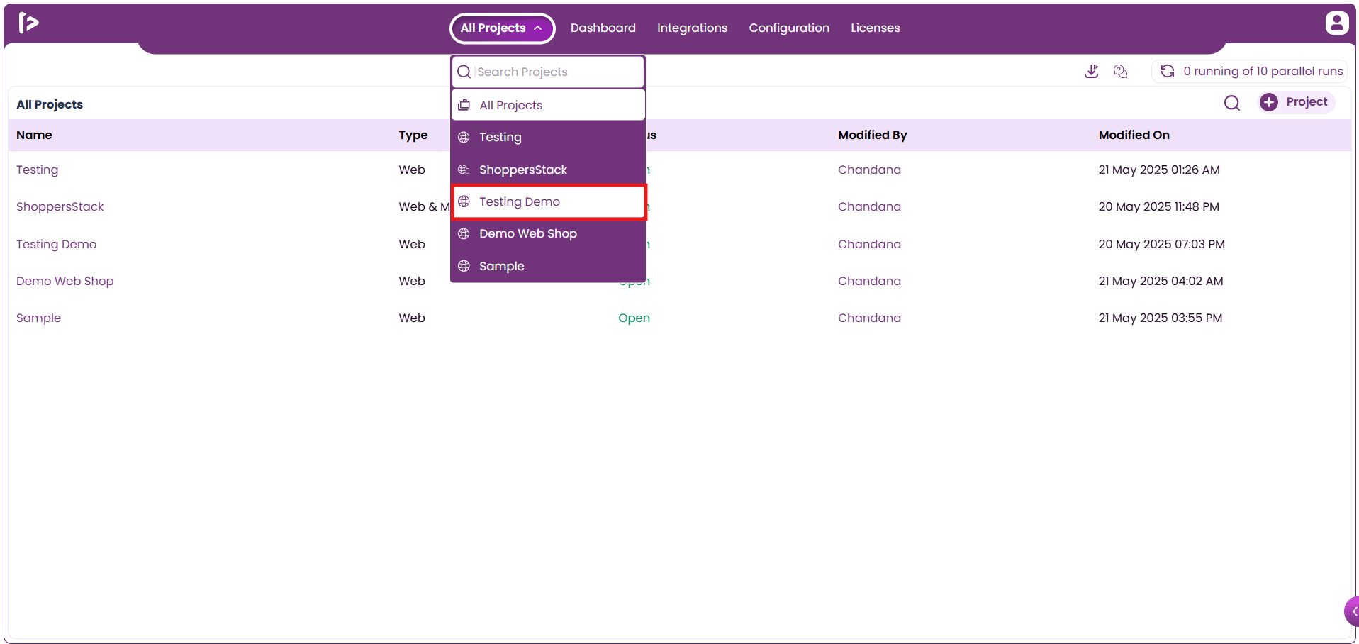
- The user can navigate to an individual project by clicking the ”All Projects” button, as shown below.
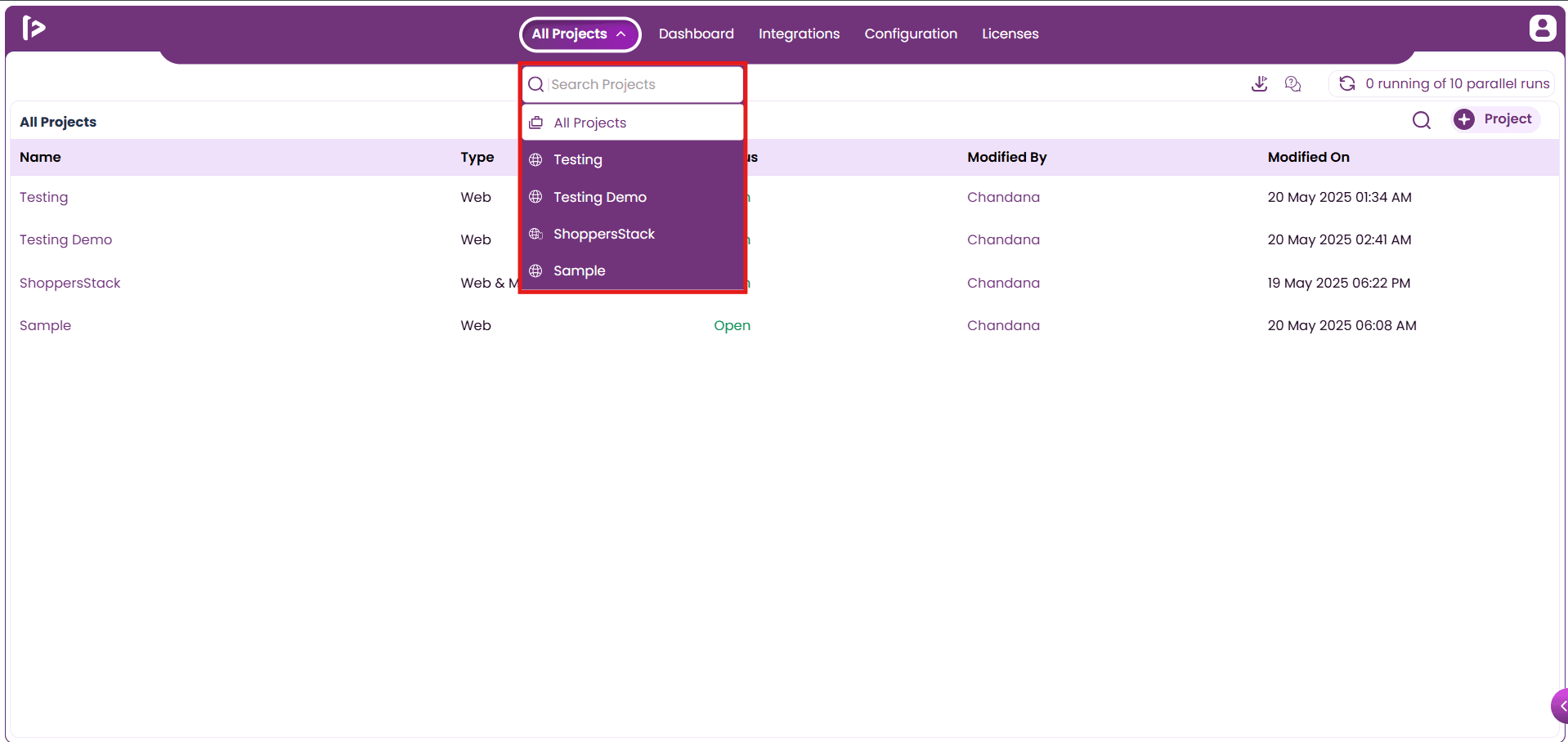
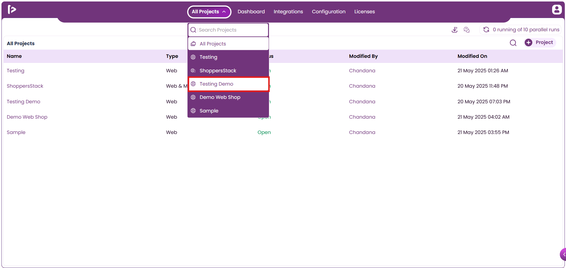
- On hovering over it, the user will see options to select a project, as illustrated below.
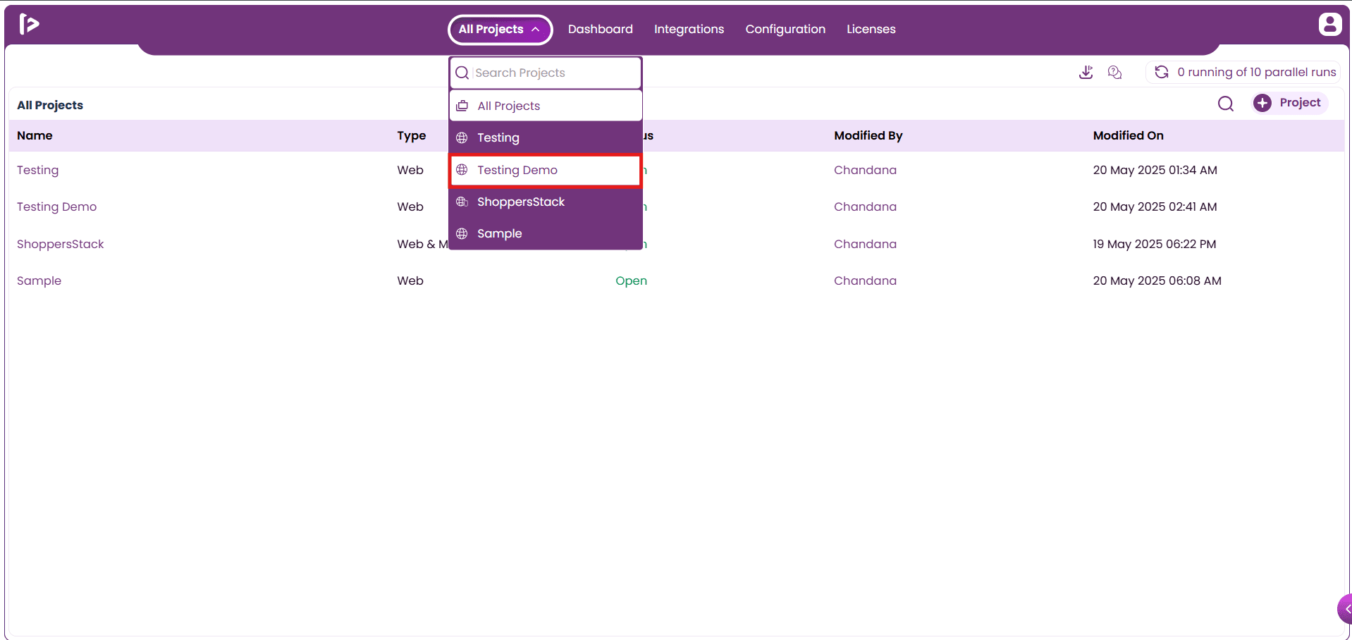
- Click on the desired project to navigate to it, as illustrated below.
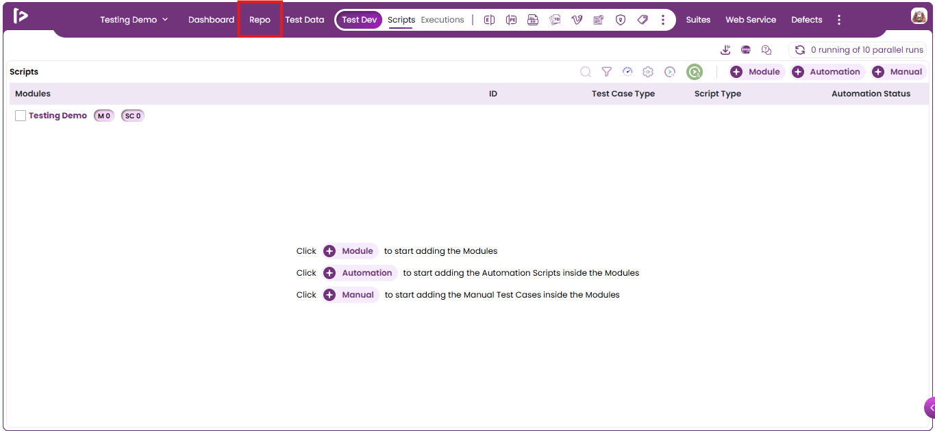
- Click On “Repo” Section.
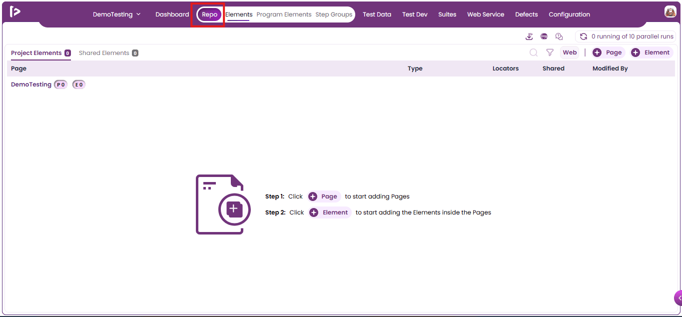
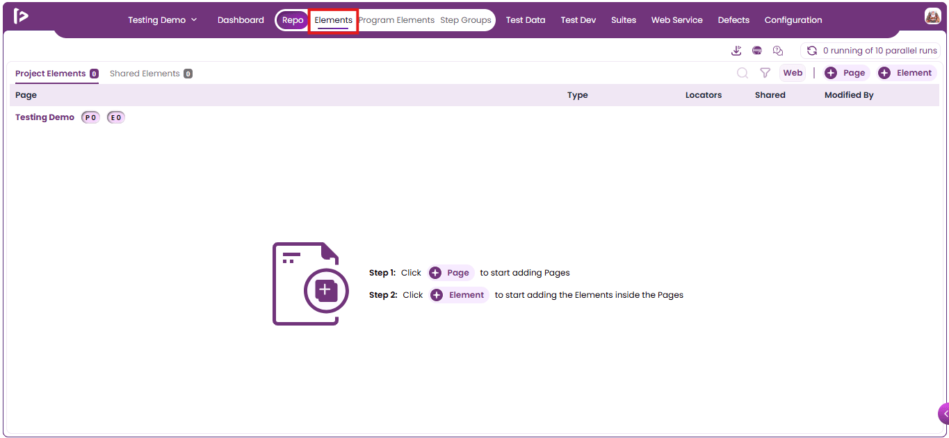
- Upon Clicking The Repo Section, the interface automatically navigates to the Elements tab by default.
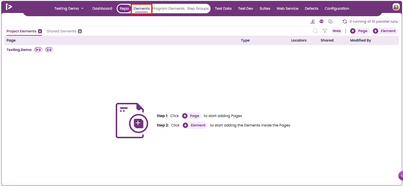
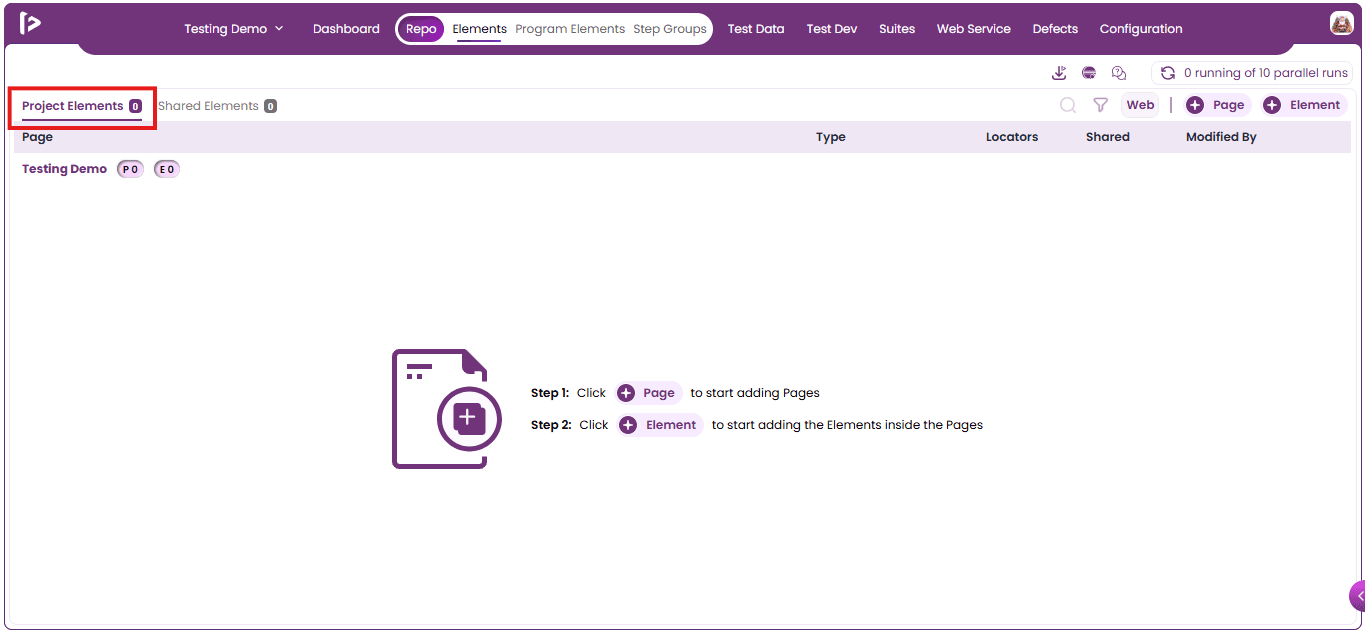
- It Displays the “Project Elements” by default.
Roles Of Page
-
In FireFlink, Pages represent application screens or functional areas, helping organize automation in a structured and maintainable way.
-
Pages group commonly used UI elements and actions—such as login, navigation, and form interactions—so they can be reused across multiple test cases, reducing duplication and improving efficiency.
-
By separating UI details from test logic, Pages make test scripts easier to read and maintain while allowing teams to focus on business workflows.
-
When application UI changes, updates can be made only in the related Page, minimizing maintenance effort. As a core component of FireFlink’s automation framework, Pages support scalable, reusable, and reliable test development aligned with industry best practices.
Process of Creating a Page
This section outlines the fundamental steps involved in creating a project element within FireFlink.
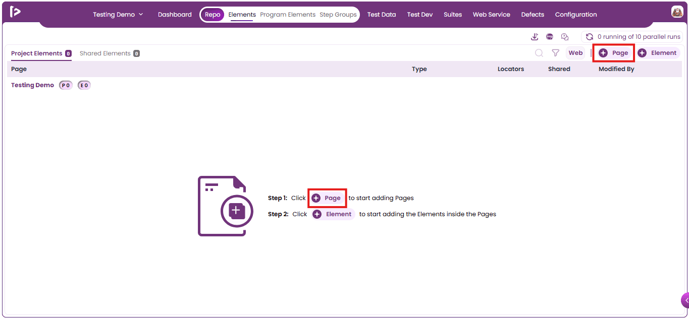
- To create a new page, click the “+ Page” button.
- Note: If no pages have been created yet, the “+ Page” button appears at the center of the screen, prompting users to add their first page to the repo.
- “Create Page” Slider will Be Displayed
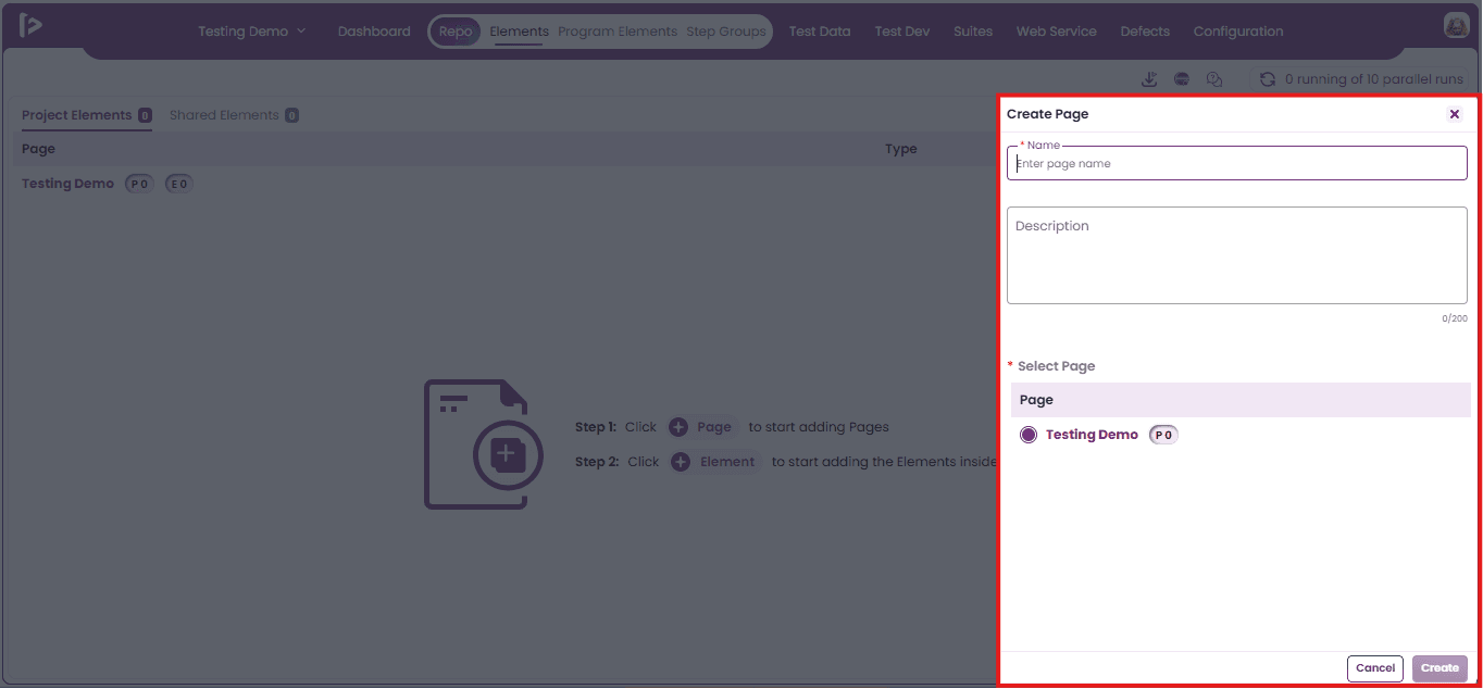
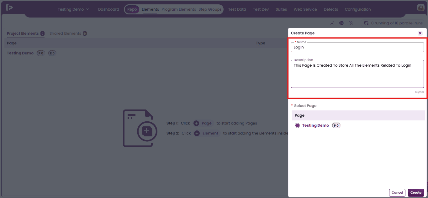
- Enter the mandatory Name field and optionally provide a Description for the page.
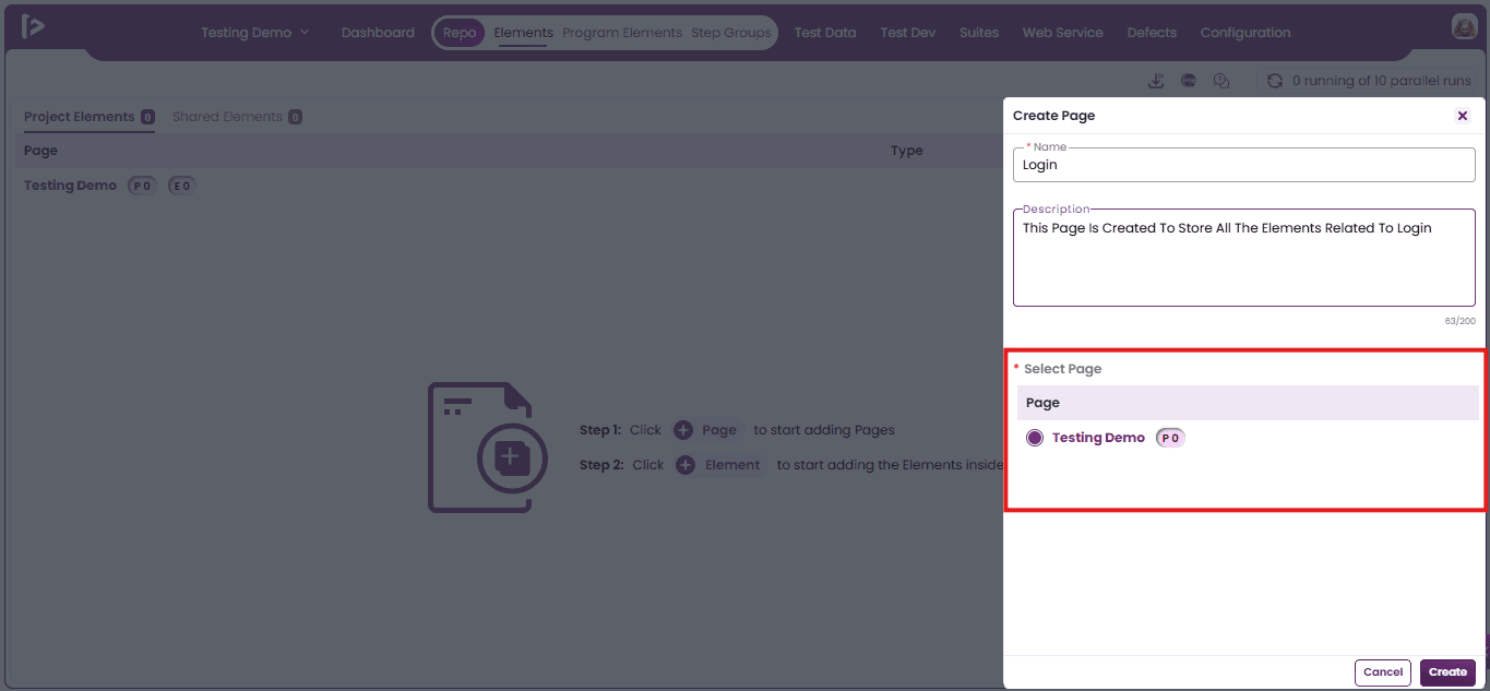
- Select the parent page under which the new page should be created.
- Note : During the first page creation, the root page is selected as the parent by default.
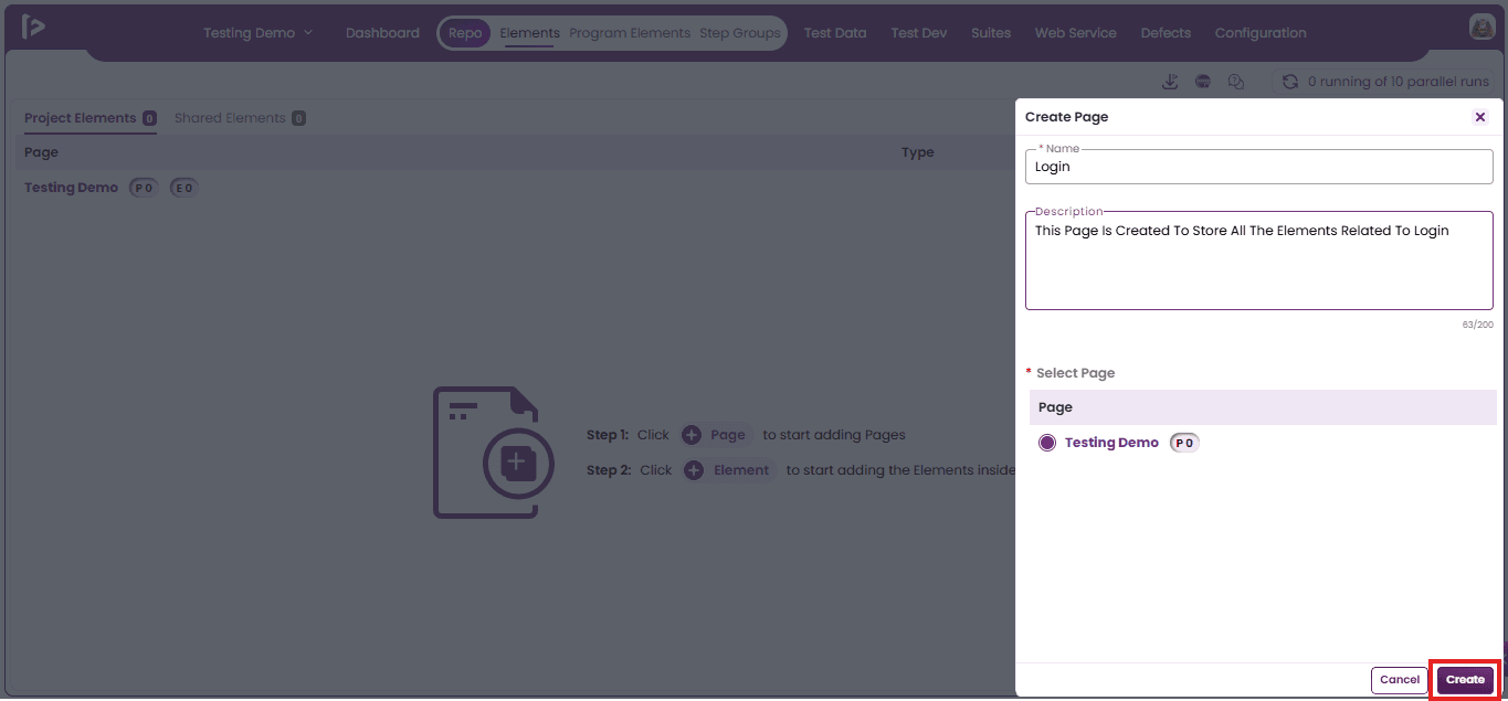
- Click on the Create button.
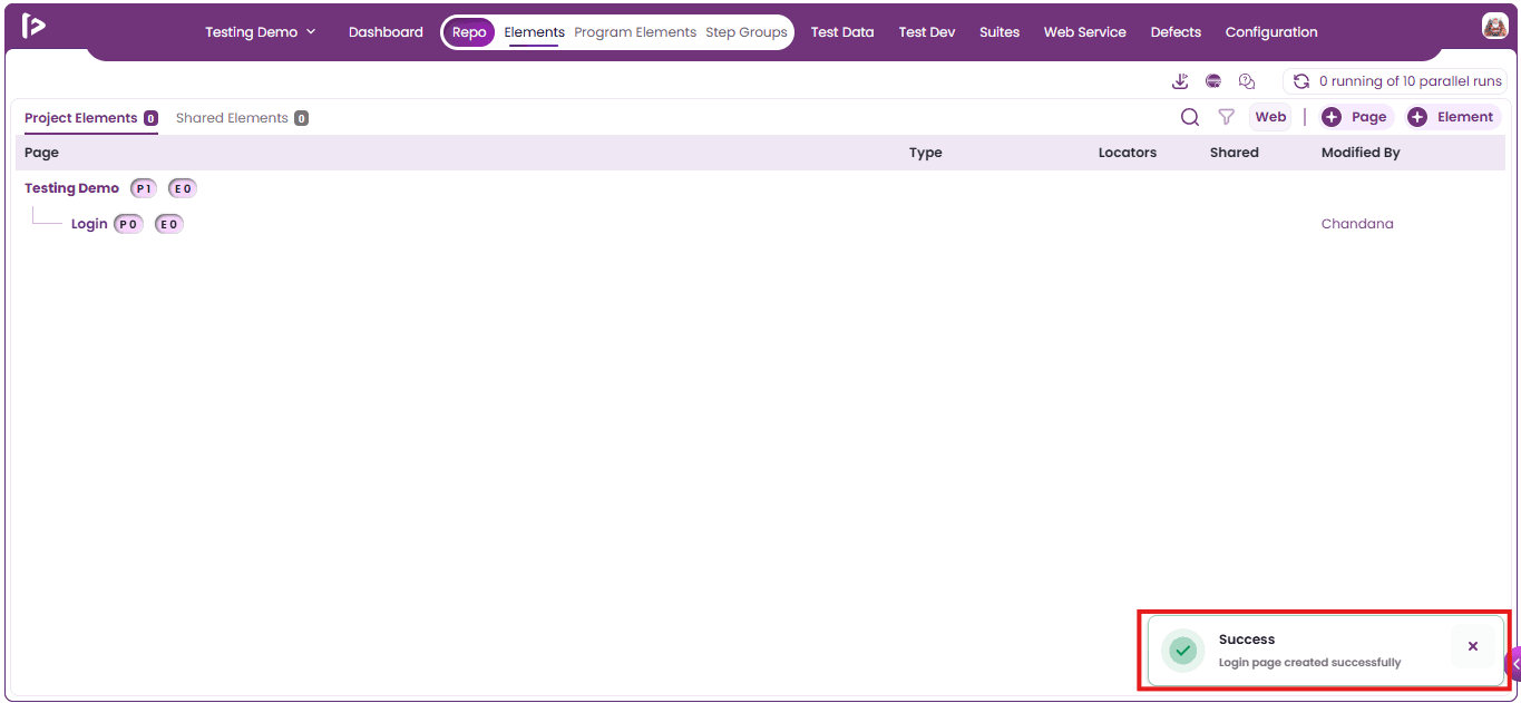
- A confirmation message indicating successful page creation will be displayed as shown below.
Columns under Project Elements
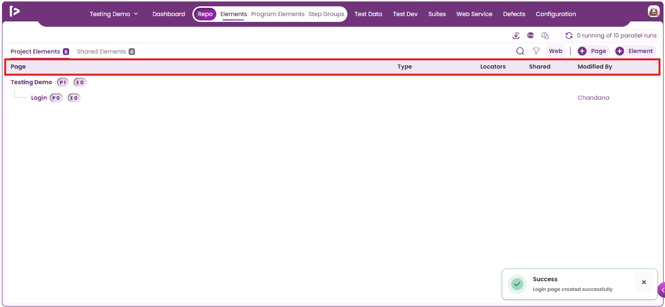
-
Page: Displays the page where the element is defined, helping organize elements based on application screens.
-
Type: Indicates the element type, such as Button, Text Field, Link, or Dropdown, helping identify the UI component.
-
Locators: Shows the locator strategy (e.g., XPath, CSS Selector, ID) used to identify the element during automation execution.
-
Shared: Indicates whether the element is shared and reusable across multiple pages or test cases, improving consistency and maintainability.
-
Modified By : Displays the user who last updated the element, supporting audit tracking and collaboration.
Roles Of Sub Page
-
In FireFlink, Sub Pages help organize application screens by representing sections within a main page, making the repo structure clearer and easier to manage.
-
Sub Pages act as child pages under a parent page, allowing complex UI workflows to be divided into smaller, manageable sections for better automation organization.
Prerequisites for Creating a Sub-Page
To create a Sub Page, a corresponding Parent Page must already exist.
Process of Creating a Sub Page
In FireFlink, there are two primary methods to add a Sub Page:
- Using + Page Button
- Using ‘+’ icon displayed beside Page
Method 1: Using “+ Page” Button
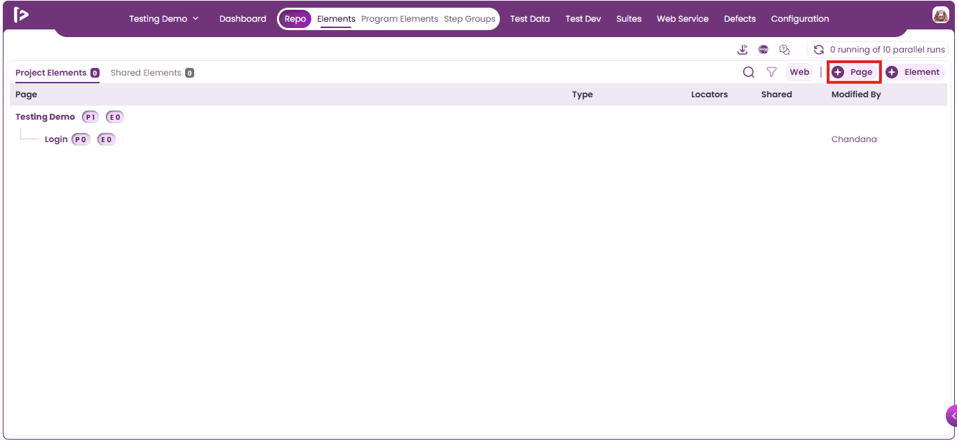
- Click on** + Page** Button as displayed below
- The Create Page slider will appear.
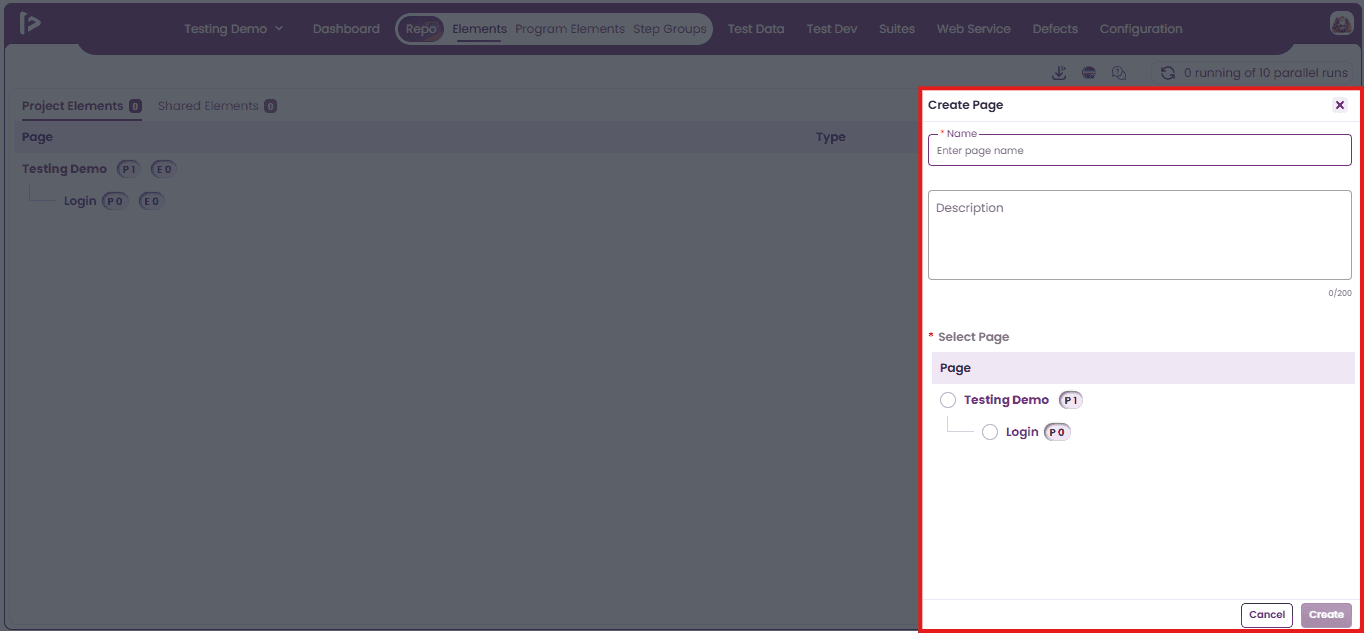
- Fill the mandatory Name field and, if needed, include a Description for the Sub Page.
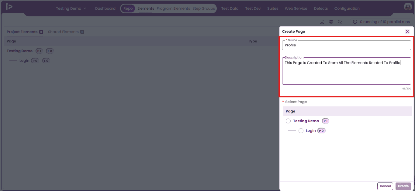
- Select the Parent Page under which the Sub-Page should be added.
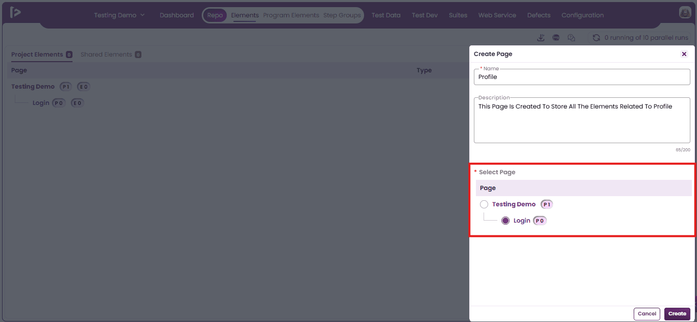
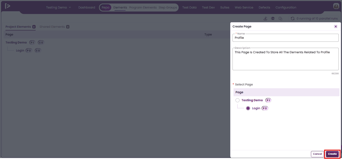
- After selecting the page, the user can click on Create Button.
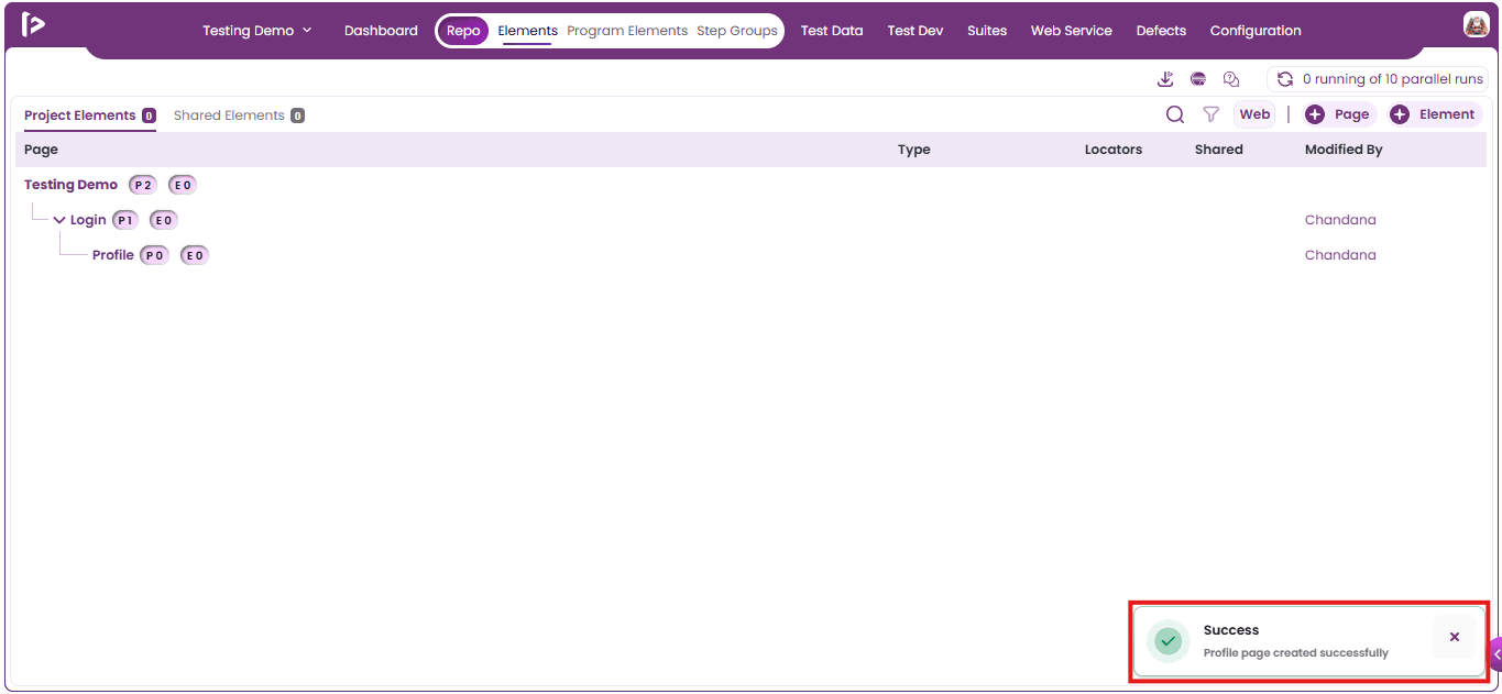
- A success message is displayed upon the successful creation of a Sub Page.
Method 2: Using “+” icon displayed beside the Page
- Place the cursor over the desired page and click the '+' icon as displayed below.
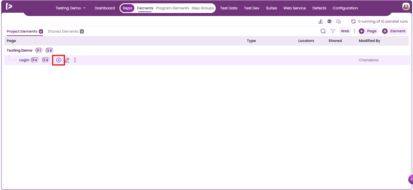
- Hovering over the '+' icon displays additional pointer options, as shown below.
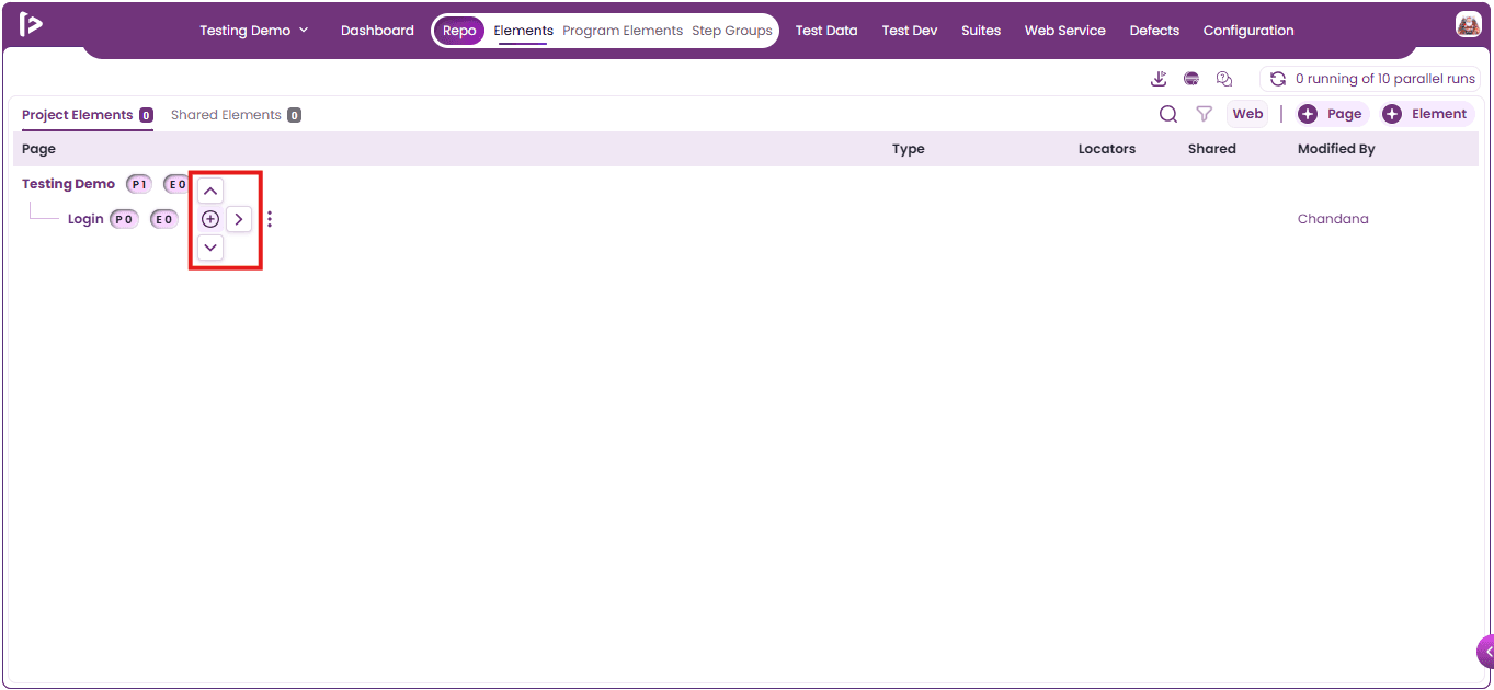
- Click on Right Pointer as displayed below.
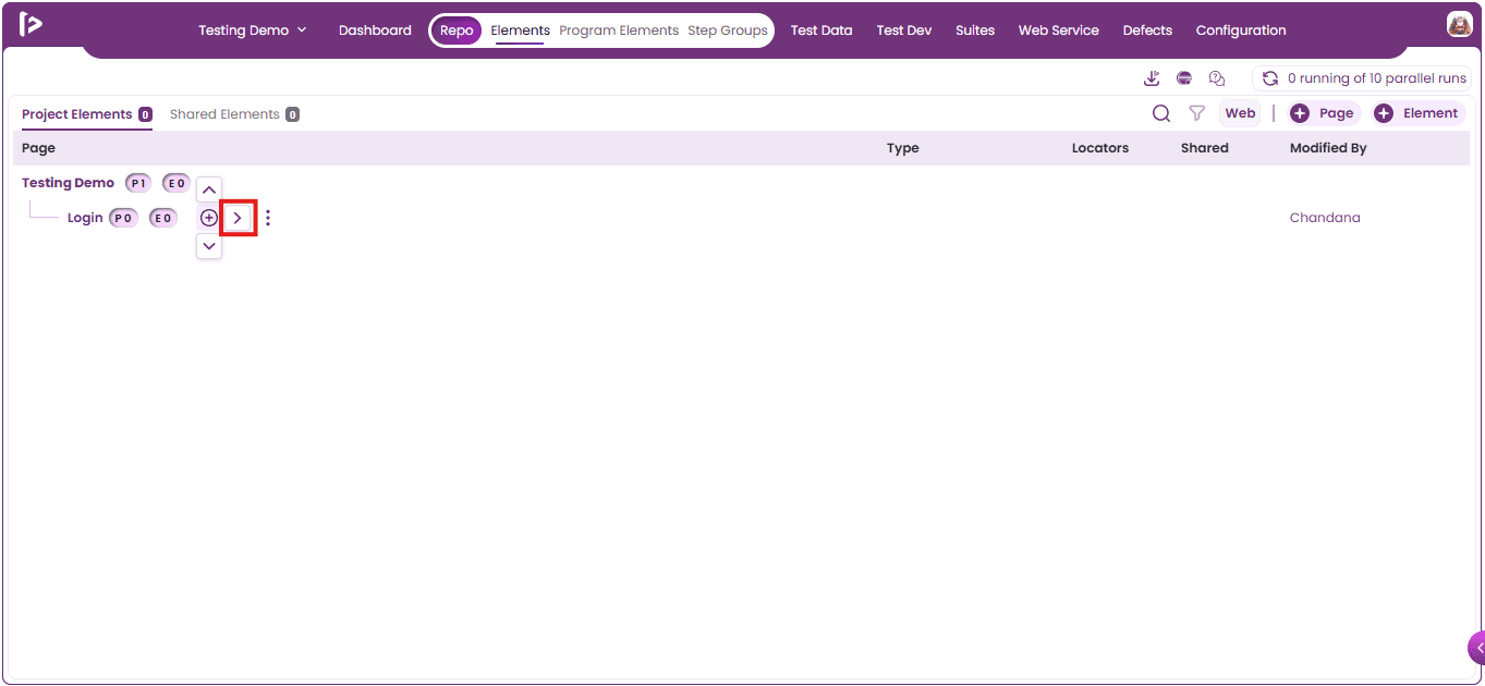
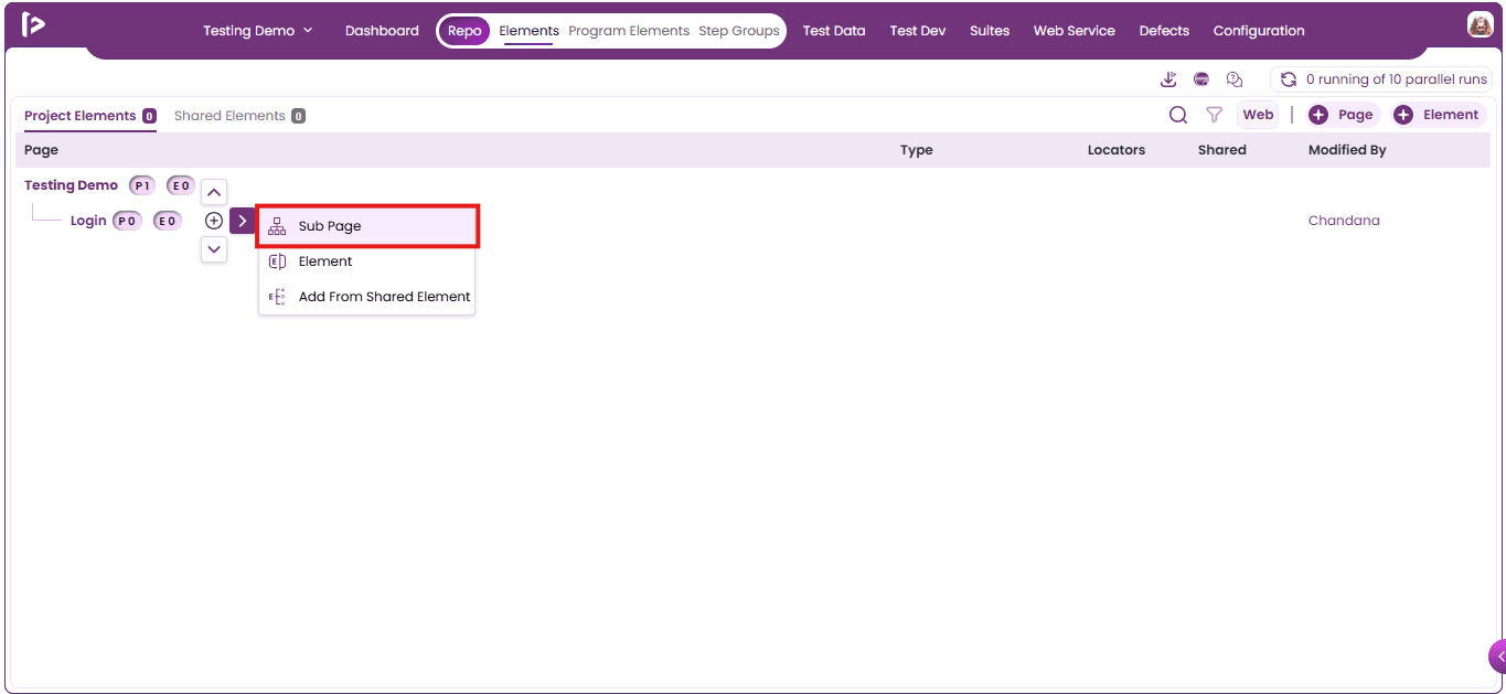
- Upon selecting the right arrow pointer, a list of additional options is displayed, as illustrated below.
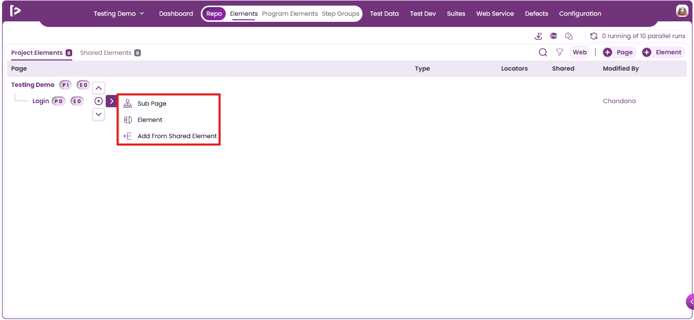
- Click on the Sub Page option.
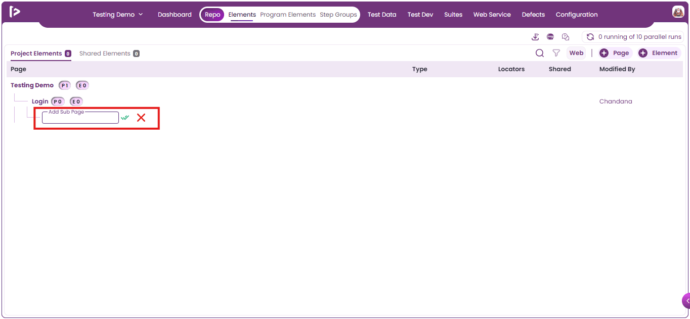
- A text input field titled 'Add a Sub Page' is displayed, as illustrated below.
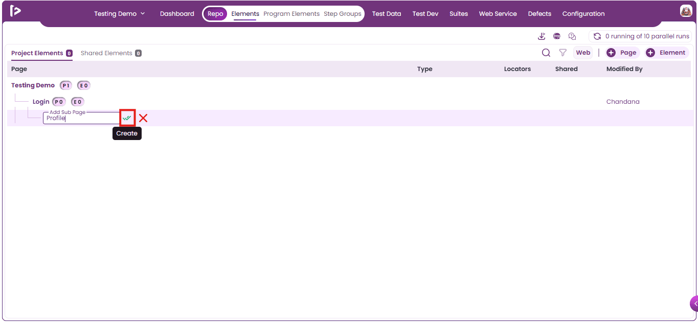
- Enter the name for the sub page and click on the Create button as shown below.
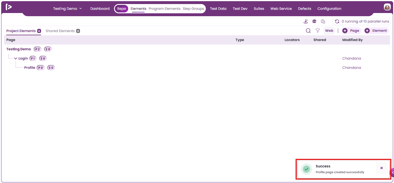
- A success message is displayed upon the successful creation of a Sub Page.
Note : A user is not allowed to create multiple pages with the same name under the same parent page.
Process to Creating a Project Element
Users can add UI elements to a Page or Sub Page using any of the following methods:
- Manually adding an element
- Using FireFlink Finder or Locator Finder
- Using the Quick Access Panel in Test Dev
- Using the Quick Access Panel in Step Groups
Method 1 : Manually Adding an Element
- To create an element, click the ‘+ Element’ button as shown below.
- Note: The ‘+ Element’ button remains disabled until at least one page is created.
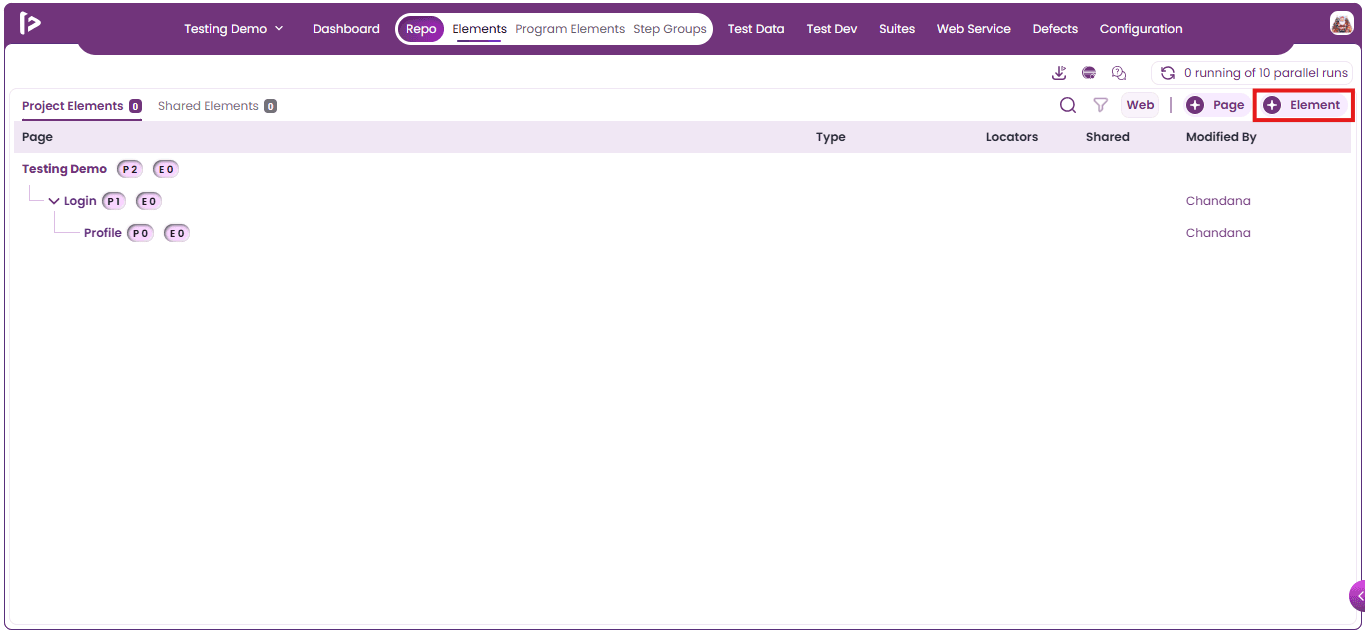
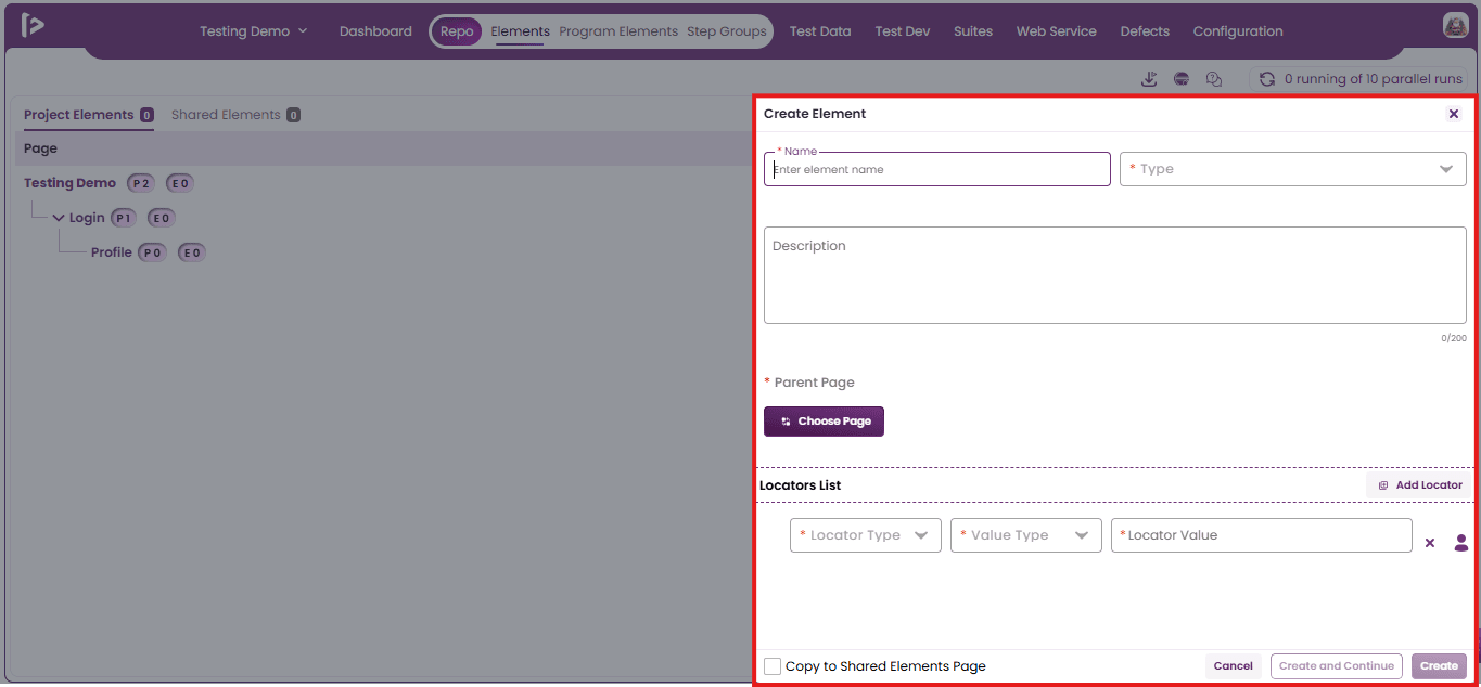
- The Create Element page appears, as shown below.
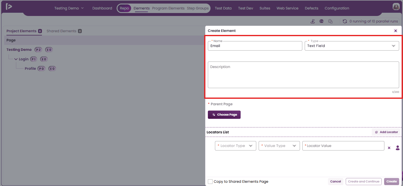
- Enter valid data in the Name, Type, and Description fields. The Name text field and the Type dropdown are required.
- Select the Parent Page under which user wants to create the element. This is also a mandatory field.
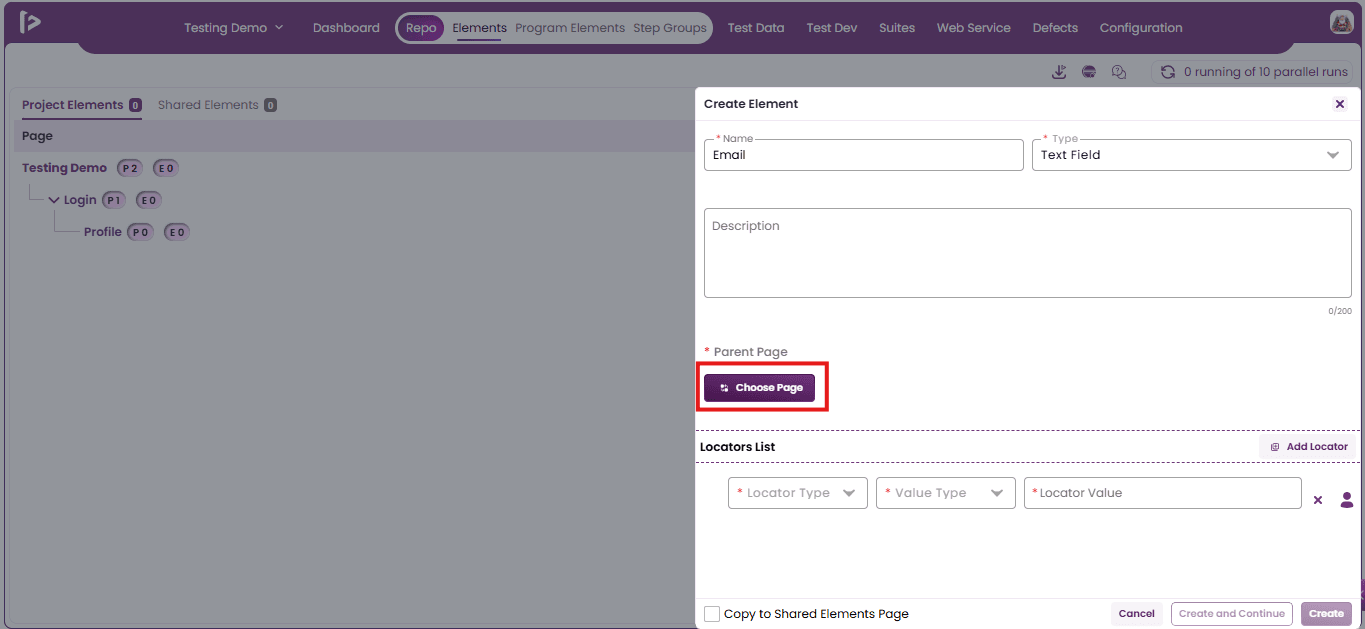
- The Select Page slider appears.
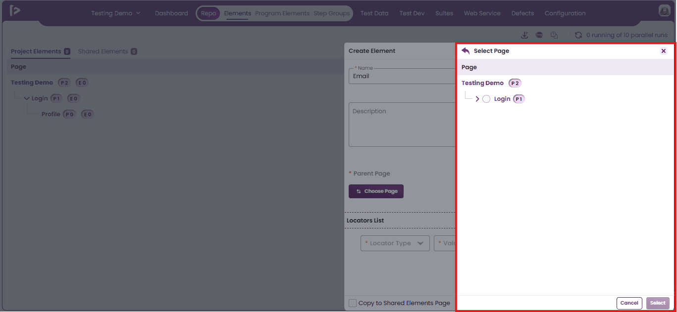
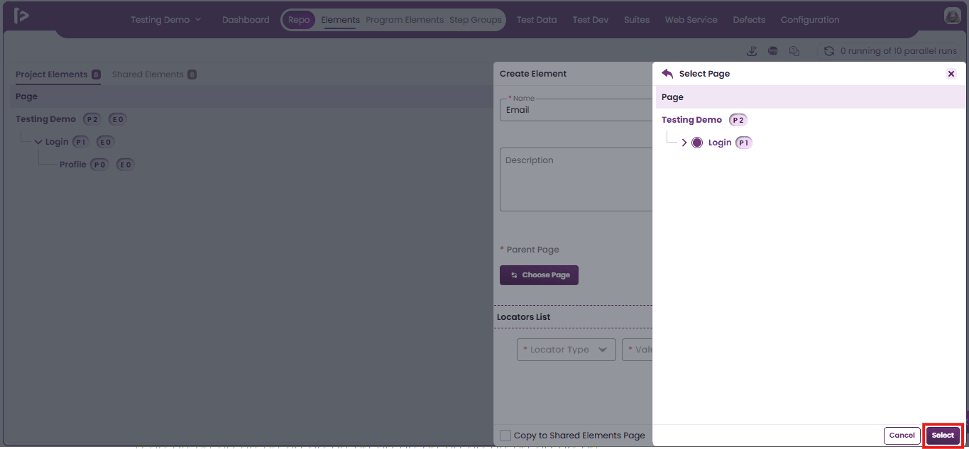
- Select the Parent Page under which the user wants to create the element, then click the Select button.
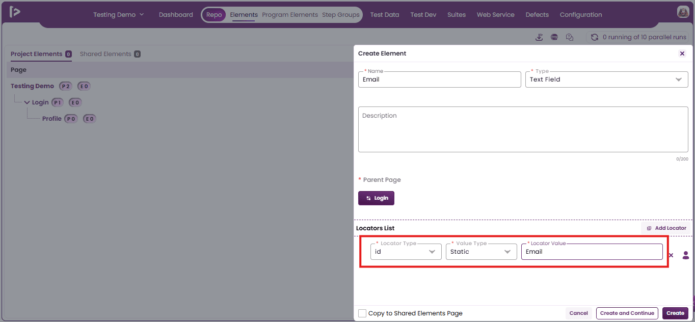
- Manually add locators by selecting Locator Type, Value Type, and entering the Locator Value in the Locators List section.
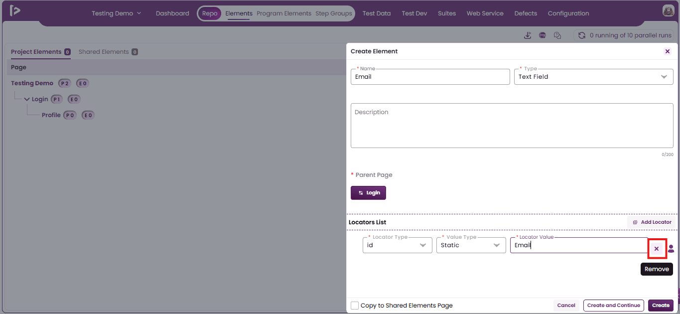
- To remove a locator entry from the Locators List, click the Cross icon located at the end of the respective row, as shown below
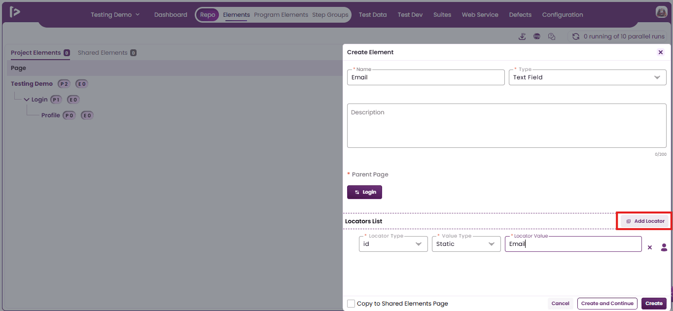
- To add new locator details, click the Add Locator button. This creates a new row in the Locators List.
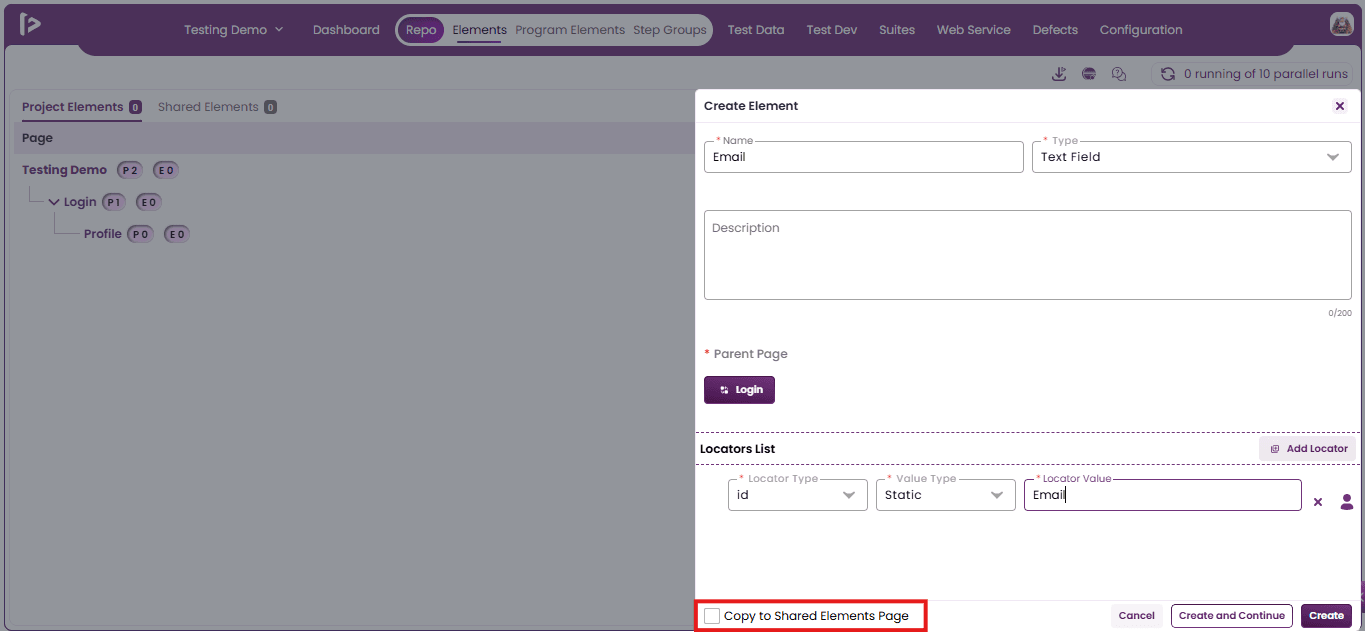
Note: Selecting the Copy to Shared Elements Page checkbox makes the element available in Shared Elements for reuse across the project.
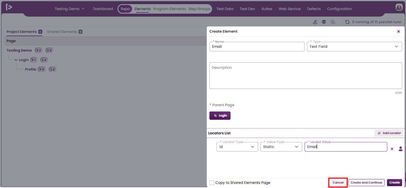
- Click the 'Cancel' button to exit the element creation process and return to the previous screen without saving the entered details.
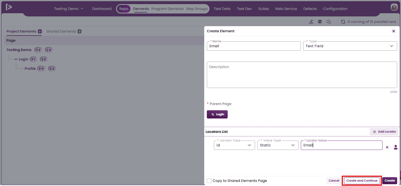
- Click the 'Create and Continue' button to save the current element and seamlessly proceed to create an additional element.
- Click the Cancel button to exit the element creation process without saving the entered details and return to the previous screen.
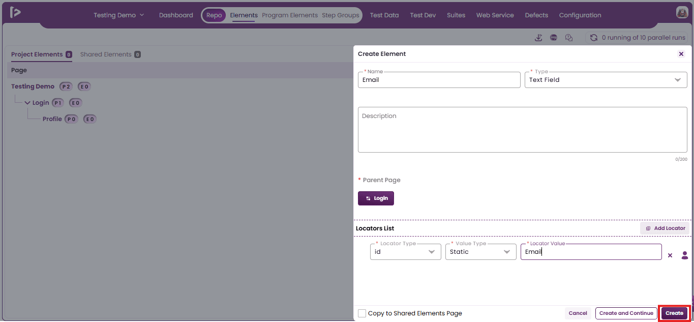
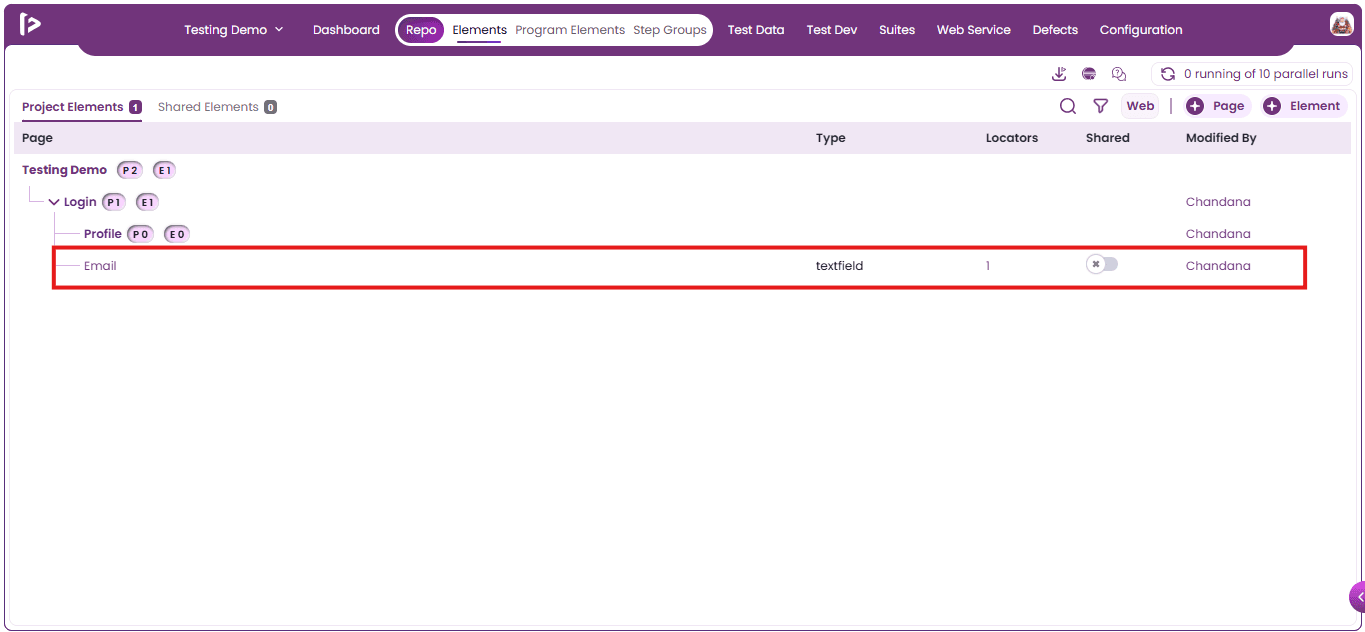
- Click the Create button to save the element and return to the element list view.
Method 2 :Using FireFlink Finder or Locator Finder
The FireFlink Finder tool provides a simplified and efficient way to generate reliable and optimized locators for UI elements across various platforms, including Web, Android, iOS, and enterprise applications, with a single click.
Prerequisites Before initiating the locator generation process, users must install the FireFlink Client on their system. It is a lightweight, standalone tool.
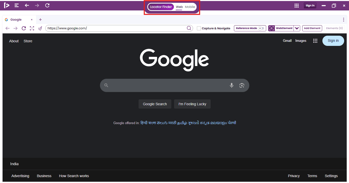
- Upon launching the FireFlink Client and signing in, the user is navigated by default to the Locator Finder section. From here, select the appropriate type either Web or Mobile based on your testing requirements..
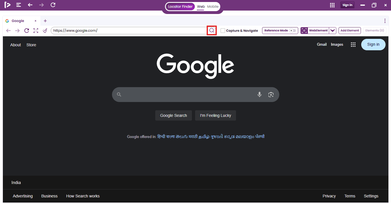
- To get started, enter the web URL into the search box, as shown in the image below.
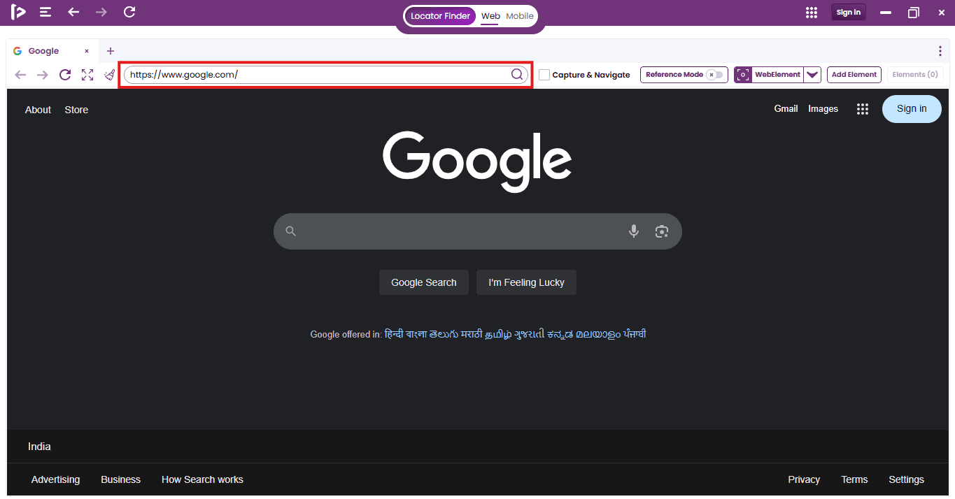
- Once the URL is entered, then click the search icon illustrated below to load the page.
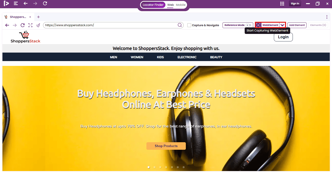
- Once the page is fully loaded, initiate the locator capturing process by clicking the 'Rec' button.
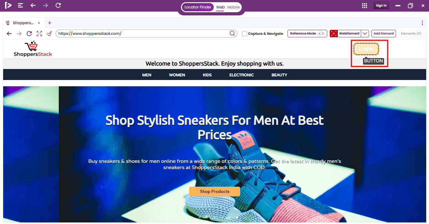
- Perform a single click on the desired UI element to capture its locator.
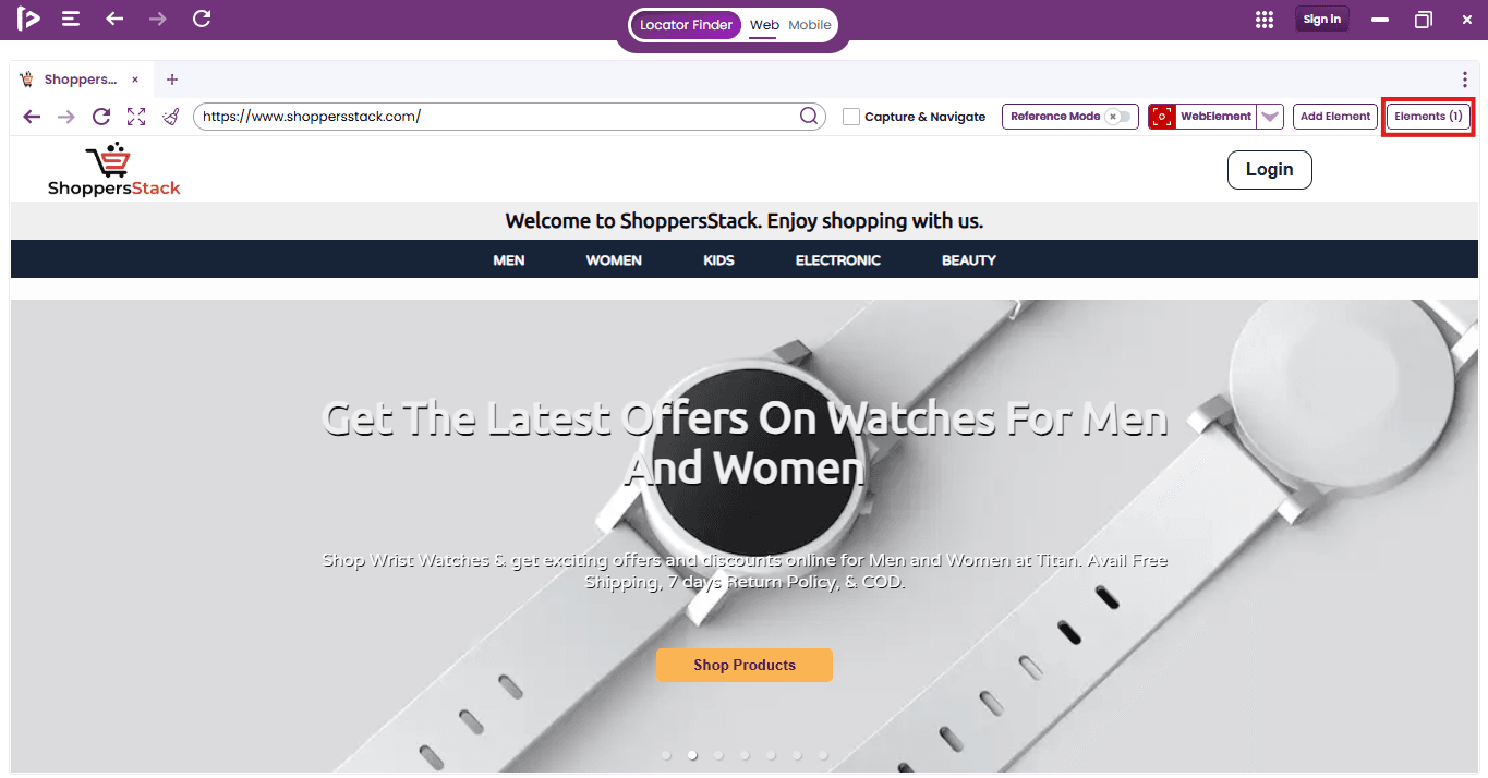
- As user click on UI elements, the count on the 'Elements' button increases. Once user selected all required elements.
- Click the 'Rec' button again to stop recording.
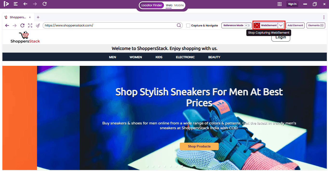
- Click the 'Elements' button to access the list of UI component locators that have been recorded.
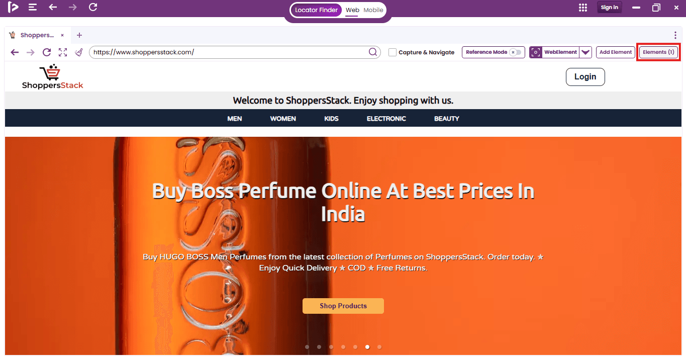
- FireFlink Finder automatically identifies each UI element’s name and type, and creates several optimized locators for it.
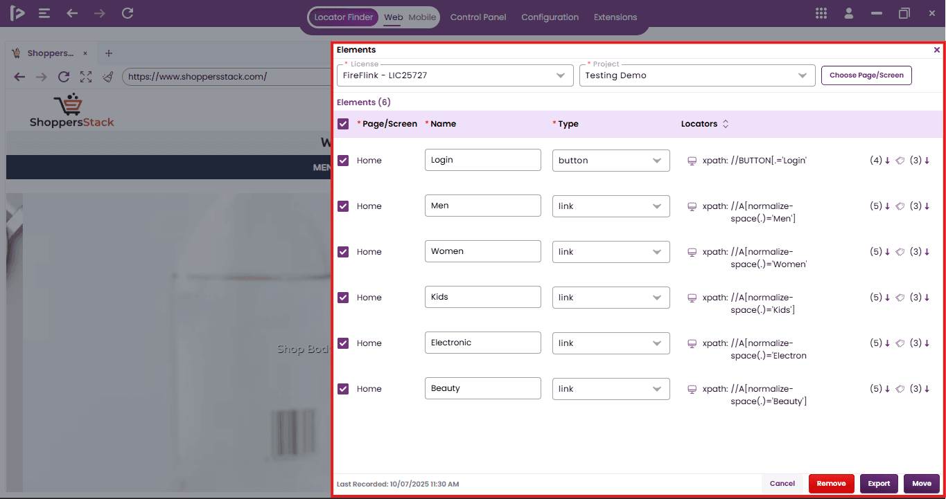
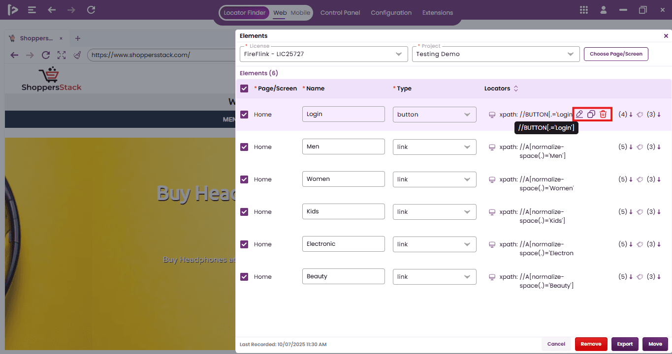
- Upon mouse hovering on locator value users can edit, copy, and delete individual locator entries as needed.
- Without signing in, users can still generate and export locators using FireFlink Finder in Excel format by clicking on the Export button.
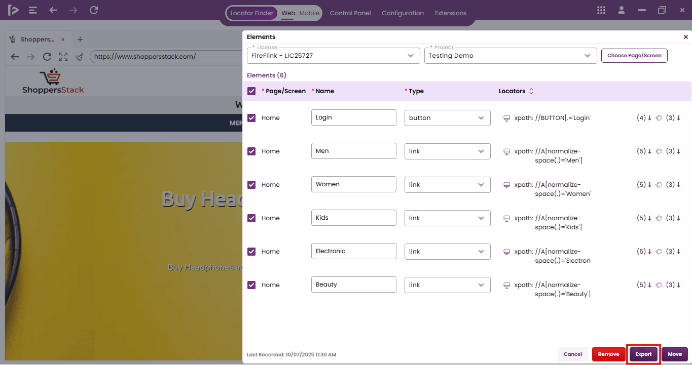
-
Logged-in users can additionally push locators directly to the FireFlink Platform for seamless integration into test automation.
-
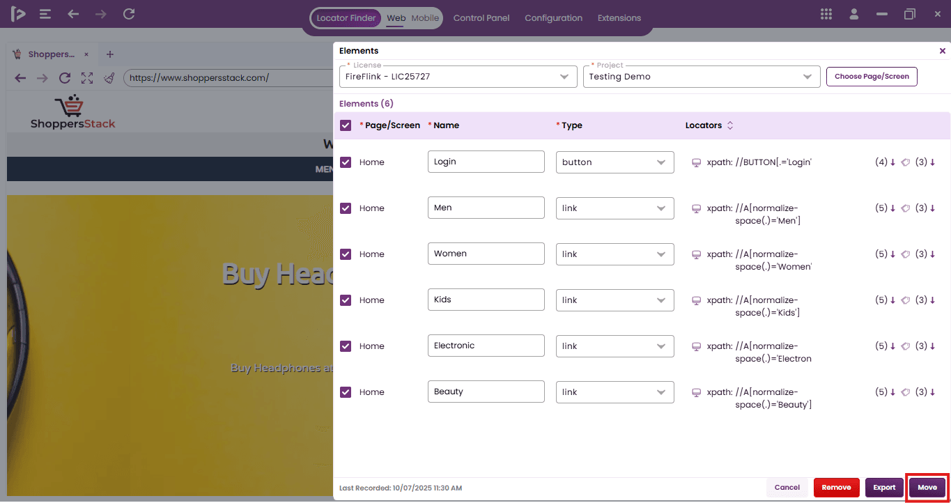
To move the selected UI elements to the FireFlink Platform, begin by selecting the desired elements using checkboxes. This will activate the 'Move' button. Click the 'Move' button, choose the appropriate license and project, then click the 'Assign Page' button to move the elements to the designated page.
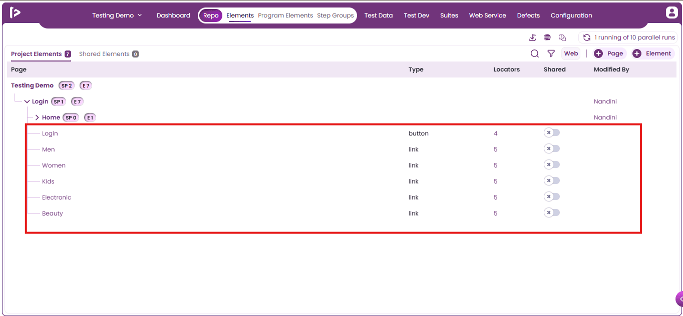
- The moved elements can be accessed from the 'Project Elements' section on the FireFlink Platform.
- In addition to automatic capture, FireFlink Finder tool supports manual addition of UI elements. (Refer Locator Finder Document in the FireFlink Client section for the detailed steps)
Method 3 : Using Quick Actions in Test Dev
- Click on the project the user wants to navigate as shown below.
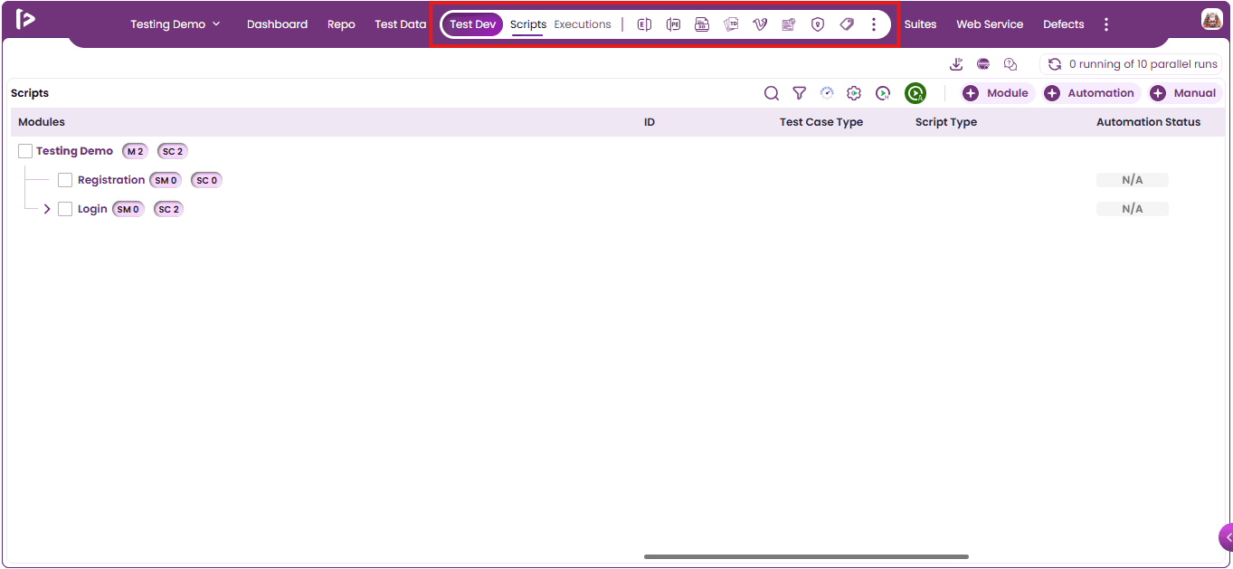
- Upon selecting an individual project, the user is automatically directed to the Test Dev section, where the Quick Access Toolbar is readily available at the top.
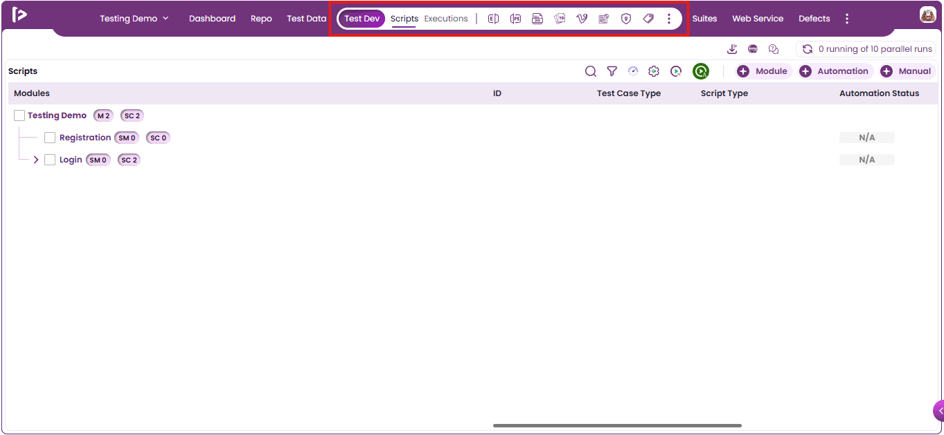
- Click On ‘Elements’ Icon As Shown Below.
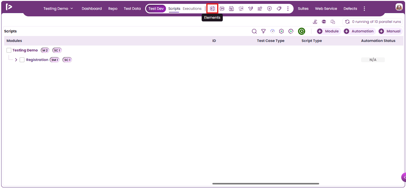
- Project Element Slider Will Be Displayed As Shown Below.
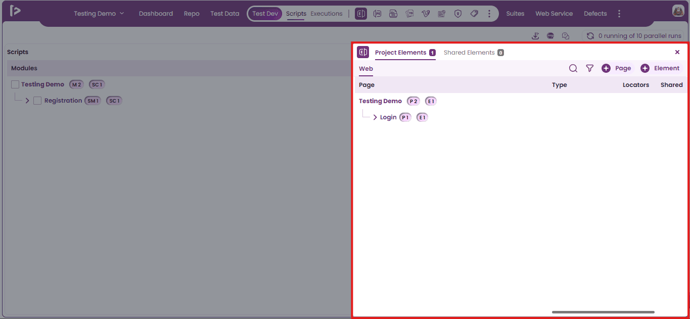
- To create an element, click the ‘+ Element’ button as illustrated below.
- The ‘Create Element’ Slider will then appear, as shown below.
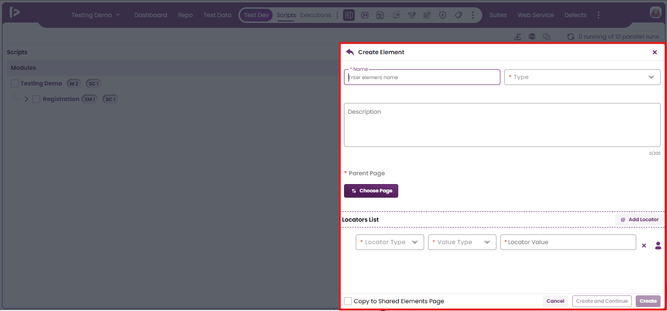
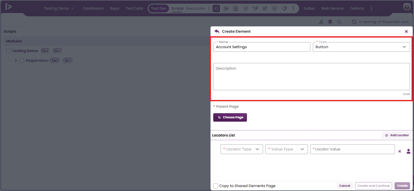
- Enter valid data in the Name Type and Description fields. The Name text field and the Type dropdown are required.
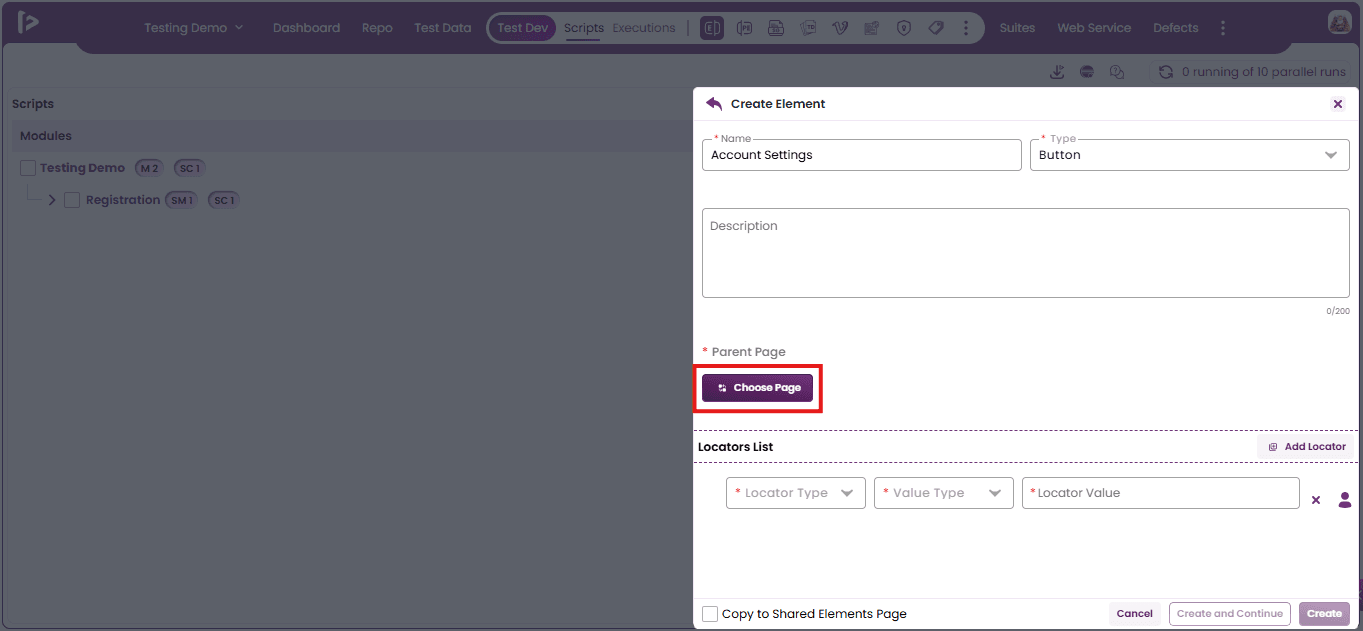
- Click On Choose Page Button As shown below.
- The ‘Select Page’ slider will appear.
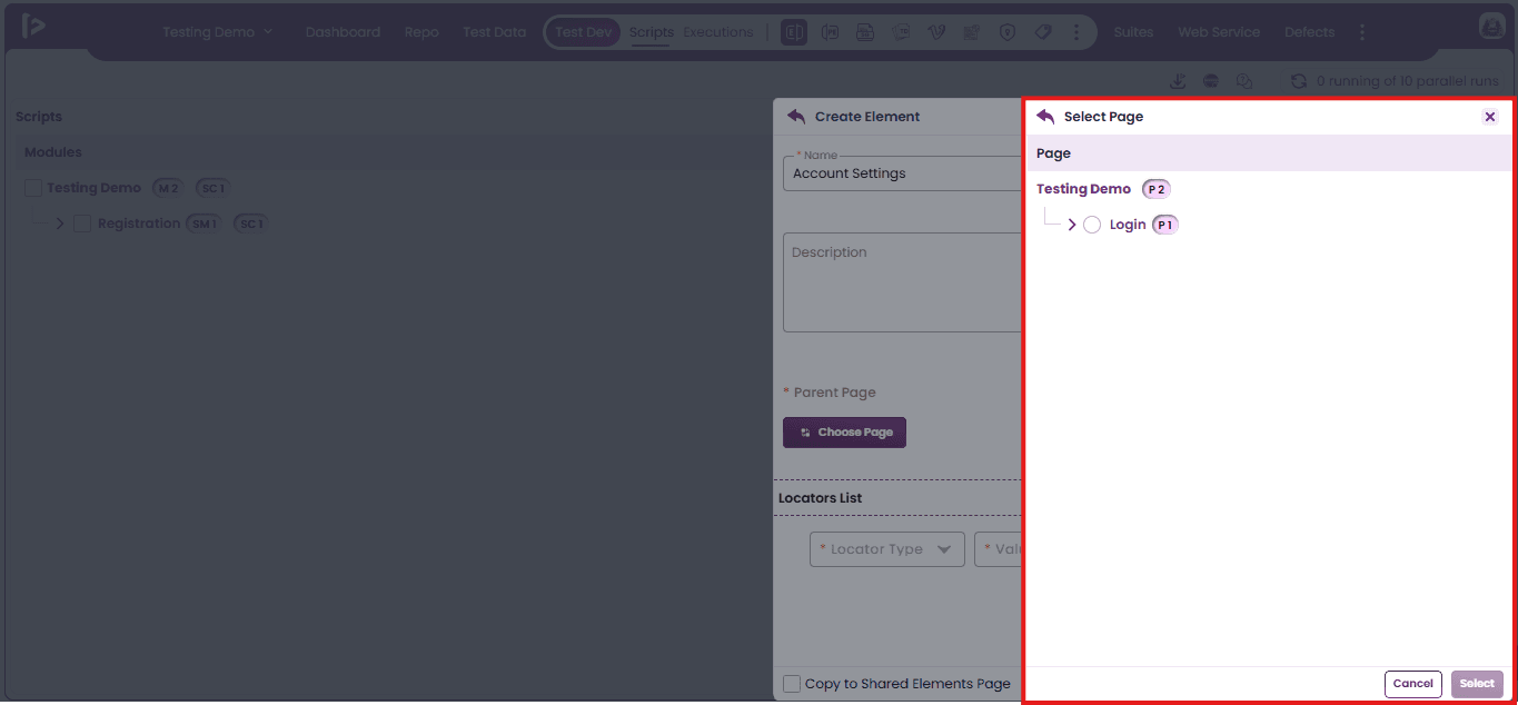
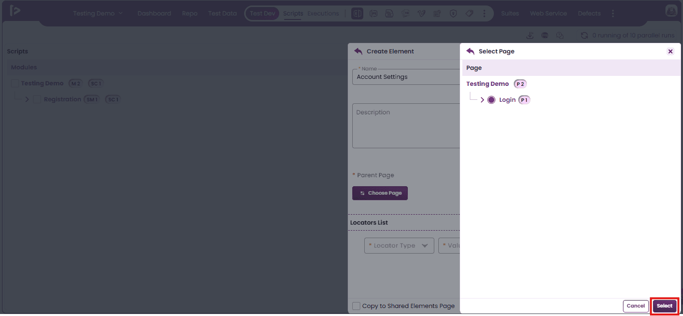
- Select the Parent Page under which user wants to create the element—this is also a mandatory field.And Click On ‘Select’ Button.
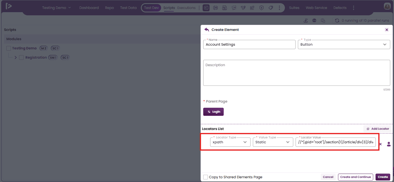
- Manually add locators by selecting the Locator Type, Value Type, and entering the Locator Value in the Locators List section.
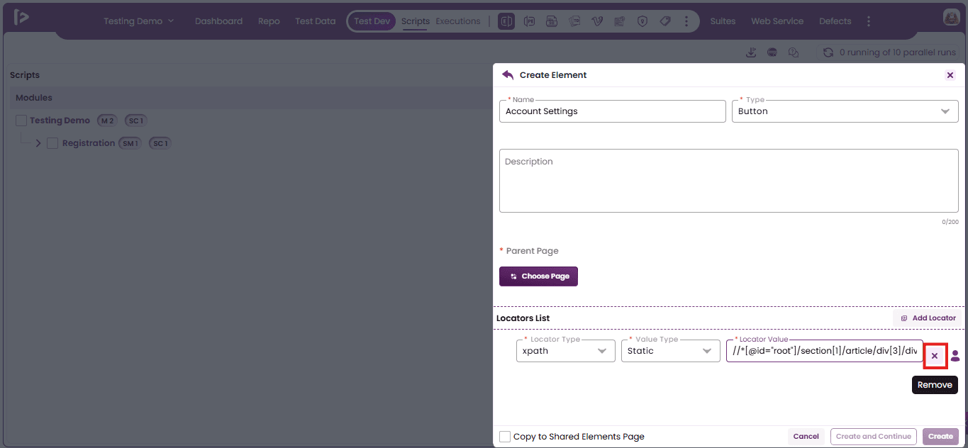
- To remove a locator entry from the Locators List, click the Cross icon located at the end of the respective row As Shown Below.
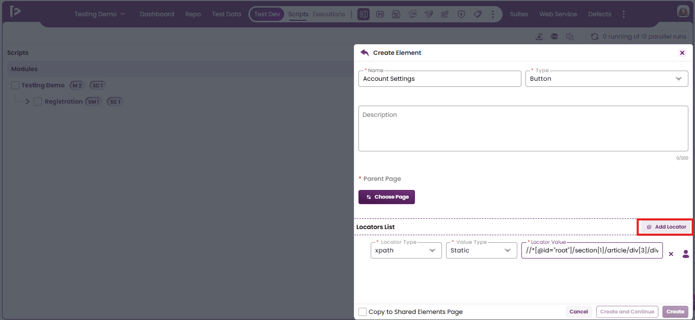
- Click the 'Add Locator' button to add a new row for entering additional locator details in the Locators List section.
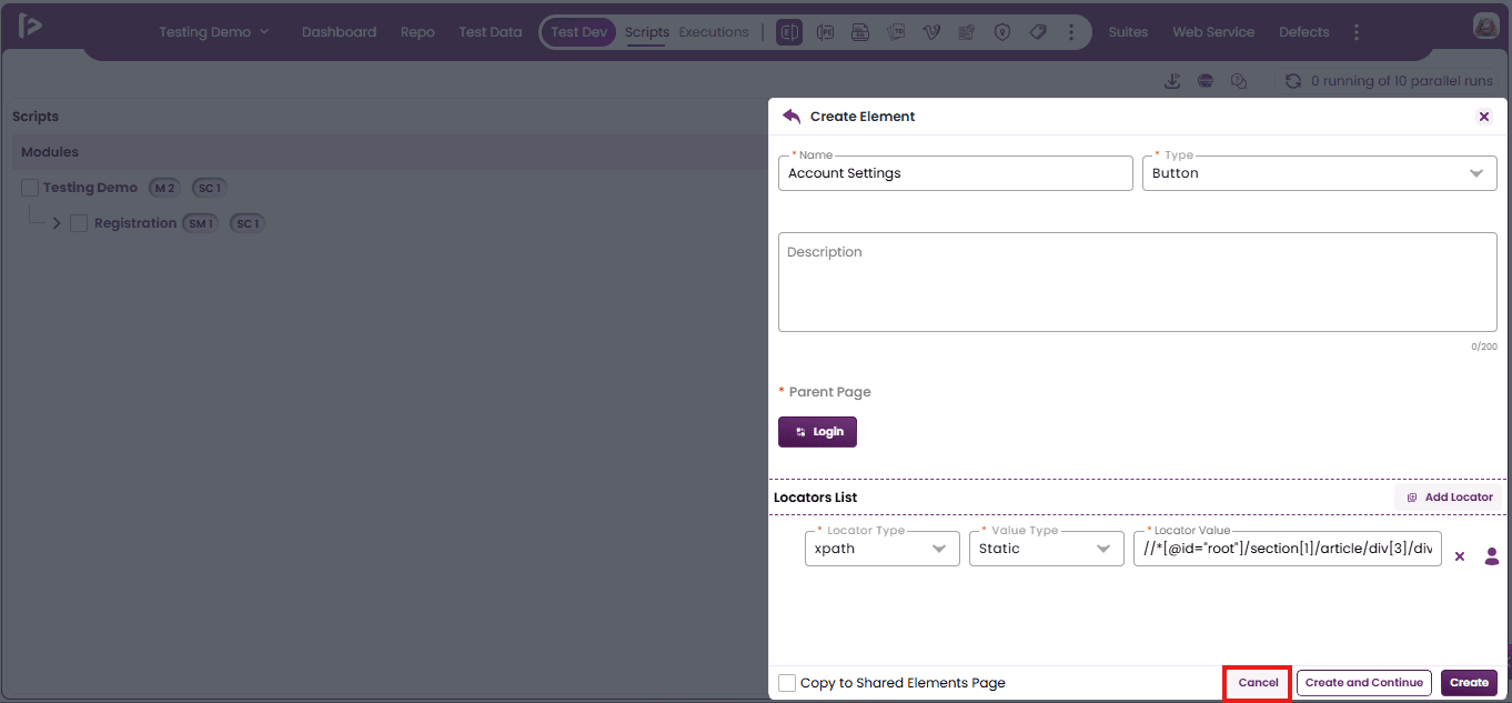
- Click the 'Cancel' button to exit the element creation process and return to the previous screen without saving the entered details.
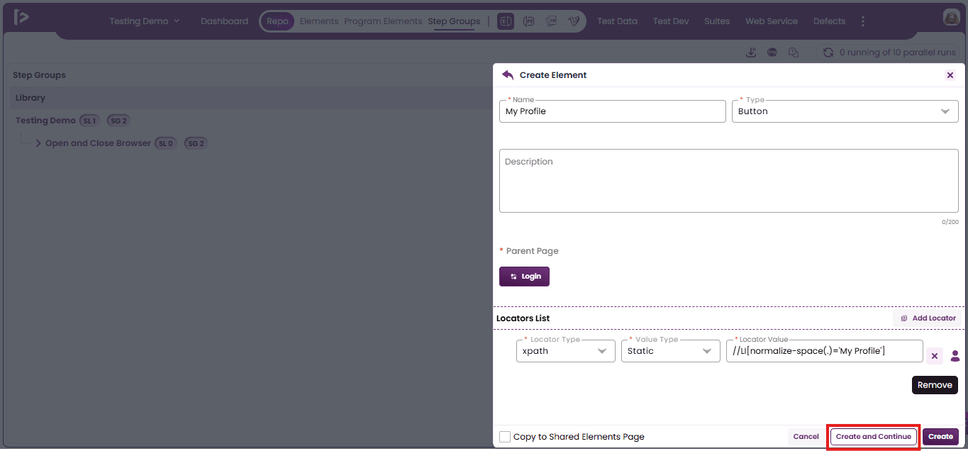
- Click the 'Create and Continue' button to save the current element details and remain on the same page.
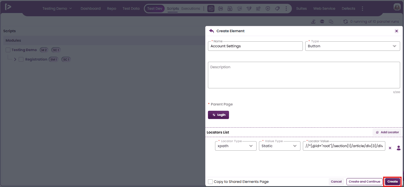
- Click the 'Create' button to save the element with the provided details and return to the element list view.
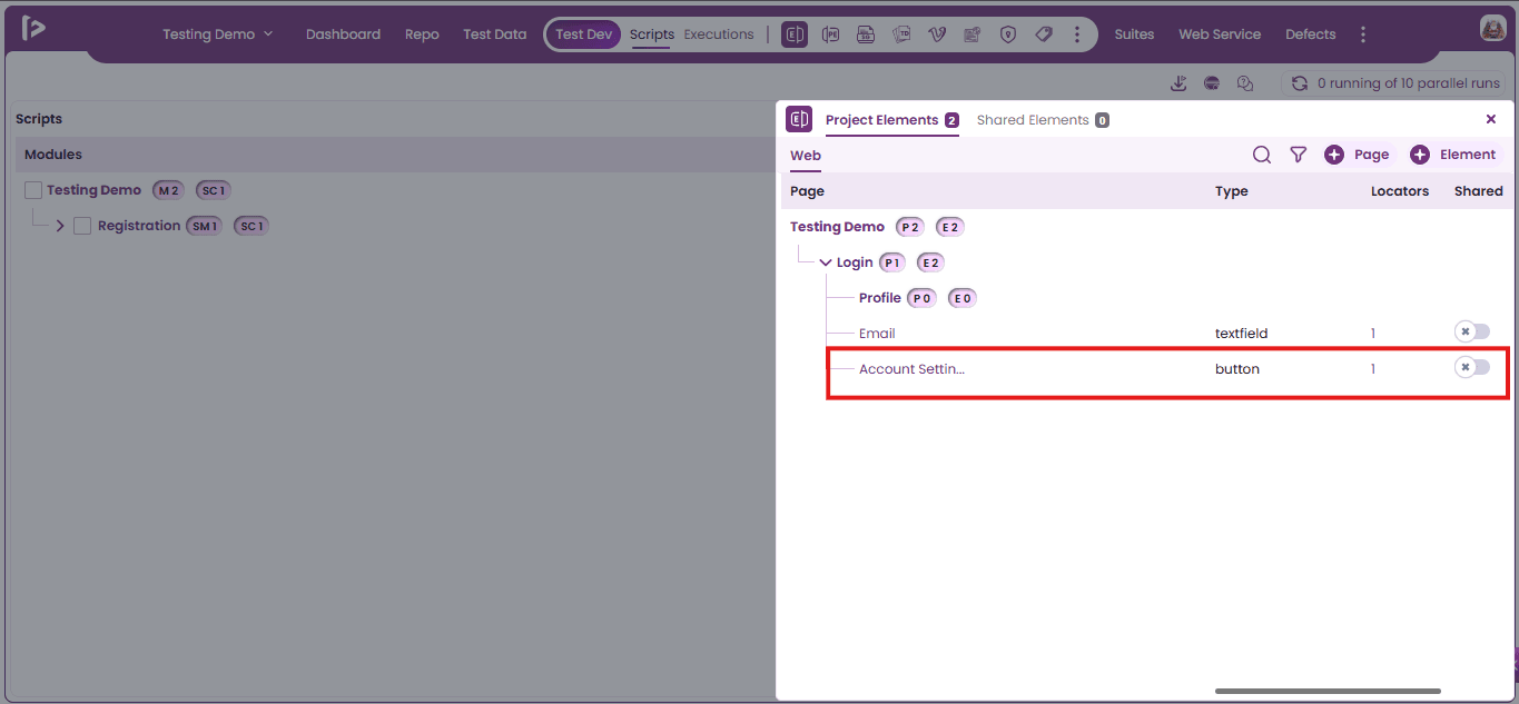
- Once an element is created, it is automatically added to the Project Element slider list under the specific page where it was created.
Method 4 : Using Quick Access Panel in Step Groups
- Click on the project the user wants to navigate as shown below.
- Upon selecting an individual project, the user is automatically directed to the Test Dev section, where the Quick Access Toolbar is readily available at the top.
- Click On “Repo” Section.
- Upon Clicking The Repo Section, the interface automatically navigates to the Elements tab by default.
- Click on the “Step Groups”option.
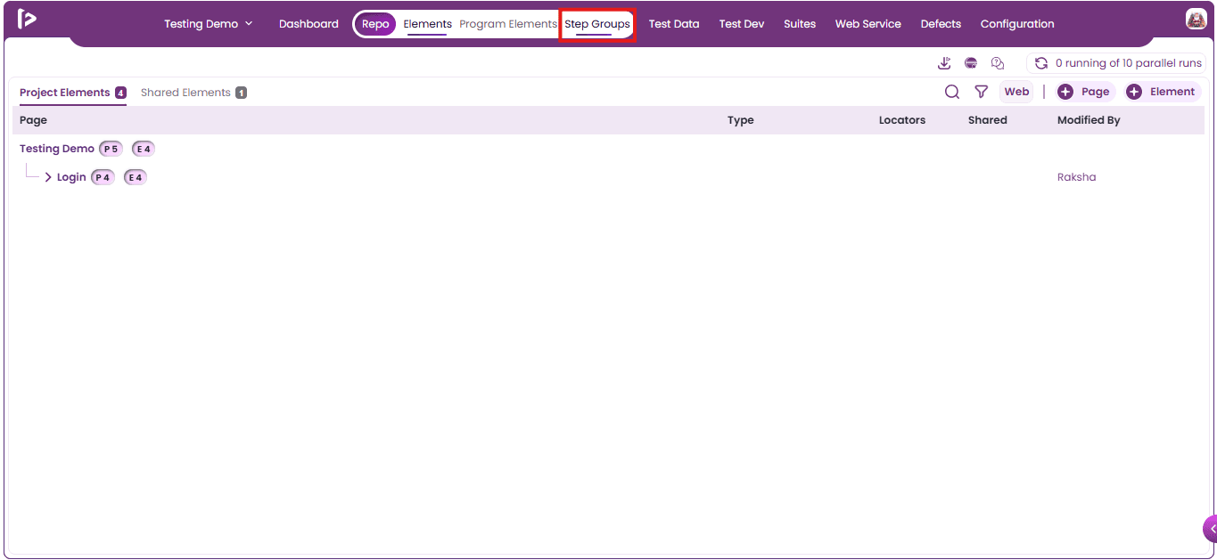
- Upon clicking on Step Groups, the user will be redirected to the Step Groups page, as shown below.
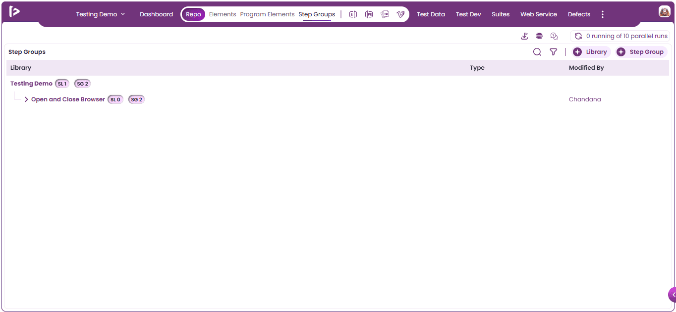
- Click On “Elements” From Quick Access Panel.
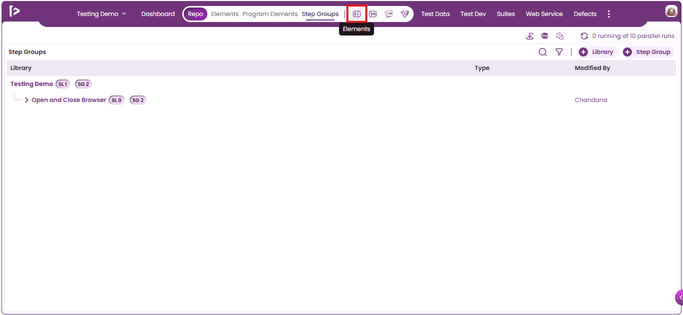
- Project Element Slider Will Be Displayed As Shown Below.
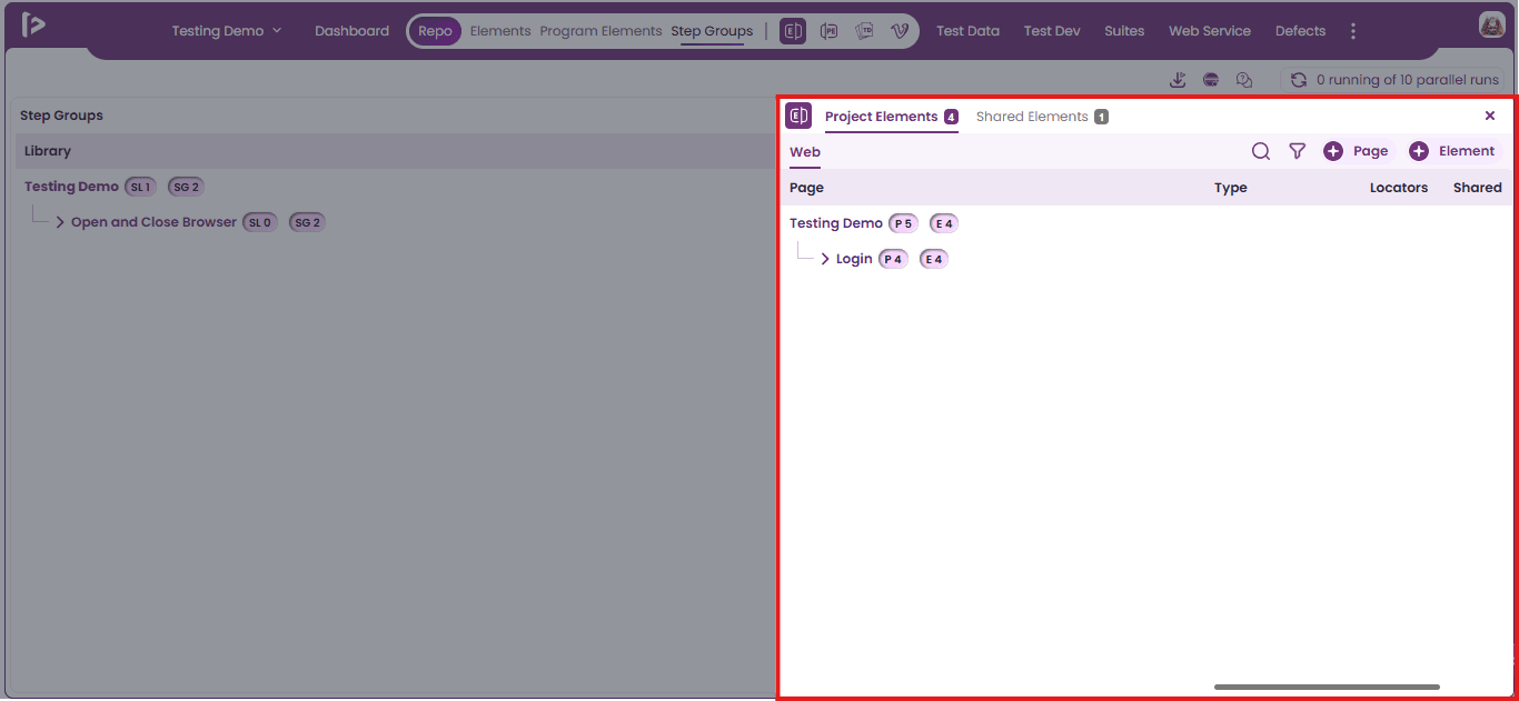
- To create an element, click the ‘+ Element’ button as illustrated below
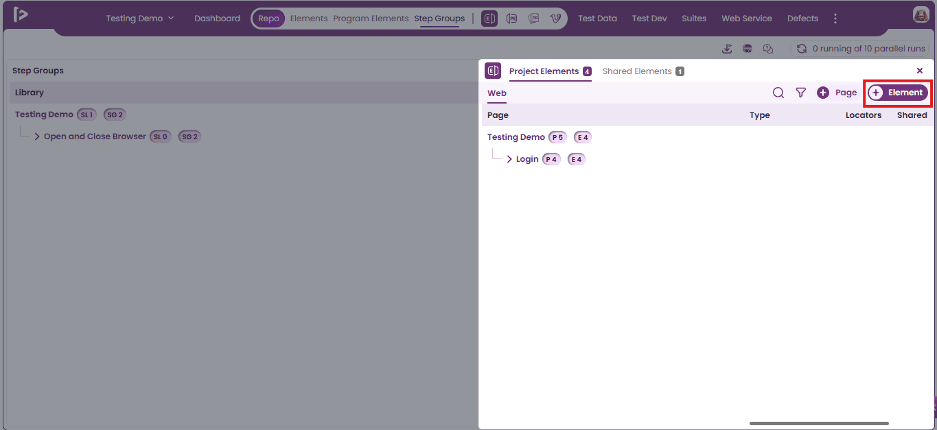
- The ‘Create Element’ Slider will then appear, as shown below.
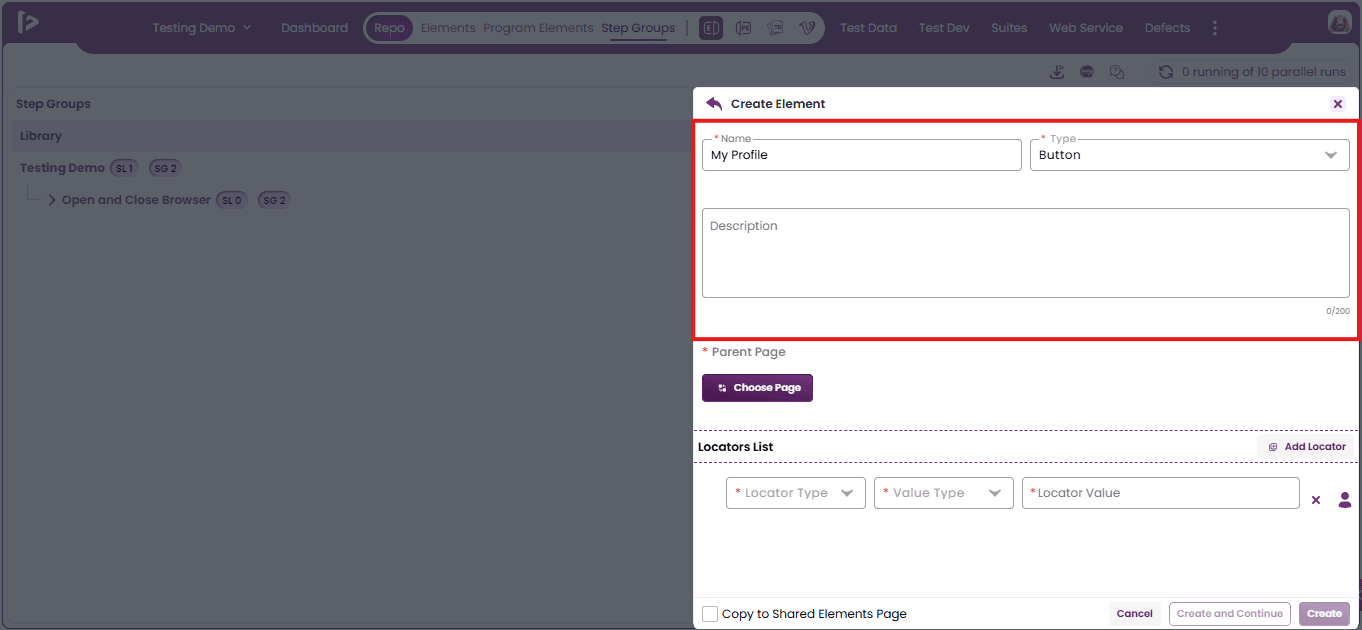
- Enter valid data in the Name Type and Description fields. The Name text field and the Type dropdown are required.
- Click On Choose Page Button As shown below.
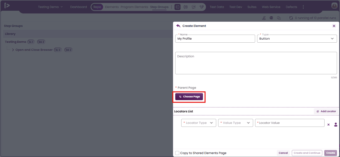
- The ‘Select Page’ slider will appear.
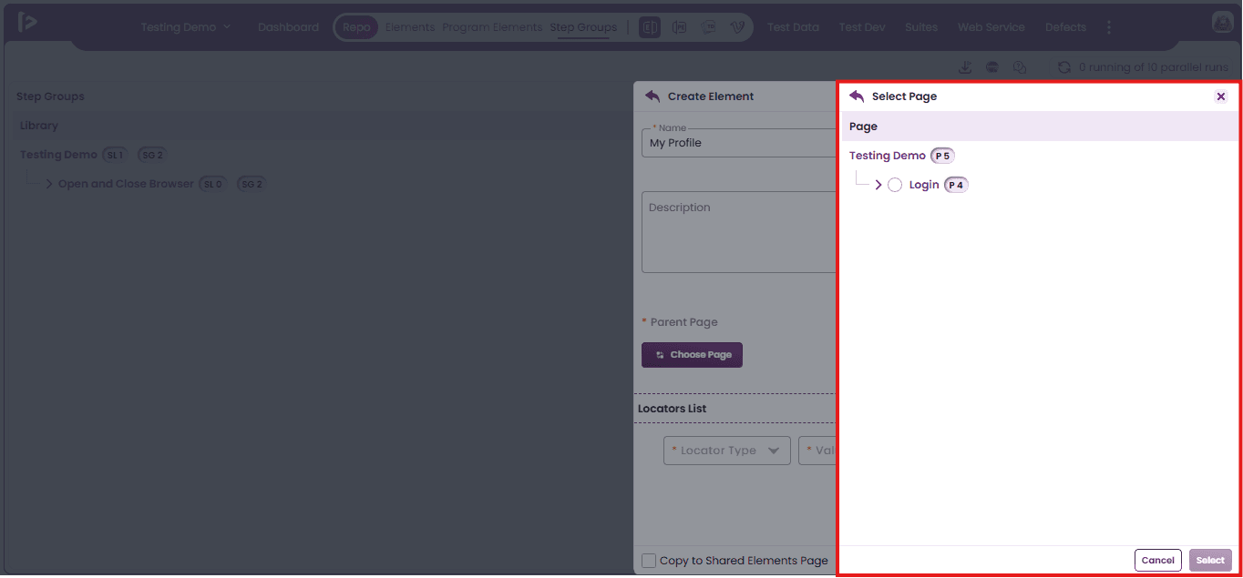
- Select the Parent Page under which user wants to create the element—this is also a mandatory field.And Click On ‘Select’ Button.
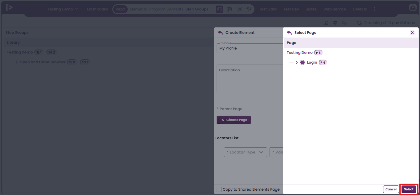
- Add locators by selecting the Locator Type, Value Type, and entering the Locator Value in the Locators List section.
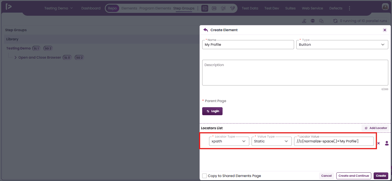
- To remove a locator entry from the Locators List, click the Cross icon located at the end of the respective row As Shown Below.
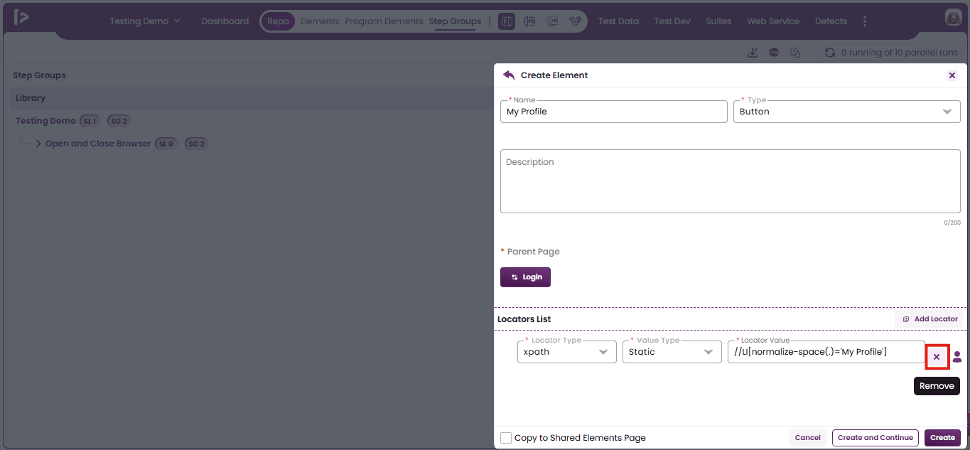
- Click the 'Add Locator' button to add a new row for entering additional locator details in the Locators List section.
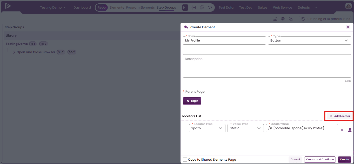
- Click the 'Cancel' button to exit the element creation process and return to the previous screen without saving the entered details.
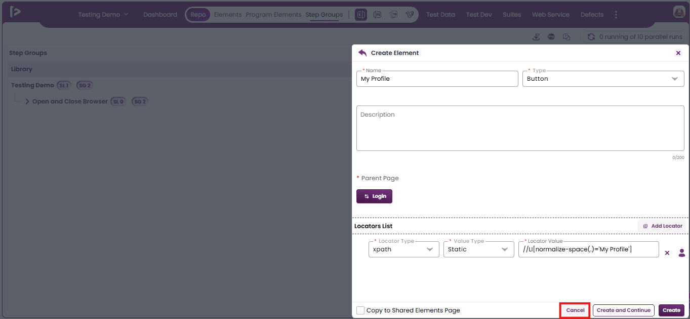
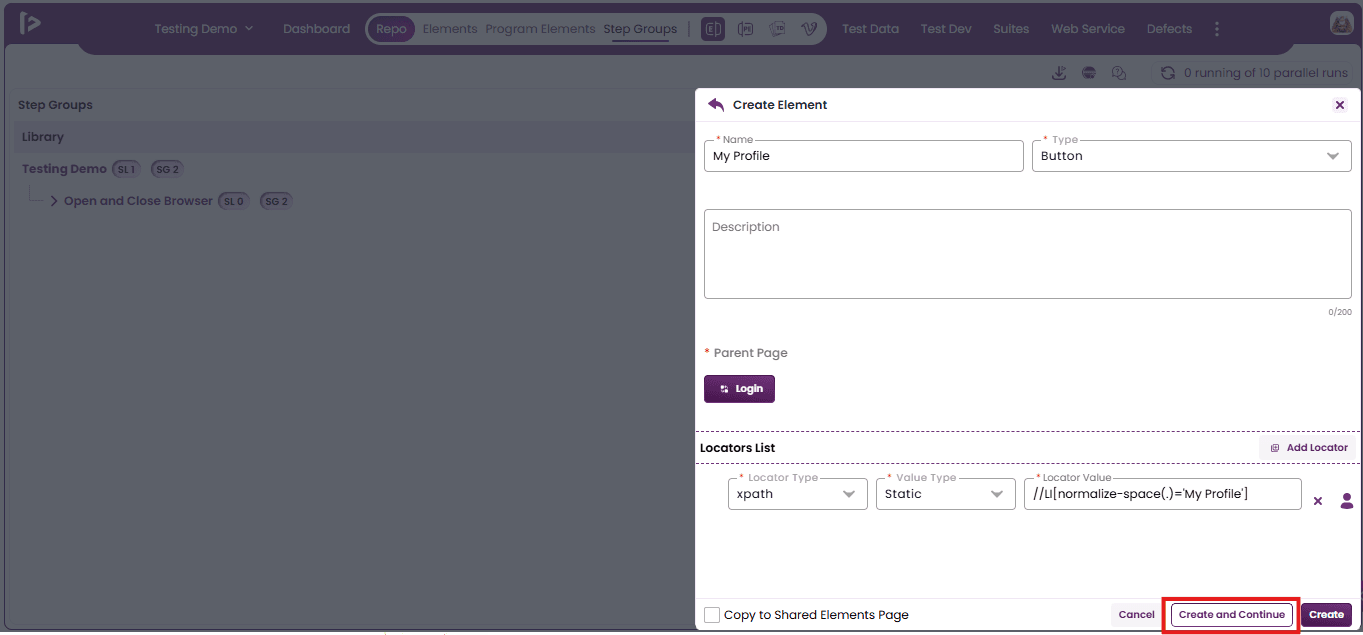
- Click the 'Create and Continue' button to save the current element details and remain on the same page.
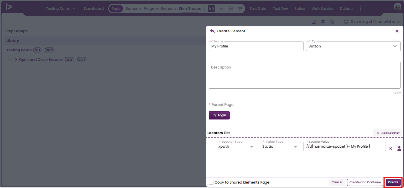
- Click the 'Create' button to save the element with the provided details and return to the element list view.
Additional features For Page And Sub Page
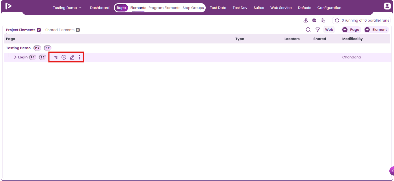
Upon hovering over the created page or subpage, it displays the actions as shown below;
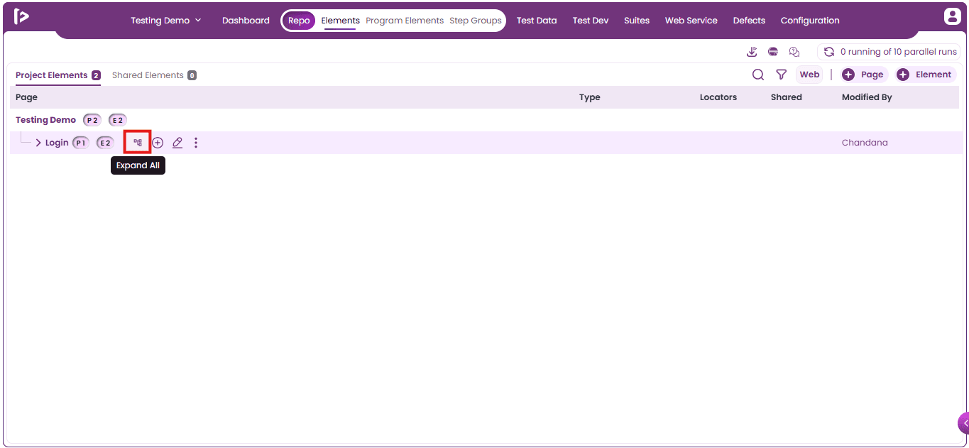
- Expand All
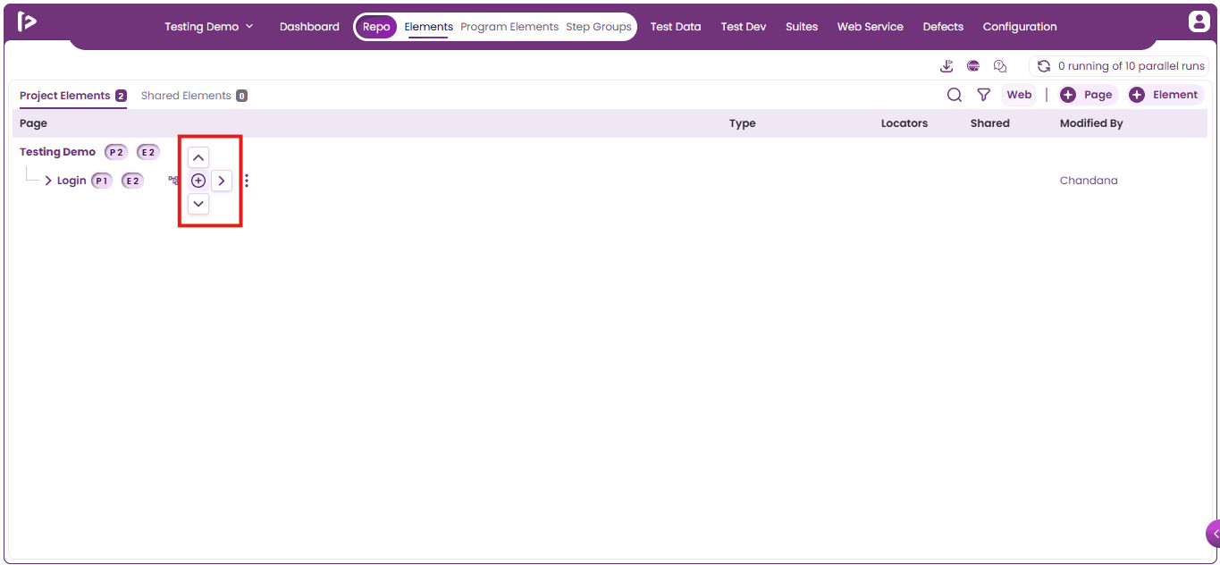
- “+” icon
- Edit icon
- More icon
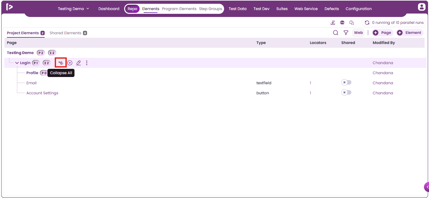
Expand all / Collapse all : These features become available only when a Page contains one or more Sub Pages.
- Expand All : In FireFlink, an "Expand All" icon is available to expand all pages in the page hierarchy.
2. Collapse all : In FireFlink, a "Collapse All" icon is available to collapse all expanded pages in the page hierarchy.
'+ icon : When the user hovers over the ‘+’ icon, three additional pointer options appear: Up Arrow Pointer, Down Arrow Pointer, and Right Arrow Pointer. These options allow the user to control the placement or flow of elements, as illustrated below.
1. Up Arrow Pointer :
- Clicking the Up Arrow Pointer will display the Page feature as shown below.
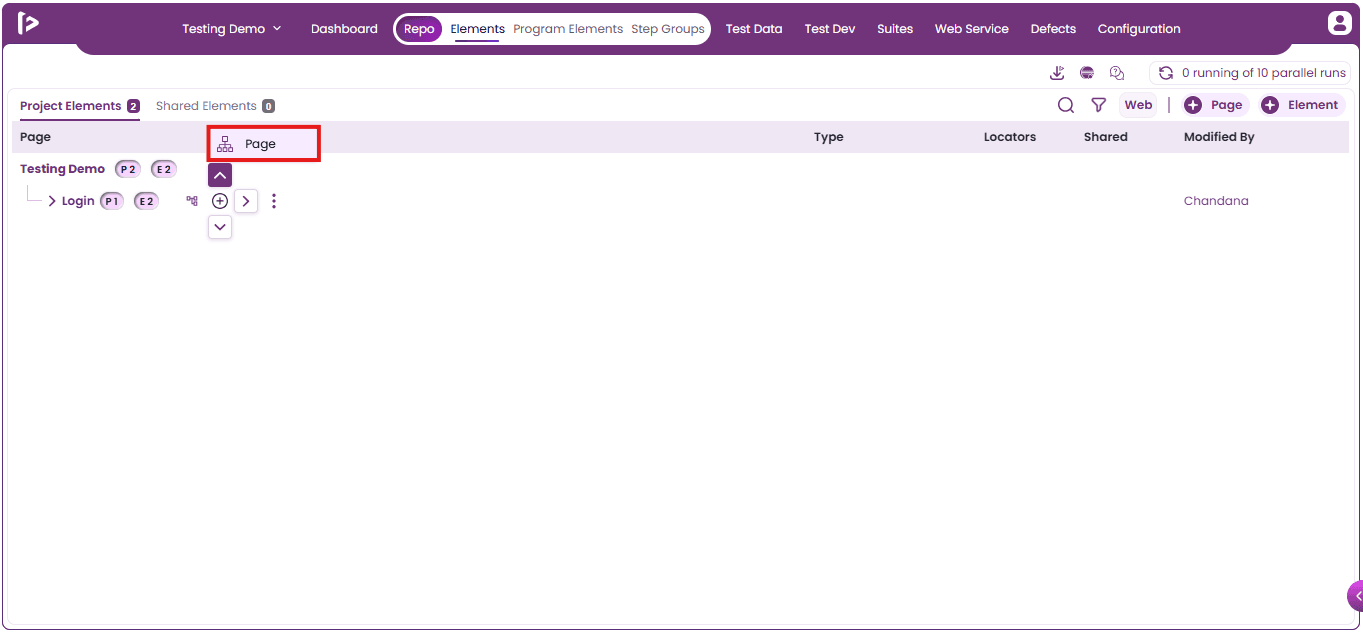
- Clicking the Page icon allows users to add a new page above the current page or sub-page
2. Right Arrow Pointer : Click the Right Arrow Pointer to display multiple features, as shown below
- Sub Page: Adds a nested page under the current page for better content hierarchy and organization.
- Element: Inserts individual UI components (e.g., text, images, inputs) to design the page layout.
- Add from Shared Element: Allows reuse of pre-configured elements shared across the project to ensure consistency and save time.
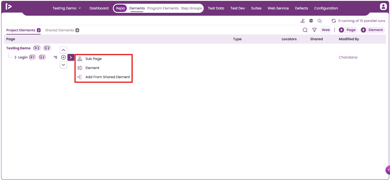
3. Down Arrow Pointer :
- Clicking the Down Arrow Pointer will display the Page feature as shown below.
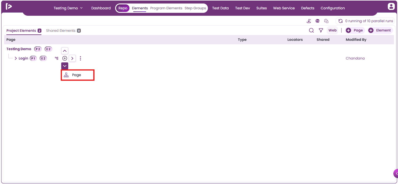
- Clicking the Page icon allows users to add a new page below the current page or subpage
Edit : User can edit the elements by following the steps given below
- Click on edit button as shown below
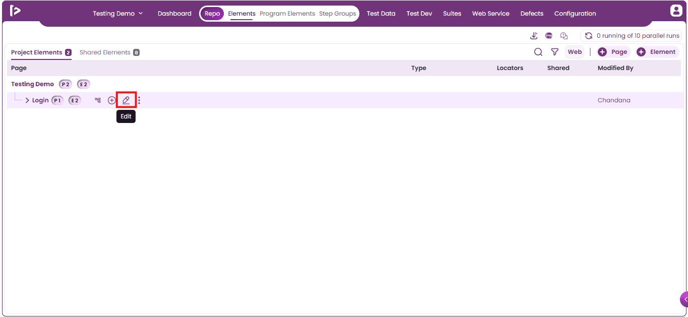
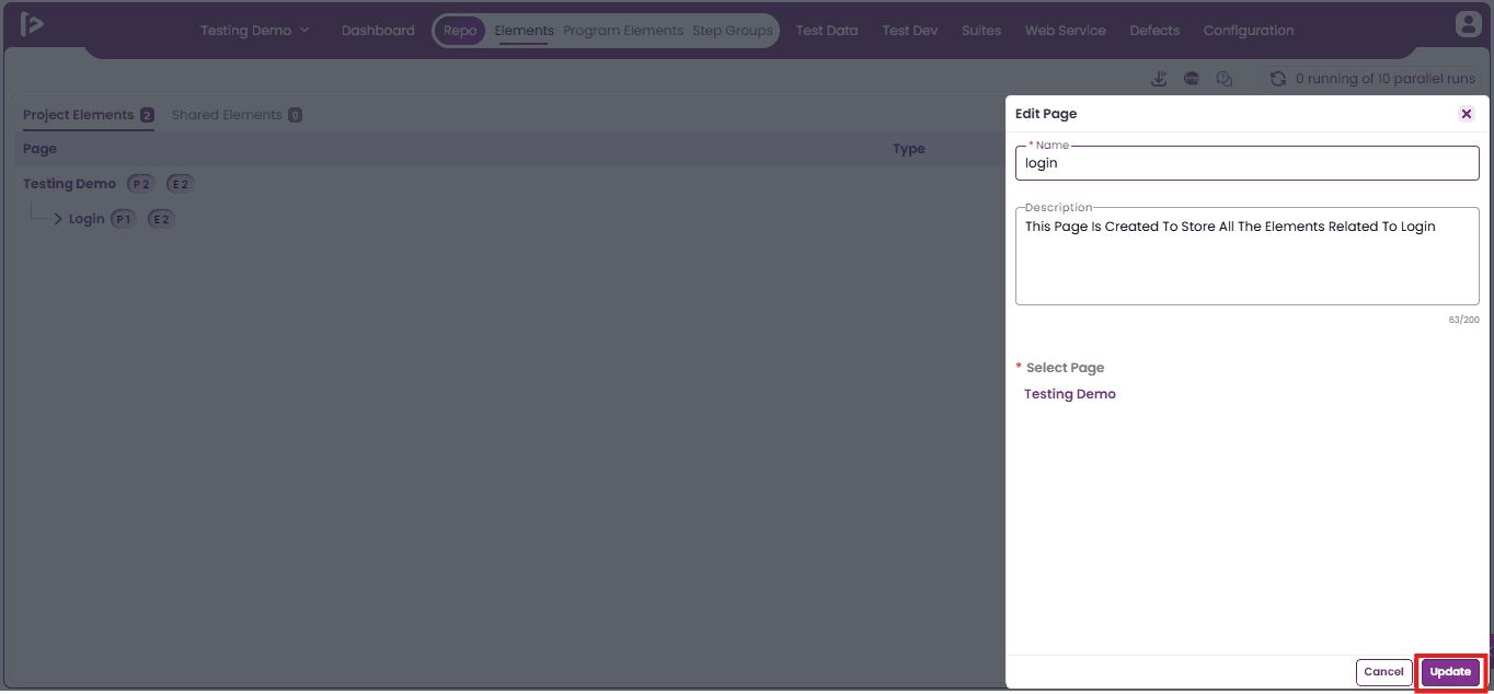
- Upon clicking on the edit button, user can view edit page slider as shown below
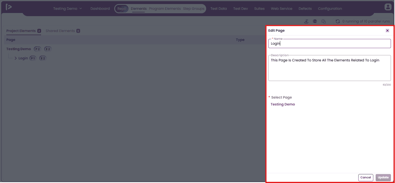
- Users can modify the page name and description. After making the necessary changes, click the 'Update' button to save them.
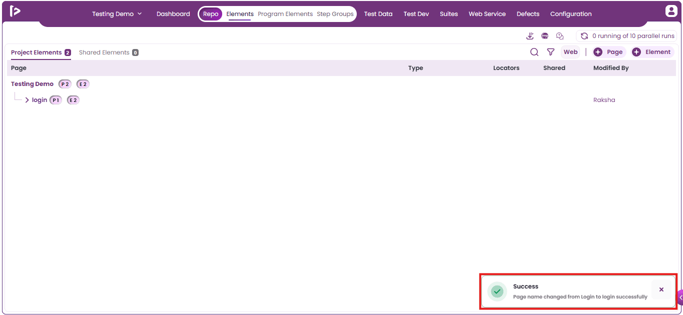
- Upon clicking on the Update button, a successful message will be displayed as shown below.
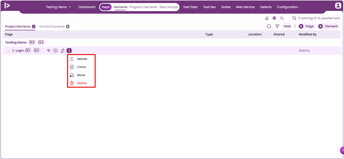
More Features : By clicking the option, users can access additional actions available for Pages and Sub-Pages, as listed below.
- Details
- Clone
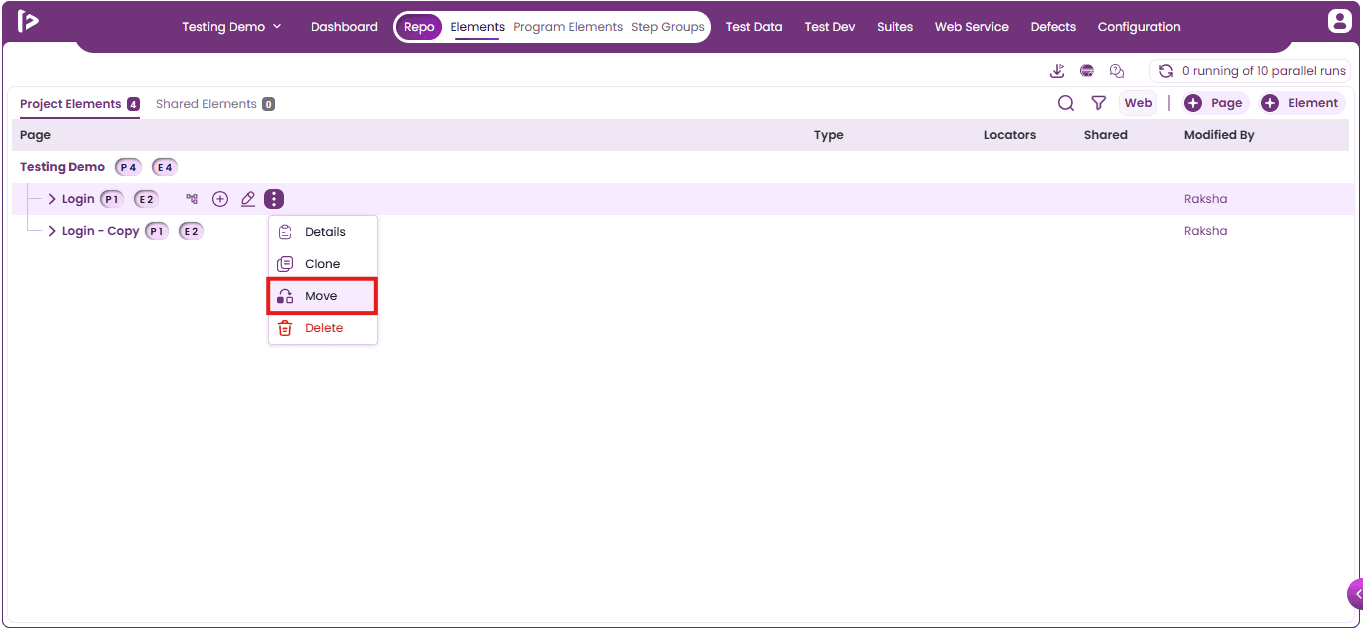
- Move
- Delete
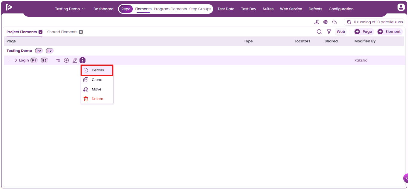
1. Details : To view the details for page or sub pages, users need to follow the steps given below:
- Click on the Details option as shown below.
- Upon clicking on Details option, user can able to view the details for the page as shown below
- Name: The title assigned to the page or sub-page.
- Project Name: The name of the project to which the page or sub-page belongs.
- Path: The hierarchical structure indicating the location of the page or sub-page .
- Total Pages: The total number of child pages or sub-pages nested under the current page.
- Total Elements: The total number of UI elements added within the page or its sub-pages.
- Created By: The user who initially created the page or sub-page.
- Created On: The date and time when the page or sub-page was created.
- Modified By: The user who last made changes to the page or sub-page.
- Modified On: The date and time when the page or sub-page was last updated.
- Description: A brief summary explaining the purpose or content of the page or sub-page.
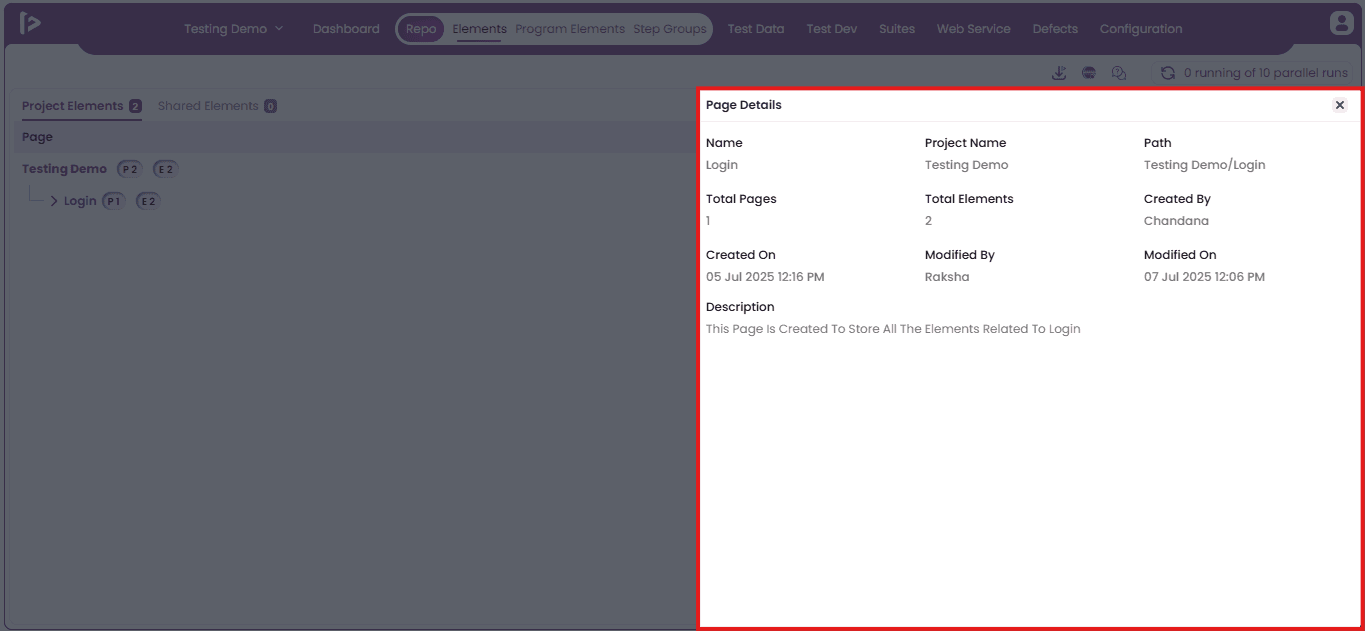
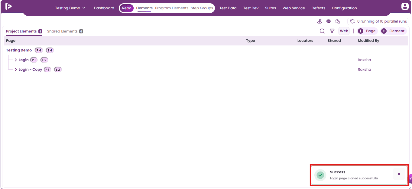
2. Clone: Users can clone pages and sub-pages by following the steps below.
- Click on the Clone option for the page as displayed below.
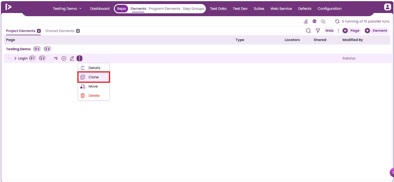
- Upon clicking on Clone option user will able to view an information popup as shown below
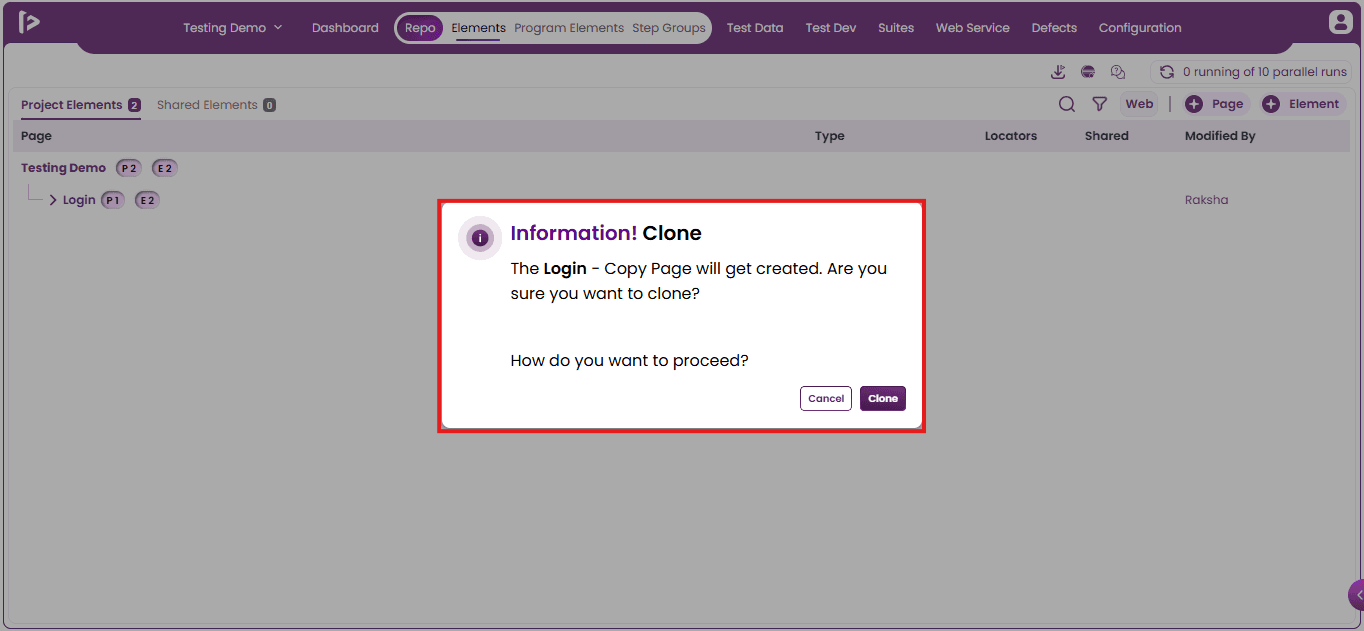
- Click on the clone button.
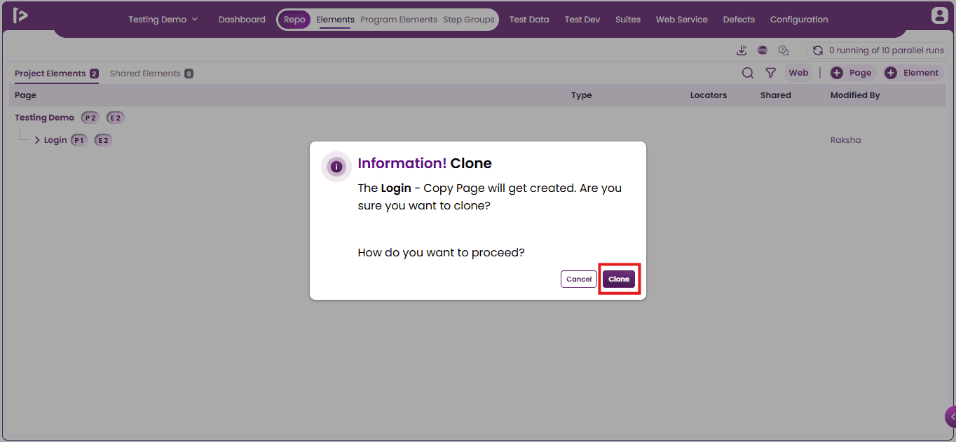
- Upon clicking on Clone button, user can able to view a successful message as displayed below
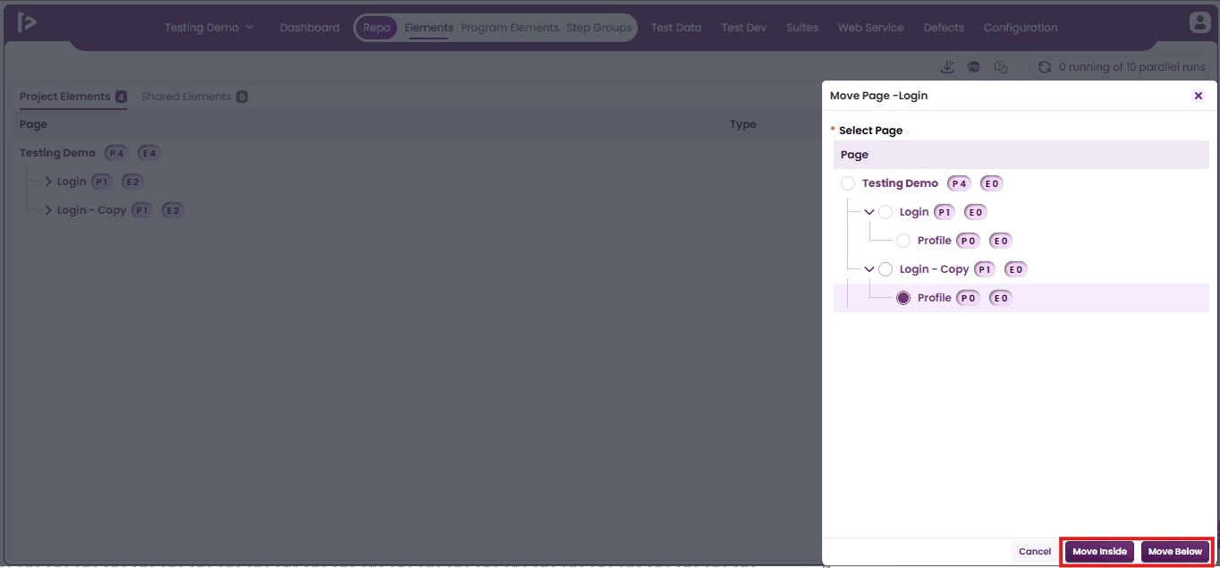
3. Move : This feature allows users to move pages and sub-pages from one position to another using two available options:
- Move Inside
- Move Below
User can able to move the page and sub pages by following the steps given below:
- Click on Move options as shown below.
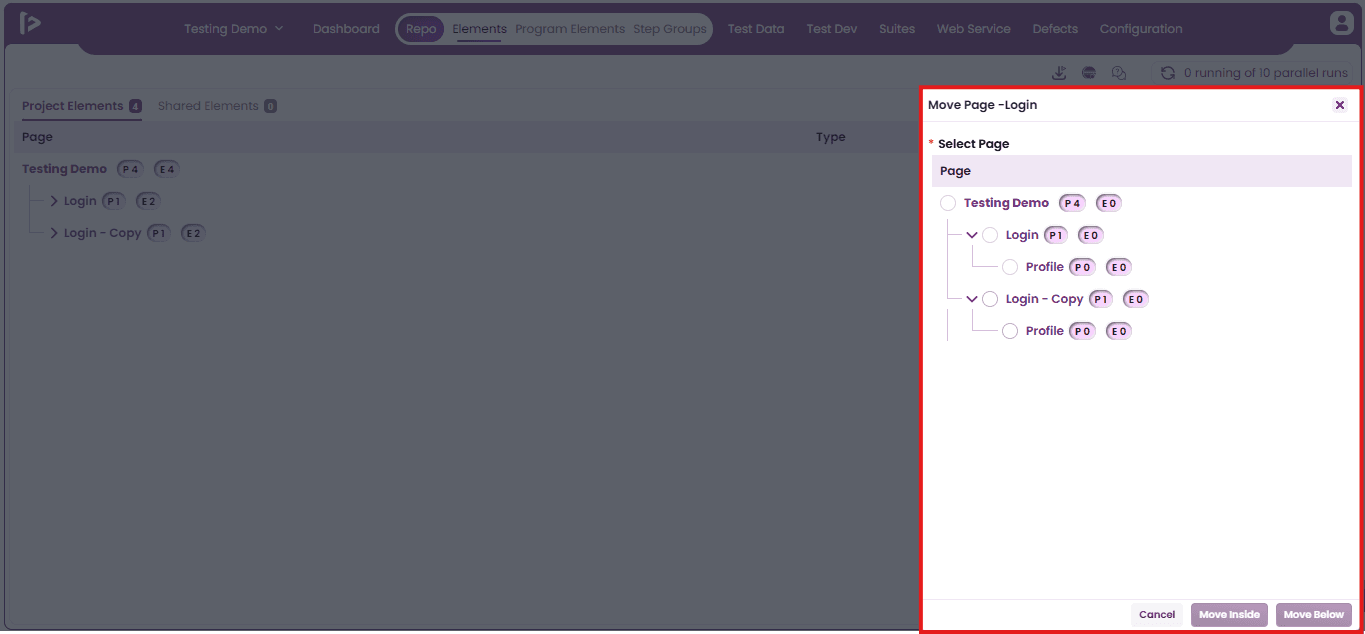
- When the user clicks on the Move option, a Move Page slider panel appears, as illustrated below.
- Select the target page under which user want to move the current page.Based on the available options, click the appropriate action button—Move Inside or Move Below.
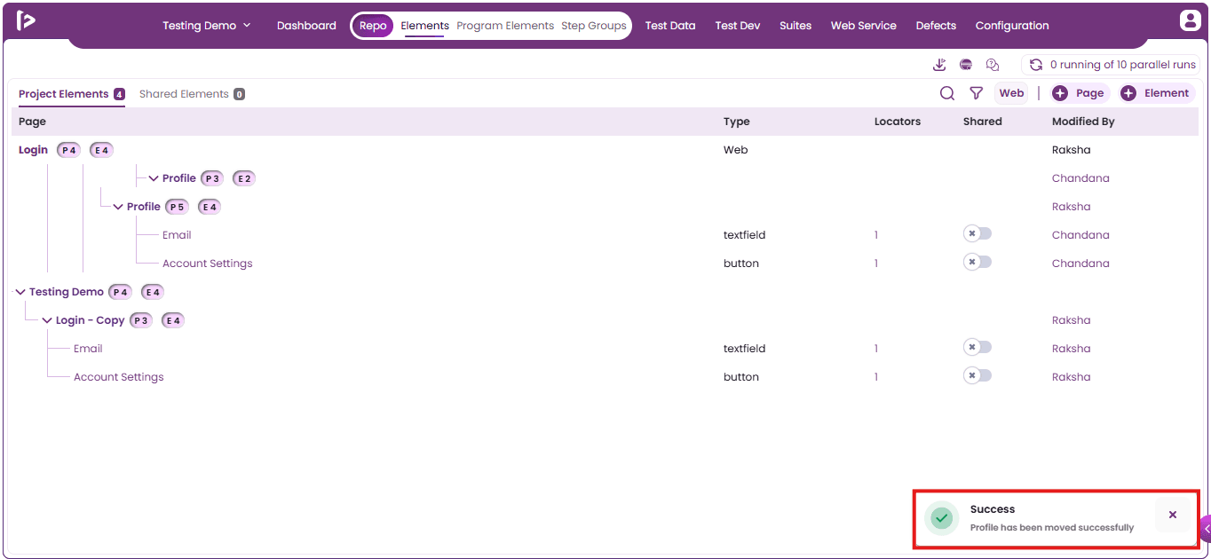
- Upon clicking the appropriate button, a success message will be displayed, as shown below.
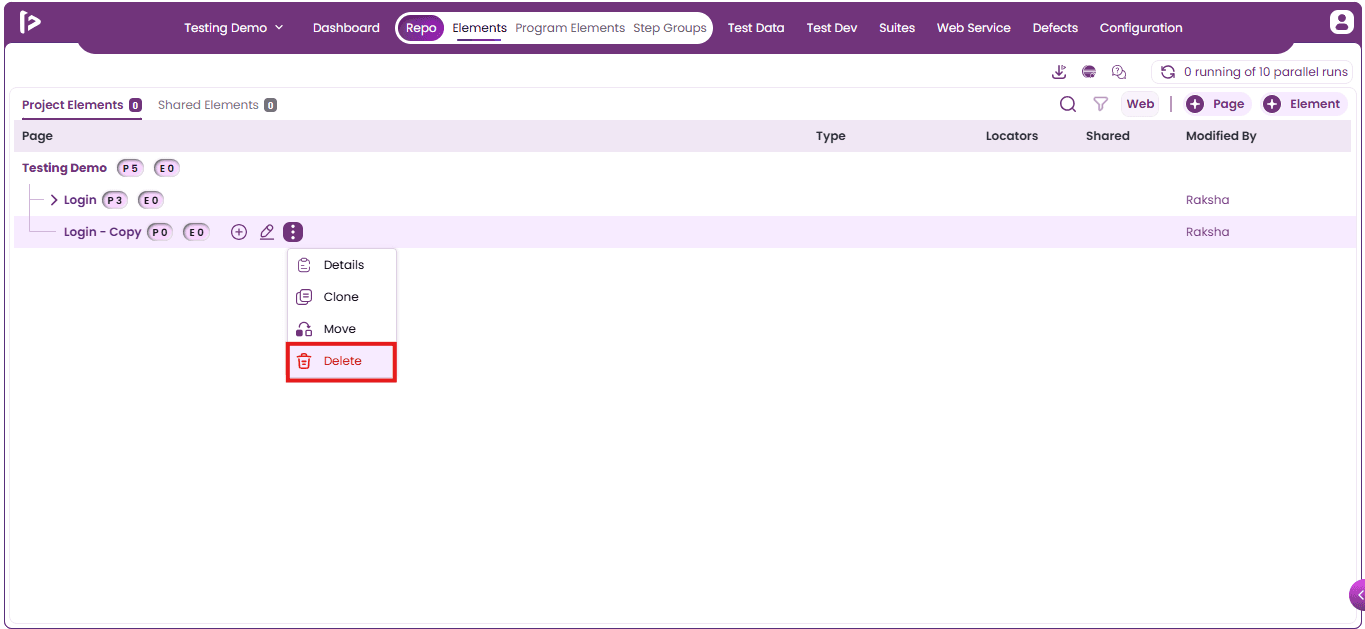
4. Delete: User can delete a Page or Sub Page by following the steps given below
- Click on the delete button as shown below.
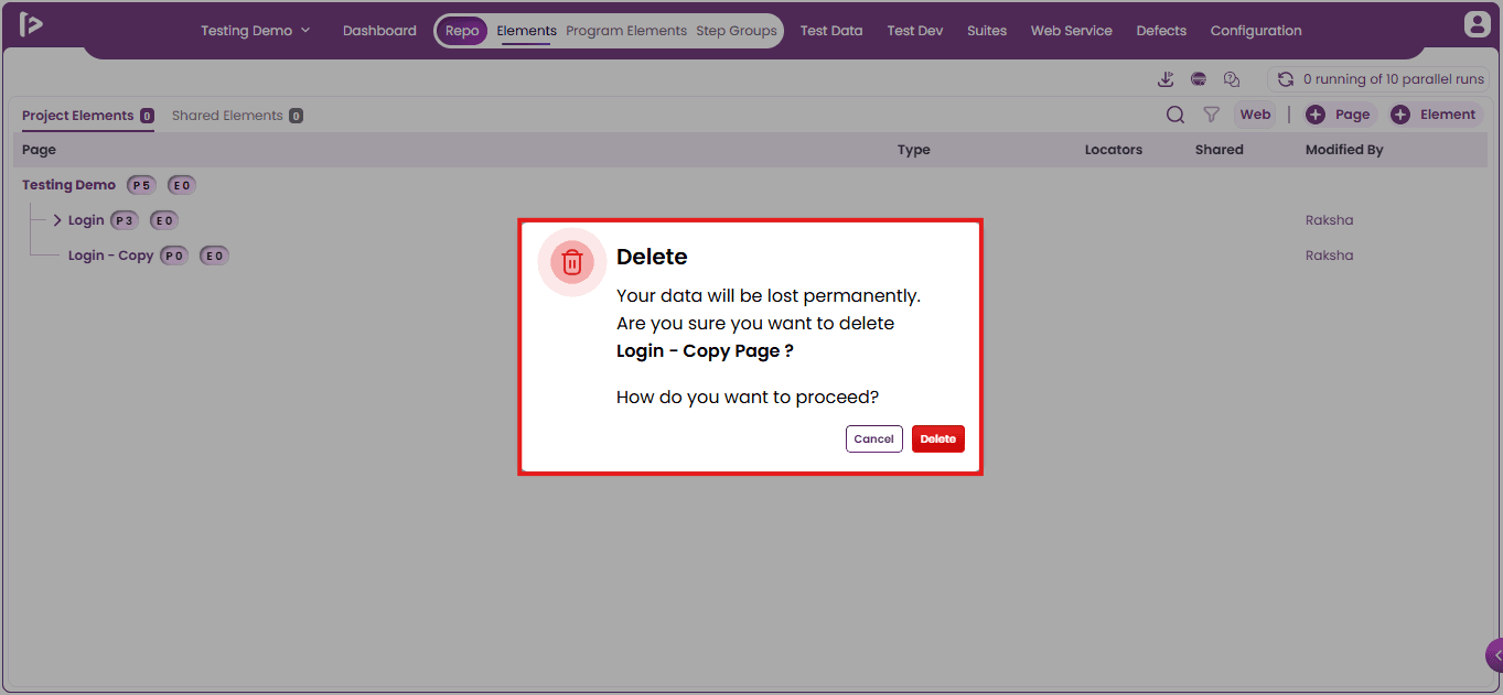
- Upon clicking the delete icon, a confirmation popup appears, as shown below.
- Note: Pages containing Sub Pages cannot be deleted directly. To proceed, remove or reassign all associated Sub Pages before attempting to delete the parent Page.
- Click on the Delete button.
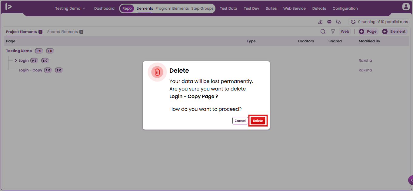
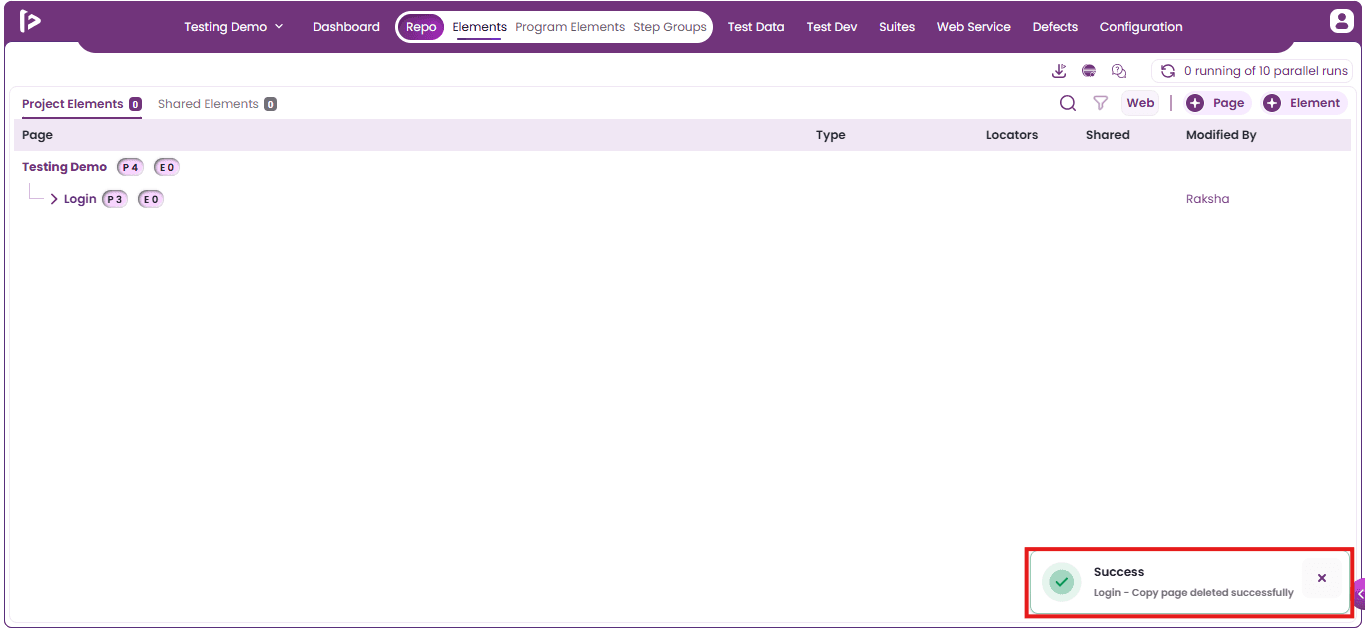
- Upon clicking on delete button, a successful message will appear as shown below
Miscellaneous Features
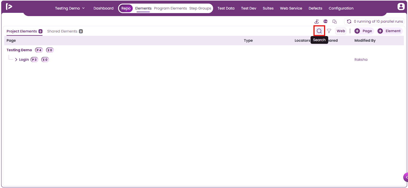
Search Functionality : In FireFlink, the Search Functionality enables users to efficiently locate specific Pages and Sub Pages within a Repository. To utilize this feature:
- Click on the search icon as displayed below.
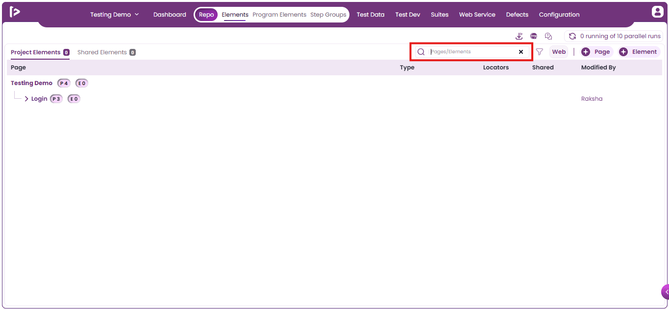
- Upon clicking the Search button, a text field will appear where the user can enter the data, as illustrated below.
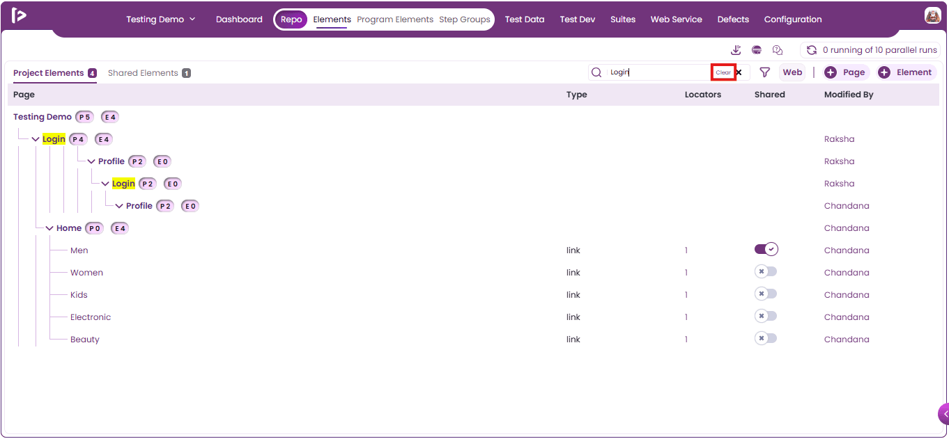
- After entering the desired data into the text field, users can press the Enter key to retrieve the results. The matching results will be displayed with highlighted fields, as shown below.
- To clear the entered search data, users can click on the Clear icon, as shown below.
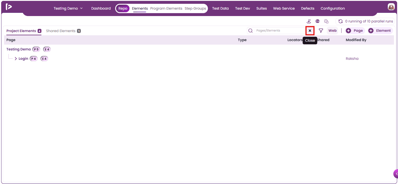
- Users can close the search by clicking on the Close icon as shown below.
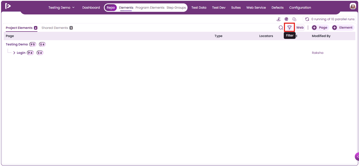
Filter Functionality: Users can filter the Project Elements by following the steps below.
- Click on the Filter Icon as shown below.
- Upon clicking the Filter icon, a Filter Slider will appear, as shown below.
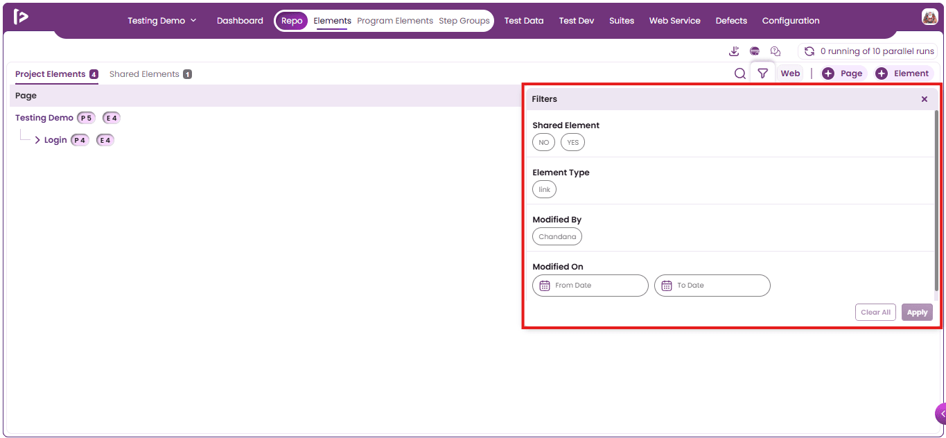
- Users can provide the desired filters by selecting the options present inside the Slider and once the options are selected, Click on Apply button.
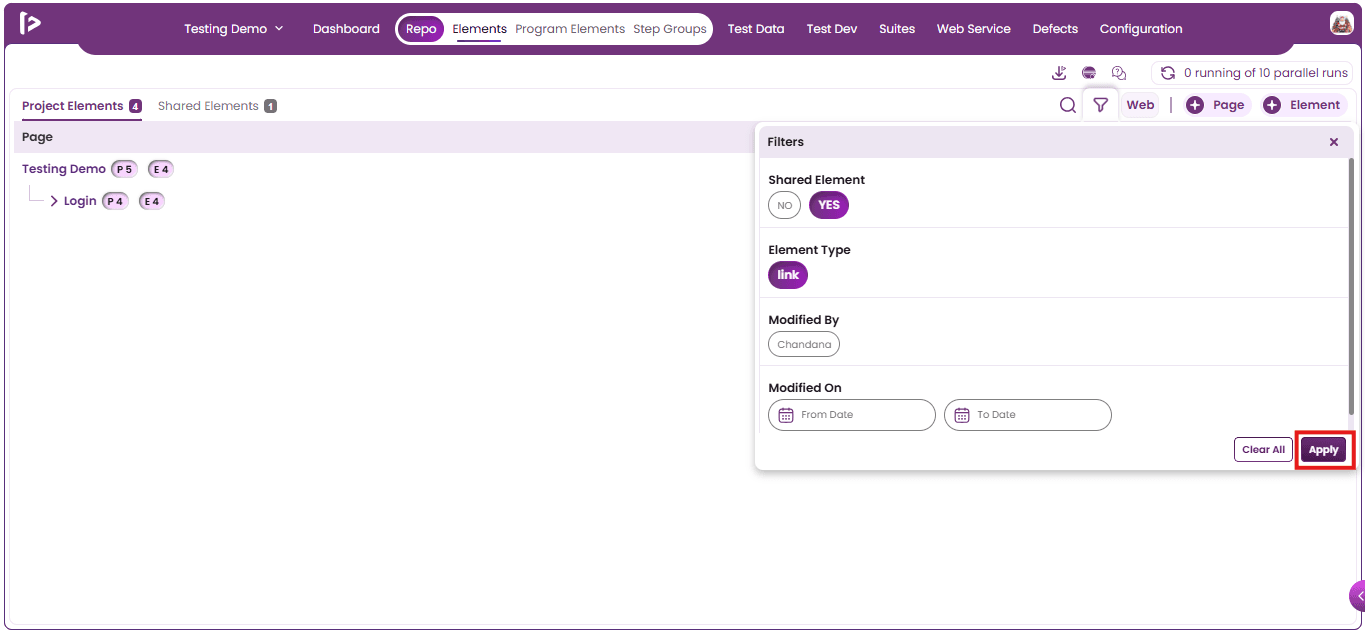
- Upon clicking on apply button, user can able to get the filtered results as shown below
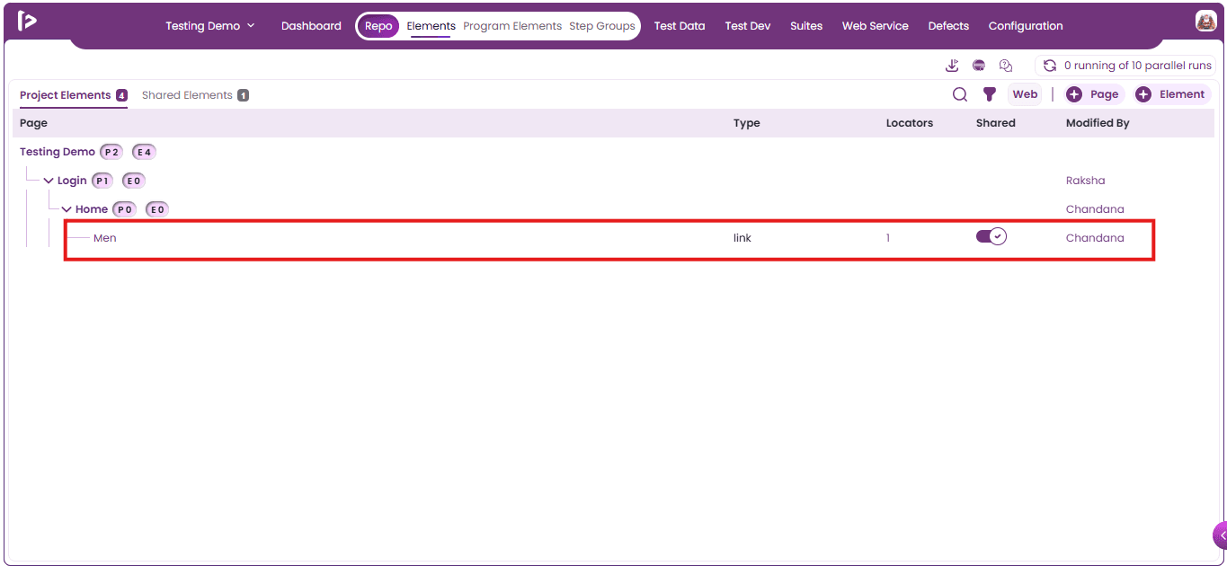
Project Elements Optimizer
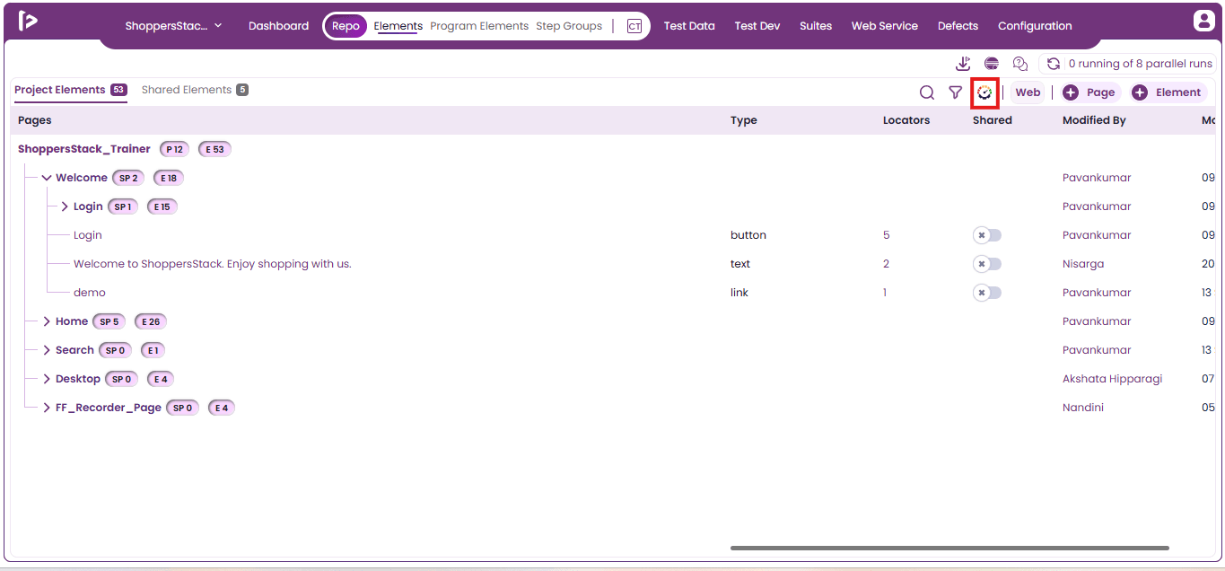
The Project Elements Optimizer helps identify unused project elements and enables bulk deletion of items that have no impact on execution. It enhances maintainability by removing redundant elements, reducing project complexity, and improving overall performance and visibility of dependencies.
How to Use Project Elements Optimizer
- Click on the Optimizer icon.
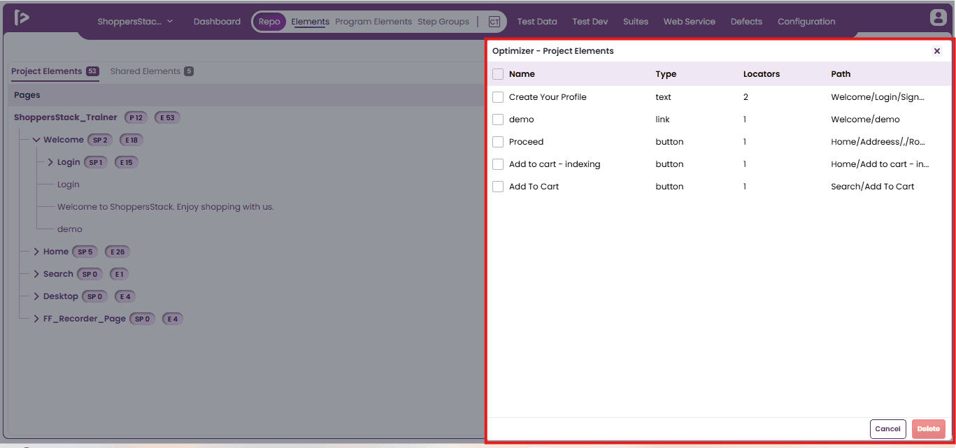
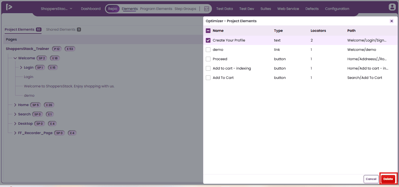
- The Optimizer - Project Elements slider will appear.
- Select the project elements that the user wishes to delete.
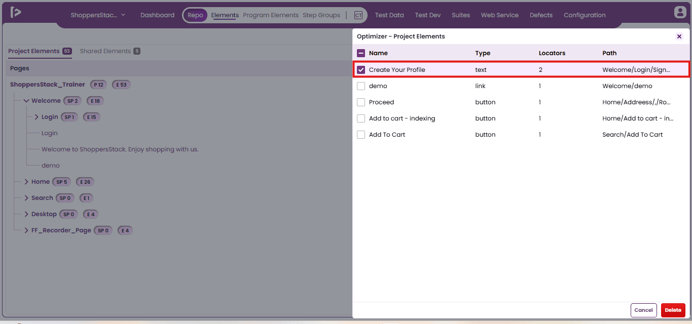
- After selecting the elements, click on the Delete button.
- A confirmation pop-up will be displayed. Click on the Delete button to proceed.
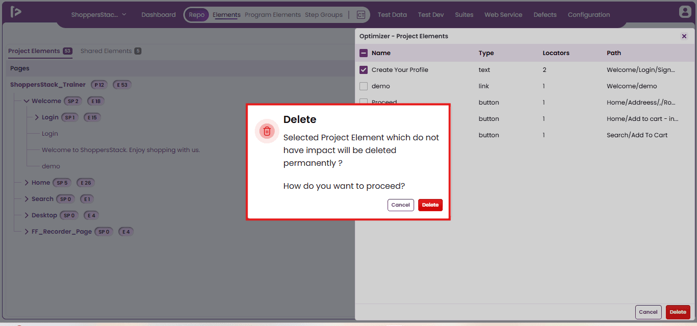
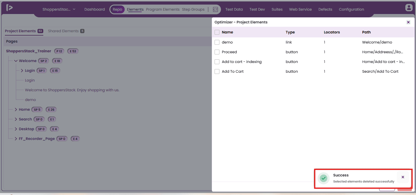
- A success toast message will be displayed confirming that the selected project elements have been deleted successfully.